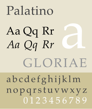
Palatino is an old-style serif typeface designed by Hermann Zapf, initially released in 1949 by the Stempel foundry and later by other companies, most notably the Mergenthaler Linotype Company.

Optima is a humanist sans-serif typeface designed by Hermann Zapf and released by the D. Stempel AG foundry, Frankfurt, West Germany in 1958.

Type design is the art and process of designing typefaces. This involves drawing each letterform using a consistent style. The basic concepts and design variables are described below.

In typography and lettering, a sans-serif, sans serif, gothic, or simply sans letterform is one that does not have extending features called "serifs" at the end of strokes. Sans-serif typefaces tend to have less stroke width variation than serif typefaces. They are often used to convey simplicity and modernity or minimalism. For the purposes of type classification, sans-serif designs are usually divided into these major groups: § Grotesque, § Neo-grotesque, § Geometric, § Humanist, and § Other or mixed.
In typography, a serif is a small line or stroke regularly attached to the end of a larger stroke in a letter or symbol within a particular font or family of fonts. A typeface or "font family" making use of serifs is called a serif typeface, and a typeface that does not include them is sans-serif. Some typography sources refer to sans-serif typefaces as "grotesque" or "Gothic" and serif typefaces as "roman".

A typeface is a design of letters, numbers and other symbols, to be used in printing or for electronic display. Most typefaces include variations in size, weight, slope, width, and so on. Each of these variations of the typeface is a font.

In typography, italic type is a cursive font based on a stylised form of calligraphic handwriting. Along with blackletter and roman type, it served as one of the major typefaces in the history of Western typography.

In typography, the x-height, or corpus size, is the distance between the baseline and the mean line of lowercase letters in a typeface. Typically, this is the height of the letter x in the font, as well as the letters v, w, and z. One of the most important dimensions of a font, x-height defines how high lowercase letters without ascenders are compared to the cap height of uppercase letters.

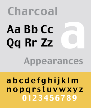
Charcoal is a sans-serif typeface designed by David Berlow of Font Bureau during the period 1994–1997. Charcoal was the default menu font in Apple Computer's Mac OS 8 and 9, replacing the comparatively harder-to-read Chicago as part of the new Platinum interface. In Mac OS X developer preview 3, it was replaced with Lucida Grande as the system typeface. Charcoal is designed for high legibility, even at smaller point sizes, displayed on computer monitors.

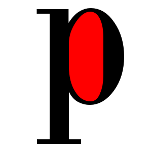
In typography, a counter is the area of a letter that is entirely or partially enclosed by a letter form or a symbol. The stroke that creates such a space is known as a "bowl". Latin letters containing closed counters include A, B, D, O, P, Q, R, a, b, d, e, g, o, p, and q. Latin letters containing open counters include c, f, h, s etc. The digits 0, 4, 6, 8, and 9 also have counters. An aperture is the opening between an open counter and the outside of the letter.
Oblique type is a form of type that slants slightly to the right, used for the same purposes as italic type. Unlike italic type, however, it does not use different glyph shapes; it uses the same glyphs as roman type, except slanted. Oblique and italic type are technical terms to distinguish between the two ways of creating slanted font styles; oblique designs may be labelled italic by companies selling fonts or by computer programs. Oblique designs may also be called slanted or sloped roman styles. Oblique fonts, as supplied by a font designer, may be simply slanted, but this is often not the case: many have slight corrections made to them to give curves more consistent widths, so they retain the proportions of counters and the thick-and-thin quality of strokes from the regular design.

In typography, a slab serif typeface is a type of serif typeface characterized by thick, block-like serifs. Serif terminals may be either blunt and angular (Rockwell), or rounded (Courier). Slab serifs were introduced in the early nineteenth century.

Didone is a genre of serif typeface that emerged in the late 18th century and was the standard style of general-purpose printing during the 19th century. It is characterized by:

In metal typesetting, a font or fount is a particular size, weight and style of a typeface. Each font is a matched set of type, with a piece for each glyph. A typeface consists of various fonts that share an overall design.

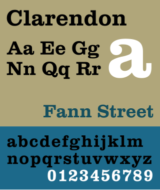
Clarendon is the name of a slab serif typeface that was released in 1845 by Thorowgood and Co. of London, a letter foundry often known as the Fann Street Foundry. The original Clarendon design is credited to Robert Besley, a partner in the foundry, and was originally engraved by punchcutter Benjamin Fox, who may also have contributed to its design. Many copies, adaptations and revivals have been released, becoming almost an entire genre of type design.

Didot is a group of typefaces. The word/name Didot came from the famous French printing and type-producing Didot family. The classification is known as modern, or Didone.

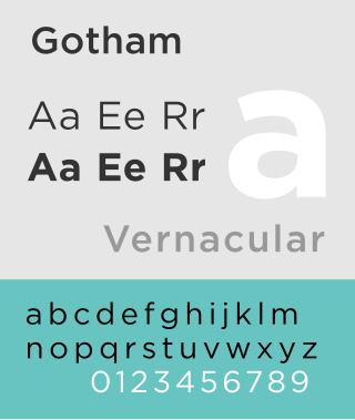
Gotham is a geometric sans-serif typeface family designed by American type designer Tobias Frere-Jones with Jesse Ragan and released through the Hoefler & Frere-Jones foundry from 2002. Gotham's letterforms were inspired by examples of architectural signs of the mid-twentieth century. Gotham has a relatively broad design with a reasonably high x-height and wide apertures.

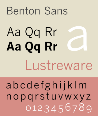
Benton Sans is a digital typeface family begun by Tobias Frere-Jones in 1995, and expanded by Cyrus Highsmith of Font Bureau. It is based on the sans-serif typefaces designed for American Type Founders by Morris Fuller Benton around the beginning of the twentieth century in the industrial or grotesque style. It was a reworked version of Benton Gothic developed for various corporate customers, under Frere-Jones's guidance. In developing the typeface, Frere-Jones studied drawings of Morris Fuller Benton's 1908 typeface News Gothic at the Smithsonian Institution. The typeface began as a proprietary type, initially titled MSL Gothic, for Martha Stewart Living magazine and the website for Martha Stewart Living Omnimedia. As Benton Gothic, there are 7 weights from Thin to Black and only 2 widths.

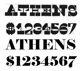
A reverse-contrast or reverse-stress letterform is a design in which the stress is reversed from the norm: a typeface or custom lettering where the horizontal lines are the thickest. This is the reverse of the vertical lines being the same width or thicker than horizontals, which is normal in Latin-alphabet writing and especially printing. The result is a dramatic effect, in which the letters seem to have been printed the wrong way round. The style invented in the early nineteenth century as attention-grabbing novelty display designs. Modern font designer Peter Biľak, who has created a design in the genre, has described them as "a dirty trick to create freakish letterforms that stood out."

A display typeface is a typeface that is intended for use in display type at large sizes for titles, headings, pull quotes, and other eye-catching elements, rather than for extended passages of body text.


