In ISO/IEC 646 and related standards including ISO 8859 and Unicode, a graphic character, also known as printing character, is any character intended to be written, printed, or otherwise displayed in a form that can be read by humans. In other words, it is any encoded character that is associated with one or more glyphs.

A typeface is a design of letters, numbers and other symbols, to be used in printing or for electronic display. Most typefaces include variations in size, weight, slope, width, and so on. Each of these variations of the typeface is a font.

The IBM Electric were an early series of electric typewriters that IBM manufactured, starting in the mid-1930s. They used the conventional moving carriage and typebar mechanism, as opposed to the fixed carriage and type ball used in the IBM Selectric, introduced in 1961. After 1944, each model came in both "Standard" and "Executive" versions, the latter featuring proportional spacing.
In writing, a space is a blank area that separates words, sentences, syllables and other written or printed glyphs (characters). Conventions for spacing vary among languages, and in some languages the spacing rules are complex. Inter-word spaces ease the reader's task of identifying words, and avoid outright ambiguities such as "now here" vs. "nowhere". They also provide convenient guides for where a human or program may start new lines.

In typography, emphasis is the strengthening of words in a text with a font in a different style from the rest of the text, to highlight them. It is the equivalent of prosody stress in speech.

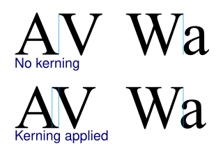
In typography, kerning is the process of adjusting the spacing between characters in a proportional font, usually to achieve a visually pleasing result. Kerning adjusts the space between individual letterforms while tracking (letter-spacing) adjusts spacing uniformly over a range of characters. In a well kerned font, the two-dimensional blank spaces between each pair of characters all have a visually similar area. The term "keming" is sometimes used informally to refer to poor kerning.

Univers is a large sans-serif typeface family designed by Adrian Frutiger and released by his employer Deberny & Peignot in 1957. Classified as a neo-grotesque sans-serif, one based on the model of nineteenth-century German typefaces such as Akzidenz-Grotesk, it was notable for its availability from the moment of its launch in a comprehensive range of weights and widths. The original marketing for Univers deliberately referenced the periodic table to emphasise its scope.

Backspace is the keyboard key that in typewriters originally pushed the carriage one position backwards, and in modern computer systems typically moves the display cursor one position backwards, deletes the character at that position, and shifts back any text after that position by one character.

In metal typesetting, a font or fount is a particular size, weight and style of a typeface. Each font is a matched set of type, with a piece for each glyph. A typeface consists of various fonts that share an overall design.
During the Killian documents controversy in 2004, the authenticity of the documents themselves was disputed by a variety of individuals and groups. Proof of authenticity is not possible without original documents, and since CBS used only faxed and photocopied duplicates, authentication to professional standards would be impossible regardless of the provenance of the originals. However, proving documents inauthentic does not depend on the availability of originals, and the validity of these photocopied documents has been challenged on a number of grounds, ranging from anachronisms in their typography to issues pertaining to their content.

In typography, rivers are gaps in typesetting which appear to run through a paragraph of text due to a coincidental alignment of spaces. Rivers can occur regardless of the spacing settings, but are most noticeable with wide inter-word spaces caused by full text justification or monospaced fonts. Rivers are less noticeable with proportional fonts, due to narrow spacing. Another cause of rivers is the close repetition of a long word or similar words at regular intervals, such as "maximization" with "minimization" or "optimization".

In CJK computing, graphic characters are traditionally classed into fullwidth and halfwidth characters. Unlike monospaced fonts, a halfwidth character occupies half the width of a fullwidth character, hence the name.

OCR-A is a font issued in 1966 and first implemented in 1968. A special font was needed in the early days of computer optical character recognition, when there was a need for a font that could be recognized not only by the computers of that day, but also by humans. OCR-A uses simple, thick strokes to form recognizable characters. The font is monospaced (fixed-width), with the printer required to place glyphs 0.254 cm apart, and the reader required to accept any spacing between 0.2286 cm and 0.4572 cm.

The history of sentence spacing is the evolution of sentence spacing conventions from the introduction of movable type in Europe by Johannes Gutenberg to the present day.
Pitch is the number of (monospaced) letters, numbers and spaces in one inch (25.4 mm) of running text, that is, characters per inch, measured horizontally. The pitch was most often used as a measurement of the size of typewriter fonts as well as those of impact printers used with computers.
A duospaced font is a fixed-width font whose letters and characters occupy either of two integer multiples of a specified, fixed horizontal space. Traditionally, this means either a single or double character width, although the term has also been applied to fonts using fixed character widths with another simple ratio between them.
A uniwidth typeface, also known as an equal-width, duplexed, or multiplexed typeface, is a typeface where every variation (font) has the same metrics. As a result, changing the variation used, such as using bold or italics, does not change the layout (reflow).
Vari-Typer is the brand name of a variable-spacing typewriter used between the 1930s and the early 1980s in printing, as well as for the production of office documents of typographic quality.


