Form elements
This section lists the form elements and describes their properties.

1. Browser Tab
The browser tab of a web page contains a title and a favicon.
Browser tab titles can be unique for each page and can be localized for different languages. Browser tab titles are chosen during the user journey workshop.
Only one favicon can be used across all pages of a brand.
2. URL
The web pages are hosted on your domain. The base URL is defined during the user journey workshop.
3. Header
The header contains the logo and a language icon to switch between languages. The relative location of the logo and language icon cannot be changed.
The header background color is defined during the user journey workshop.

Logo
The logo height is fixed (35px). Provide the logo image for your brand in PNG or SVG format. Ensure that the logo (and its background if non-transparent) are appropriate for your header background color.
Language icon
Users can switch between languages by clicking the language icon, which shows a drop-down list with the available languages. The language currently active is indicated in the icon by its two-letter code (ISO 639-1). The font, size, and shape of the language icon is fixed, but the background color can be customized.
You can display your UI in different languages:
- For English, German, French, and Dutch, the OneWelcome Identity Platform provides default text snippets for the UI that you can customize according to your organization's identity.
- For Italian and Spanish, the OneWelcome Identity Platform provides unofficial text snippets that can serve as a basis for your translations.
- For all other languages, the OneWelcome Identity Platform requires the translations from you.
Note
When switching between languages in the UI, only the text is changed. It is not possible to have a different look and feel per language.

4. Footer
The footer is an optional responsive element.
The footer height is fixed (80px). The footer background color is defined during the user journey workshop.
The footer can contain up to two text elements with a fixed height, relative width (3/2), and position. The text, font, size, and color of these elements can be customized.
It is a good practice to use the text elements to add your company’s contact information and important hyperlinks, such as your privacy policy, terms and conditions, and home page.
5. Page background
You can display a background image or choose a background color. The background can be different for each user flow, but must be the same within a user flow.
To configure the page background, provide a high-resolution PNG file or the HEX/RGB code of your choice.

6. Form elements
The form is the body content in your UI. It contains the text fields, input fields, error notifications, and buttons for the user.
Each element within the form can be styled according to your brand's style guide.

Text fields
Text fields are used to add headings and paragraphs to the form.
Input fields
Input fields are used to collect data from a user. Input fields can be optional or required.
Free input field
Free input fields are the default input field type and accept any text input. Text input can be validated with regex (such as digit-only input and formatting validation for telephone numbers).
- On page load, each free input field contains customizable placeholder text.
- On desktop hover, each free input field displays a customizable tooltip.
- On page load, each free input field can provide consent attributes to provide more information about why the information is required from the user.
Password field
Password fields and confirm password fields conceal input with a bullet character. Users can click the eye icon to temporarily reveal the input.
To configure additional security features, like MFA, request them during the user journey workshop.
User passwords can be validated against your company's password policy. A good practice is to use a password policy that includes the following requirements:
- The password is at least eight characters long.
- The password satisfies at least three of the following conditions:
- At least one uppercase letter (ABC…)
- At least one lowercase letter (abc…)
- At least one number (12345…)
- At least one special character (
}@#$%”&*)
Drop-down list
The OneWelcome Identity Platform supports the following drop-down list use cases:
- Country calling code (list of countries)
- Gender selection (female, male, other)
Check-box
We support the following check box use cases:
- Consent to privacy policy terms and conditions
Error notifications
When the user performs an invalid action, error notifications are displayed.

Error messages are used to inform the user that they have entered incorrect input. A message is displayed underneath the input field while the color of the label changes to red. Error messages are fixed in design and it is not possible to customize their behavior or text.
Buttons
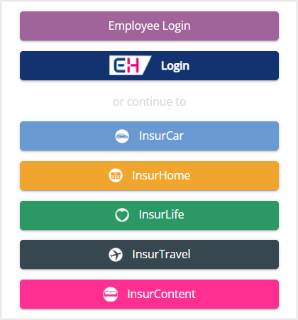
Buttons are used to navigate the flow of a user journey. When multiple buttons are provided, the user can choose which flow they want to follow. You can also redirect the user away from the UI.
Buttons have a customizable color, but their size and shape are fixed. Button text can be customized according to color and font family, but not font size.

Other form elements
You can include a collapsible section consisting of a title and expandable content sections. Collapsible sections allow inclusion of a HELP or FAQ section.


