A radar chart is a graphical method of displaying multivariate data in the form of a two-dimensional chart of three or more quantitative variables represented on axes starting from the same point. The relative position and angle of the axes is typically uninformative, but various heuristics, such as algorithms that plot data as the maximal total area, can be applied to sort the variables (axes) into relative positions that reveal distinct correlations, trade-offs, and a multitude of other comparative measures. [1]
The radar chart is also known as web chart, spider chart, spider graph, spider web chart, star chart, [2] star plot, cobweb chart, irregular polygon, polar chart, or Kiviat diagram. [3] [4] It is equivalent to a parallel coordinates plot, with the axes arranged radially.
The radar chart is a chart and/or plot that consists of a sequence of equi-angular spokes, called radii, with each spoke representing one of the variables. The data length of a spoke is proportional to the magnitude of the variable for the data point relative to the maximum magnitude of the variable across all data points. A line is drawn connecting the data values for each spoke. This gives the plot a star-like appearance and the origin of one of the popular names for this plot. The star plot can be used to answer the following questions: [5]
Radar charts are a useful way to display multivariate observations with an arbitrary number of variables. [6] Each star represents a single observation. Typically, radar charts are generated in a multi-plot format with many stars on each page and each star representing one observation. [5] The star plot was first used by Georg von Mayr in 1877. [7] [8] Radar charts differ from glyph plots in that all variables are used to construct the plotted star figure. There is no separation into foreground and background variables. Instead, the star-shaped figures are usually arranged in a rectangular array on the page. It is somewhat easier to see patterns in the data if the observations are arranged in some non-arbitrary order (if the variables are assigned to the rays of the star in some meaningful order). [9]
Radar charts can be used in sports to chart players' strengths and weaknesses [10] by calculating various statistics related to the player that can tracked along the central axis of the chart. Examples include a basketball players shots made, rebounds, assists, etc., or the batting or pitching stats of a baseball player. This creates a centralized visualization of the strengths and weaknesses of a player, and if overlapped with the statistics of other players or league averages, can display where a player excels and where they could improve. [11] These insights into player strengths and weakness could prove crucial to player development as it allows coaches and trainers to adjust a player's training regiment to help improve on their weaknesses. The results of the radar chart can also be useful in situational play. If a batter is shown to hit poorly against left-handed pitching, then his team knows to limit his plate appearances against left-handed pitchers, while the opposing team may try to force a situation where the batter is forced to hit against the pitcher.
Another application of radar charts is the control of quality improvement to display the performance metrics various objects including computer programs, [12] computers, phones, vehicles, and more. Computer programmer often use analytics to test the performance of their programs versus others. An example of this where radar charts may be useful is the performance analysis of various sorting algorithms. A programmer could gather up several different sorting algorithms such as selection, bubble, and quick, then analyze the performance of these algorithms by measuring their speed, memory usage, and power usage, then graph these on a radar chart to see how each sort performs under various sizes of data. Another performance application is measuring the performance of similar cars against each other. A consumer could look at variables such as the cars’ top speed, miles per gallon, horsepower, and torque. Then after using a radar chart to visualize the data, they could decide on what car is best for them based on the results.
Radar charts can be used in life sciences to display the strengths and weakness of drugs and other medications. [13] Using the example of two anti-depressants, a researcher can rank variables such as efficacy, side effects, cost, etc. on a scale of one to ten. They could then graph the results using a radar chart to see the spread of variables and find how the differ, such as one anti-depressant being cheaper and quicker acting, but not having great relief over time. Meanwhile, the other anti-depressant provides stronger relief and holds up better over time but is more expensive. Another life science application is in patient analysis. Radar charts can be used to graph the variables of life affecting a person's wellness, and then be analyzed to help them. A more specific example is in the case of athletes, whose various wellness habits such as sleep, diet, and stress are monitored to make sure they stay in peak physical condition. [14] If any areas would be shown dipping, doctors and trainers could step in to assist the athlete and improve their wellness.
Radar charts are primarily suited for strikingly showing outliers and commonality , or when one chart is greater in every variable than another, and primarily used for ordinal measurements – where each variable corresponds to "better" in some respect, and all variables on the same scale.
Conversely, radar charts have been criticized as poorly suited for making trade-off decisions – when one chart is greater than another on some variables, but less on others. [15]
Further, it is hard to visually compare lengths of different spokes, because radial distances are hard to judge, though concentric circles help as grid lines. Instead, one may use a simple line graph, particularly for time series. [16]
Radar charts can distort data to some extent, especially when areas are filled in, because the area contained becomes proportional to the square of the linear measures. For example, in a chart with 5 variables that range from 1 to 100, the area contained by the polygon bounded by 5 points when all measures are 90, is more than 10% larger than the same for a chart with all values of 82.
Radar charts can also become hard to visually compare between different samples on the chart when their values are close as their lines or areas bleed into each other, as shown in Figure 5.
Radar charts impose several structures on data, which are often artificial:
For example, the alternating data 9, 1, 9, 1, 9, 1 yields a spiking radar chart (which goes in and out), while reordering the data as 9, 9, 9, 1, 1, 1 instead yields two distinct wedges (sectors).
In some cases there is a natural structure, and radar charts can be well-suited. For example, for diagrams of data that vary over a 24-hour cycle, the hourly data is naturally related to its neighbor, and has a cyclic structure, so it can naturally be displayed as a radar chart. [16] [19] [20]
One set of guidelines on the use of radar charts (or rather the closely related "polar area graph") is: [20]
Radar charts are helpful for small-to-moderate-sized multivariate data sets. Their primary weakness is that their effectiveness is limited to data sets with less than a few hundred points. After that, they tend to be overwhelming. [5]
Further, when using radar charts with multiple dimensions or samples, the radar chart may become cluttered and harder to interpret as the number of samples grows.
For example, take the batting stats table comparing MLB 2021 MVP Shohei Ohtani, vs the stats of the leagues average designated hitters and some Hall of Fame players. These stats represent the percentage of hits, home runs, strike outs, etc. per at bat of a player. For more information on what each stat used in the table represents, you can refer to this reference by the MLB. [21] We will use this table below to create Radar charts comparing the 2021 MVP batting stats to the league averages for Designated Hitters and regular batters, in an attempt to visualize performance metrics and visually come to a conclusion that Shohei out performed the average player. Next we will include additional samples into the Radar chart, using Hall of Fame players Jackie Robinson, Jim Thome, and Frank Thomas to compare Shohei to a few of the greatest batters of all time. This Radar chart not only can give us intuition of how Shohei compares to the top historical players, but will also serve a purpose in showing the limitations of having too many samples in a Radar chart.
Target | BA | OBP | SLG | OPS | HR% | SO% | BB% |
---|---|---|---|---|---|---|---|
MLB | 0.244 | 0.317 | 0.411 | 0.728 | 0.037 | 0.232 | 0.087 |
DH | 0.239 | 0.316 | 0.434 | 0.75 | 0.047 | 0.256 | 0.093 |
Shohei Ohtani | 0.257 | 0.372 | 0.592 | 0.965 | 0.086 | 0.296 | 0.15 |
Jackie Robinson | 0.313 | 0.41 | 0.477 | 0.887 | 0.0282 | 0.0582 | 0.151 |
Jim Thome | 0.276 | 0.402 | 0.554 | 0.956 | 0.072 | 0.302 | 0.207 |
Frank Thomas | 0.301 | 0.419 | 0.555 | 0.974 | 0.063 | 0.17 | 0.203 |
We can see in Figure 10 how a radar chart can be easily interpreted when the number of spokes and samples is relatively small. When we compare more samples in Figure 11, even without an area fill on the radar chart, it becomes apparent how difficult it can become to interpret or make trade-off decisions.
The chart on the right [5] contains the star plots of 15 cars. The variable list for the sample star plot is:
We can look at these plots individually or we can use them to identify clusters of cars with similar features. For example, we can look at the star plot of the Cadillac Seville (the last one on the image) and see that it is one of the most expensive cars, gets below average (but not among the worst) gas mileage, has an average repair record, and has average-to-above-average roominess and size. We can then compare the Cadillac models (the last three plots) with the AMC models (the first three plots). This comparison shows distinct patterns. The AMC models tend to be inexpensive, have below average gas mileage, and are small in both height and weight and in roominess. The Cadillac models are expensive, have poor gas mileage, and are large in both size and roominess. [5]
One may use line graphs for time series and other data, [16] in the form of parallel coordinates.
For graphical qualitative comparison of 2-dimensional tabular data in several variables, a common alternative are Harvey balls, which are used extensively by Consumer Reports . [22] Comparison in Harvey balls (and radar charts) may be significantly aided by ordering the variables algorithmically to add order. [23]
An excellent way for visualising structures within multivariate data is offered by principal component analysis (PCA).
Another alternative is to use small, inline bar charts, which may be compared to sparklines. [23]
Although radar and polar charts are often described as the same chart types, [4] some sources make a difference between them and even consider the radar chart to be a polar chart's variation that does not display data in terms of polar coordinate. [24]
A descriptive statistic is a summary statistic that quantitatively describes or summarizes features from a collection of information, while descriptive statistics is the process of using and analysing those statistics. Descriptive statistics is distinguished from inferential statistics by its aim to summarize a sample, rather than use the data to learn about the population that the sample of data is thought to represent. This generally means that descriptive statistics, unlike inferential statistics, is not developed on the basis of probability theory, and are frequently nonparametric statistics. Even when a data analysis draws its main conclusions using inferential statistics, descriptive statistics are generally also presented. For example, in papers reporting on human subjects, typically a table is included giving the overall sample size, sample sizes in important subgroups, and demographic or clinical characteristics such as the average age, the proportion of subjects of each sex, the proportion of subjects with related co-morbidities, etc.
A chart is a graphical representation for data visualization, in which "the data is represented by symbols, such as bars in a bar chart, lines in a line chart, or slices in a pie chart". A chart can represent tabular numeric data, functions or some kinds of quality structure and provides different info.
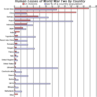
A bar chart or bar graph is a chart or graph that presents categorical data with rectangular bars with heights or lengths proportional to the values that they represent. The bars can be plotted vertically or horizontally. A vertical bar chart is sometimes called a column chart.
A scatter plot, also called a scatterplot, scatter graph, scatter chart, scattergram, or scatter diagram, is a type of plot or mathematical diagram using Cartesian coordinates to display values for typically two variables for a set of data. If the points are coded (color/shape/size), one additional variable can be displayed. The data are displayed as a collection of points, each having the value of one variable determining the position on the horizontal axis and the value of the other variable determining the position on the vertical axis.
A small multiple is a series of similar graphs or charts using the same scale and axes, allowing them to be easily compared. It uses multiple views to show different partitions of a dataset. The term was popularized by Edward Tufte.
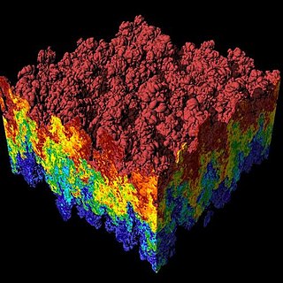
Scientific visualization is an interdisciplinary branch of science concerned with the visualization of scientific phenomena. It is also considered a subset of computer graphics, a branch of computer science. The purpose of scientific visualization is to graphically illustrate scientific data to enable scientists to understand, illustrate, and glean insight from their data. Research into how people read and misread various types of visualizations is helping to determine what types and features of visualizations are most understandable and effective in conveying information.
A diagram is a symbolic representation of information using visualization techniques. Diagrams have been used since prehistoric times on walls of caves, but became more prevalent during the Enlightenment. Sometimes, the technique uses a three-dimensional visualization which is then projected onto a two-dimensional surface. The word graph is sometimes used as a synonym for diagram.
A pie chart is a circular statistical graphic which is divided into slices to illustrate numerical proportion. In a pie chart, the arc length of each slice is proportional to the quantity it represents. While it is named for its resemblance to a pie which has been sliced, there are variations on the way it can be presented. The earliest known pie chart is generally credited to William Playfair's Statistical Breviary of 1801.
Infographics are graphic visual representations of information, data, or knowledge intended to present information quickly and clearly. They can improve cognition by using graphics to enhance the human visual system's ability to see patterns and trends. Similar pursuits are information visualization, data visualization, statistical graphics, information design, or information architecture. Infographics have evolved in recent years to be for mass communication, and thus are designed with fewer assumptions about the readers' knowledge base than other types of visualizations. Isotypes are an early example of infographics conveying information quickly and easily to the masses.
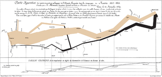
Data and information visualization is the practice of designing and creating easy-to-communicate and easy-to-understand graphic or visual representations of a large amount of complex quantitative and qualitative data and information with the help of static, dynamic or interactive visual items. Typically based on data and information collected from a certain domain of expertise, these visualizations are intended for a broader audience to help them visually explore and discover, quickly understand, interpret and gain important insights into otherwise difficult-to-identify structures, relationships, correlations, local and global patterns, trends, variations, constancy, clusters, outliers and unusual groupings within data. When intended for the general public to convey a concise version of known, specific information in a clear and engaging manner, it is typically called information graphics.
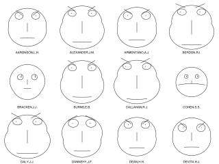
Chernoff faces, invented by applied mathematician, statistician and physicist Herman Chernoff in 1973, display multivariate data in the shape of a human face. The individual parts, such as eyes, ears, mouth and nose represent values of the variables by their shape, size, placement and orientation. The idea behind using faces is that humans easily recognize faces and notice small changes without difficulty. Chernoff faces handle each variable differently. Because the features of the faces vary in perceived importance, the way in which variables are mapped to the features should be carefully chosen.
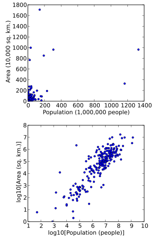
In statistics, data transformation is the application of a deterministic mathematical function to each point in a data set—that is, each data point zi is replaced with the transformed value yi = f(zi), where f is a function. Transforms are usually applied so that the data appear to more closely meet the assumptions of a statistical inference procedure that is to be applied, or to improve the interpretability or appearance of graphs.
Statistical graphics, also known as statistical graphical techniques, are graphics used in the field of statistics for data visualization.
A plot is a graphical technique for representing a data set, usually as a graph showing the relationship between two or more variables. The plot can be drawn by hand or by a computer. In the past, sometimes mechanical or electronic plotters were used. Graphs are a visual representation of the relationship between variables, which are very useful for humans who can then quickly derive an understanding which may not have come from lists of values. Given a scale or ruler, graphs can also be used to read off the value of an unknown variable plotted as a function of a known one, but this can also be done with data presented in tabular form. Graphs of functions are used in mathematics, sciences, engineering, technology, finance, and other areas.
In statistics, bivariate data is data on each of two variables, where each value of one of the variables is paired with a value of the other variable. It is a specific but very common case of multivariate data. The association can be studied via a tabular or graphical display, or via sample statistics which might be used for inference. Typically it would be of interest to investigate the possible association between the two variables. The method used to investigate the association would depend on the level of measurement of the variable. This association that involves exactly two variables can be termed a bivariate correlation, or bivariate association.
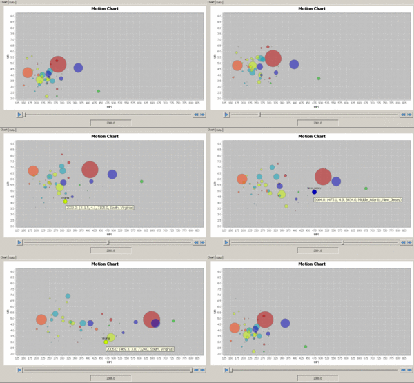
A motion chart is a dynamic bubble chart which allows efficient and interactive exploration and visualization of longitudinal multivariate data. Motion charts provide mechanisms for mapping ordinal, nominal and quantitative variables onto time, 2D coordinate axes, size, colors, glyphs and appearance characteristics, which facilitate the interactive display of multidimensional and temporal data.
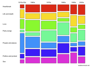
A mosaic plot, Marimekko chart, Mekko chart, or sometimes percent stacked bar plot, is a graphical visualization of data from two or more qualitative variables. It is the multidimensional extension of spineplots, which graphically display the same information for only one variable. It gives an overview of the data and makes it possible to recognize relationships between different variables. For example, independence is shown when the boxes across categories all have the same areas. Mosaic plots were introduced by Hartigan and Kleiner in 1981 and expanded on by Friendly in 1994. Mosaic plots are also called Marimekko or Mekko charts because they resemble some Marimekko prints. However, in statistical applications, mosaic plots can be colored and shaded according to deviations from independence, whereas Marimekko charts are colored according to the category levels, as in the image.
Univariate is a term commonly used in statistics to describe a type of data which consists of observations on only a single characteristic or attribute. A simple example of univariate data would be the salaries of workers in industry. Like all the other data, univariate data can be visualized using graphs, images or other analysis tools after the data is measured, collected, reported, and analyzed.
Philip J. Kiviat is noted, along with Alan Pritsker, for half a century of work on computer simulation.
This article incorporates public domain material from the National Institute of Standards and Technology
Dr. Philip J. Kiviat suggested at a recent NBS/ACM workshop on performance measurement that a circular graph, using radii as the variable axes might be a useful form. […] I recommend they be called "Kiviat Plots" or "Kiviat Graphs" to recognize his insight as to their importance.