In these states, taking a selfie with your ballot could get you arrestedYup, it’s true. The Associated Press recently combed through the laws in all 50 states relating to the legality of taking a selfie in the voting booth. In 21 US states (and...

In these states, taking a selfie with your ballot could get you arrested

Yup, it’s true. The Associated Press recently combed through the laws in all 50 states relating to the legality of taking a selfie in the voting booth. In 21 US states (and Washington, DC), it is perfectly legal to take a photo in a voting booth. But in 16 other states, it is explicitly illegal — and can earn you a fine or even jail time.

Make sure to take note here before heading to the polls!

Source: vox.com vote voting poll polling democracy ballot selfie election election 2016 campaign politics maps America United States of America illegal legal photos

Why red means Republican and blue means Democrat

On any given election night, Americans are accustomed to seeing maps of states turning red for a Republican win or blue for the Democrats. We often hear political pundits talk relentlessly about “blue states” like California and “red states” like Utah.

But these colors — which have now cemented themselves as part of the Republican and Democratic Parties’ national identities — are a surprisingly recent development.

In fact, there was a period when some of the networks, like NBC and CBS, had this color scheme reversed. In 1980, for example, NBC anchor David Brinkley declared the NBC map to “look like a suburban swimming pool” as Ronald Reagan’s big win over Jimmy Carter turned the NBC map almost entirely blue.

Networks introduced colored maps to their election night coverage as a visual tool to distinguish themselves in the era of color television; CBS was first in 1972, and soon the others followed. By 1996, the television map color schemes aligned to what we are accustomed to now: red for Republicans and blue for Democrats.

By the 2000 election and in the days that followed, television news relied heavily on their colored maps to illustrate how close the election between Al Gore and George W. Bush was. Those map colors quickly became easy shorthand for Republicans and Democrats, and the terms “red state” and “blue state” truly took hold. Soon, headline writers and cultural figures like David Letterman would adopt the terms.

President Barack Obama famously denounced the terminology red state and blue statein the speech that made him famous. When he addressed the 2004 DNC, the then state senator told the crowd, “the pundits like to slice and dice our country into red states and blue states: red states for Republicans, blue states for Democrats,” but later declared “we are one people … all of us defending the United States of America.”

But despite President Obama’s critique, it’s fairly safe to say that the coloring scheme is here to stay for a while. In my reporting for this story I spoke to a number of high-level industry veterans from the big three television networks. When I asked if any would ever consider flipping the color scheme around or using alternative colors in the interest of doing away with national divisions, real or perceived, that come from the “red state” and “blue state” terms, most replied with some variation on “no.”

At this point, it would be too confusing for the viewers at home.

Source: vox.com Republican Democrat liberal conservative colors maps states politics policy video history Barack Obama Hillary Clinton Donald Trump George W. Bush did you know
Did you know? Germany and Japan have the world’s oldest populations. Niger has the youngest.
Much of what looks like politics and economics is actually just demographics in disguise. Countries with aging populations often end up with high budget...

Did you know? Germany and Japan have the world’s oldest populations. Niger has the youngest. 

Much of what looks like politics and economics is actually just demographics in disguise. Countries with aging populations often end up with high budget deficits and weak economic growth because there are too few workers to support the many retirees. Countries with extremely young populations often end up in political chaos — particularly if there aren’t enough jobs to go around. Right now, Germany and Japan have the world’s oldest populations, with a median age of 46.1. Niger has the world’s youngest population, with a median age of, shockingly, 15.1.

Map courtesy of: Simran Khosla/Global Post

Source: vox.com maps age Germany Japan Niger youth growth visuals design graphics images data world
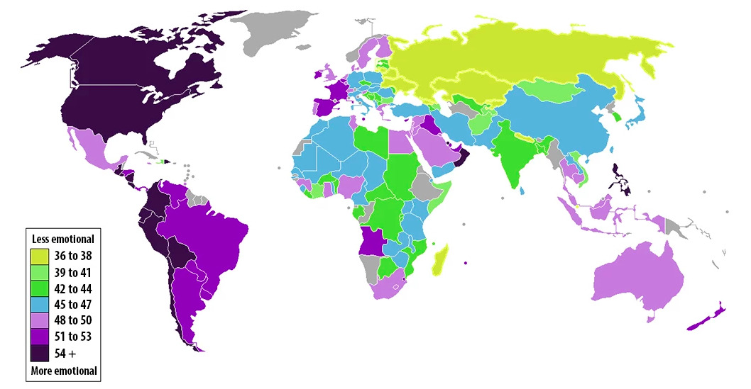
Did you know? The Philippines is the most emotional country in the world. Singapore is the least.
Since 2009, Gallup has been polling people in 150 countries and territories about their everyday emotional experiences. The questions are things like...

Did you know? The Philippines is the most emotional country in the world. Singapore is the least. 

Since 2009, Gallup has been polling people in 150 countries and territories about their everyday emotional experiences. The questions are things like “Did you smile or laugh a lot yesterday?” and “Did you experience [enjoyment/physical pain/worry/sadness/stress/anger] during a lot of the day yesterday?” Only 36 percent of Singaporeans reported experiencing either positive or negative emotions in a given day — making them the least emotional country in the world. By contrast, the Philippines are the world’s most emotional country, with 60 percent saying they had either a positive or negative emotional experience on a given day. America, by the way, is the 15th most emotional country.

Map courtesy of: The Washington Post

Source: vox.com maps philippines singapore emotion feelings graphs charts visuals design world
Did you know? Fewer people are dying from war than ever before.
People sometimes complain that the press never writes about all the planes that land safely. By the same token, it also doesn’t write about all the people who aren’t dying in wars. But...

Did you know? Fewer people are dying from war than ever before.

People sometimes complain that the press never writes about all the planes that land safely. By the same token, it also doesn’t write about all the people who aren’t dying in wars. But the decline in war-related deaths is a huge story — one of the most encouraging of the 20th century, for sure. “On average, about 15 percent of people in prestate eras died violently, compared to about 3 percent of the citizens of the earliest states,” wrote Harvard’s Steven Pinker. “The rate of documented direct deaths from political violence (war, terrorism, genocide and warlord militias) in the past decade is an unprecedented few hundredths of a percentage point.” Vox’s Zack Beauchamp explains the reasons for the decline here, and it includes some culprits you probably don’t expect, like nuclear weapons.

Source: vox.com maps graphics visuals charts images numbers data war world
The map of world wealthThis is a map of the world weighted not by land mass or navigation lines but around how much wealth each country has. As you can see, North America and Western Europe balloon to enormous proportions — even after adjusting for...

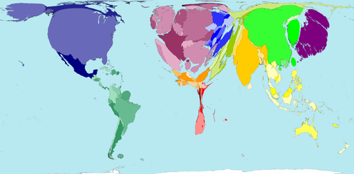
The map of world wealth

This is a map of the world weighted not by land mass or navigation lines but around how much wealth each country has. As you can see, North America and Western Europe balloon to enormous proportions — even after adjusting for purchasing power, 46 percent of global wealth in 2002 was in their hands. The horror of this map is the shrunken husk of Africa. That’s a lot of people living with very little.

Map courtesy of: Worldmapper

Source: vox.com maps visuals graphics art design images wealth Africa Western Europe economics geography world news
Did you know? America is so big that its states are the size of countries
This map puts the sheer size of the United States into perspective. Montana is about the size of Japan. California is roughly as large as Iraq. Arizona is as large as the...

Did you know? America is so big that its states are the size of countries

This map puts the sheer size of the United States into perspective. Montana is about the size of Japan. California is roughly as large as Iraq. Arizona is as large as the Philippines. Though, to be honest, I find this map surprising because some countries are much larger than I’d realized. I wouldn’t have guessed, for instance, that Burma is as large as Texas, or that New Zealand is the size of Colorado.

For 21 other surprising maps and charts, click here.

Map courtesy of: Mainstay 17

Source: vox.com maps graphs charts visuals graphics design geography smarts trivia did you know world The United States
Did you know? Much of America is uninhabited.
This map, by Nik Freeman, pulls out the 4,871,270 census blocks — covering 4.6 million square kilometers — where no one lives. That tends to mean one of three things: the first is that the land is...

Did you know? Much of America is uninhabited. 

This map, by Nik Freeman, pulls out the 4,871,270 census blocks — covering 4.6 million square kilometers — where no one lives. That tends to mean one of three things: the first is that the land is uninhabitable, perhaps because it’s covered by a lake. The second is that laws or other kinds of sanctions prevent settlement, for instance on national parks. The third is that it’s a commercial or industrial zone where people work but no one actually lives. “Human geographers spend so much time thinking about where people are,” Freeman writes. “I thought I might bring some new insight by showing where they are not.”

For 21 other surprising maps and charts, click here

Map courtesy of: MapsByNik

Source: vox.com maps graphics visuals charts design images geography did you know smarts trivia America world
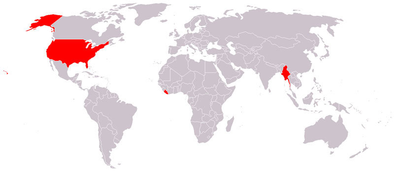
Did you know? Liberia, Myanmar, and the United States are the only countries that don’t use the metric system
As Vox’s Susannah Locke wrote, “The measuring system that the United States uses right now isn’t really a system at all. It’s a hodgepodge...

Did you know? Liberia, Myanmar, and the United States are the only countries that don’t use the metric system

As Vox’s Susannah Locke wrote, “The measuring system that the United States uses right now isn’t really a system at all. It’s a hodgepodge of various units that often seem to have no logical relationship to one another — units collected throughout our history here and there, bit by bit. Twelve inches in a foot, three feet in a yard, 1,760 yards in a mile.” That’s why the rest of the world uses the metric system, where “all you need to do is multiply or divide by some factor of 10 — 10 millimeters in a centimeter, 100 centimeters in a meter, 1,000 meters in a kilometer. Water freezes at 0°C and boils at 100°C.”

For 21 other surprising maps and charts, click here.

Map courtesy of: Wikimedia Commons

Source: vox.com maps graphics visuals design geography measurement smarts trivia did you know images world
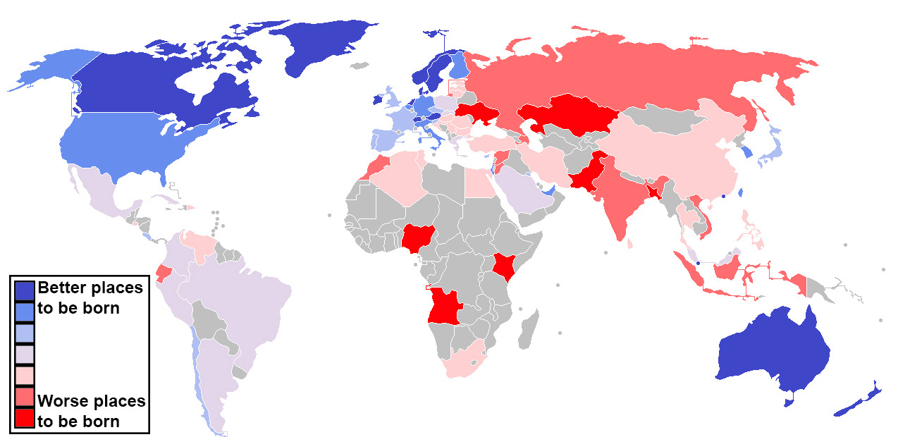
Did you know? Switzerland is the best place to be born.
The Economist’s Intelligence Unit tried to assess which country gave its children the best chance of a happy, safe, and prosperous life. “Being rich helps more than anything else,” they write,...

Did you know? Switzerland is the best place to be born.

The Economist’s Intelligence Unit tried to assess which country gave its children the best chance of a happy, safe, and prosperous life. “Being rich helps more than anything else,” they write, “but it is not all that counts; things like crime, trust in public institutions and the health of family life matter too.” The final measure factors in everything from income to geography to demography. When all is said and done, Switzerland leads the list, with Australia and Norway close behind. The United States tied with Germany for 16th place.

For 21 other surprising maps and charts, click here.

Map courtesy of: The Washington Post

Source: vox.com maps charts visuals graphics The Economist geography birth Switzerland Germany did you know smarts trivia world The Washington Post