A graphical user interface, or GUI, is a form of user interface that allows users to interact with electronic devices through graphical icons and visual indicators such as secondary notation. In many applications, GUIs are used instead of text-based UIs, which are based on typed command labels or text navigation. GUIs were introduced in reaction to the perceived steep learning curve of command-line interfaces (CLIs), which require commands to be typed on a computer keyboard.
In computing, a window is a graphical control element. It consists of a visual area containing some of the graphical user interface of the program it belongs to and is framed by a window decoration. It usually has a rectangular shape that can overlap with the area of other windows. It displays the output of and may allow input to one or more processes.
In user interface design, a modal window is a graphical control element subordinate to an application's main window.

In computer graphical user interfaces, drag and drop is a pointing device gesture in which the user selects a virtual object by "grabbing" it and dragging it to a different location or onto another virtual object. In general, it can be used to invoke many kinds of actions, or create various types of associations between two abstract objects.
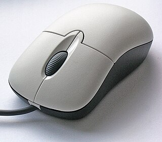
Point and click are one of the actions of a computer user moving a pointer to a certain location on a screen (pointing) and then pressing a button on a mouse or other pointing device (click). An example of point and click is in hypermedia, where users click on hyperlinks to navigate from document to document. User interfaces, for example graphical user interfaces, are sometimes described as "point-and-click interfaces", often to suggest that they are very easy to use, requiring that the user simply point to indicate their wishes. Describing software this way implies that the interface can be controlled solely through a pointing device with little or no input from the keyboard, as with many graphical user interfaces.
The taskbar is a graphical user interface element that has been part of Microsoft Windows since Windows 95, displaying and facilitating switching between running programs. The taskbar and the associated Start Menu were created and named in 1993 by Daniel Oran, a program manager at Microsoft who had previously collaborated on great ape language research with the behavioral psychologist B.F. Skinner at Harvard.

In computing, text-based user interfaces (TUI), is a retronym describing a type of user interface (UI) common as an early form of human–computer interaction, before the advent of bitmapped displays and modern conventional graphical user interfaces (GUIs). Like modern GUIs, they can use the entire screen area and may accept mouse and other inputs. They may also use color and often structure the display using box-drawing characters such as ┌ and ╣. The modern context of use is usually a terminal emulator.

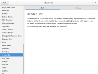
A graphical widget in a graphical user interface is an element of interaction, such as a button or a scroll bar. Controls are software components that a computer user interacts with through direct manipulation to read or edit information about an application. User interface libraries such as Windows Presentation Foundation, Qt, GTK, and Cocoa, contain a collection of controls and the logic to render these.

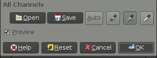
In computing, a button is a graphical control element that provides the user a simple way to trigger an event, like searching for a query at a search engine, or to interact with dialog boxes, like confirming an action.

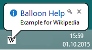
Balloon help is a help system introduced by Apple Computer in their 1991 release of System 7.0. The name referred to the way the help text was displayed, in "speech balloons", like those containing words in a comic strip. The name has since been used by many to refer to any sort of pop-up help text.

In the field of computing and web design, a mouseover, is an event occuring when the user moves the cursor over a specified point on a computer monitor using a computer mouse. Also called a hover effect, mouseovers are graphical controls that respond when a user moves their mouse pointer over a designated area. This area can be a button, image, or hyperlink. This simple action can trigger different responses. The element's color or appearance can change. Additional information or interactive content can be displayed. The mouseover effect is an essential part of user interaction. It adds layers of interactivity and responsiveness to websites and applications.
In human–computer interaction, a cursor is an indicator used to show the current position on a computer monitor or other display device that will respond to input.

Interface Builder is a software development application for Apple's macOS operating system. It is part of Xcode, the Apple Developer developer's toolset. Interface Builder allows Cocoa and Carbon developers to create interfaces for applications using a graphical user interface. The resulting interface is stored as a .nib file, short for NeXT Interface Builder, or more recently, as an XML-based .xib file.

A menu bar is a graphical control element which contains drop-down menus.
The Windows shell is the graphical user interface for the Microsoft Windows operating system. Its readily identifiable elements consist of the desktop, the taskbar, the Start menu, the task switcher and the AutoPlay feature. On some versions of Windows, it also includes Flip 3D and the charms. In Windows 10, the Windows Shell Experience Host interface drives visuals like the Start Menu, Action Center, Taskbar, and Task View/Timeline. However, the Windows shell also implements a shell namespace that enables computer programs running on Windows to access the computer's resources via the hierarchy of shell objects. "Desktop" is the top object of the hierarchy; below it there are a number of files and folders stored on the disk, as well as a number of special folders whose contents are either virtual or dynamically created. Recycle Bin, Libraries, Control Panel, This PC and Network are examples of such shell objects.
A console application or command-line program is a computer program designed to be used via a text-only user interface, such as a text terminal, the command-line interface of some operating systems or the text-based interface included with most graphical user interface (GUI) operating systems, such as the Windows Console in Microsoft Windows, the Terminal in macOS, and xterm in Unix.

The Yahoo! User Interface Library (YUI) is a discontinued open-source JavaScript library for building richly interactive web applications using techniques such as Ajax, DHTML, and DOM scripting. YUI includes several cores CSS resources. It is available under a BSD License. Development on YUI began in 2005 and Yahoo! properties such as My Yahoo! and the Yahoo! front page began using YUI in the summer of that year. YUI was released for public use in February 2006. It was actively developed by a core team of Yahoo! engineers.

This article details features of the Opera web browser.

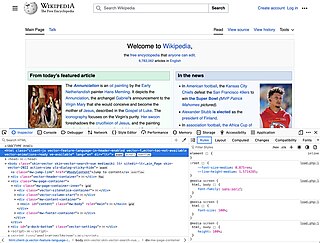
Web development tools allow web developers to test, modify and debug their websites. They are different from website builders and integrated development environments (IDEs) in that they do not assist in the direct creation of a webpage, rather they are tools used for testing the user interface of a website or web application.


