Related Research Articles
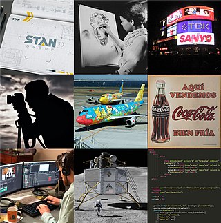
Graphic design is a profession, academic discipline and applied art whose activity consists in projecting visual communications intended to transmit specific messages to social groups, with specific objectives. Graphic design is an interdisciplinary branch of design and of the fine arts. Its practice involves creativity, innovation and lateral thinking using manual or digital tools, where it is usual to use text and graphics to communicate visually.

Jan Tschichold, also known as Iwan Tschichold or Ivan Tschichold, was a German calligrapher, typographer and book designer. He played a significant role in the development of graphic design in the 20th century – first, by developing and promoting principles of typographic modernism, and subsequently idealizing conservative typographic structures. His direction of the visual identity of Penguin Books in the decade following World War II served as a model for the burgeoning design practice of planning corporate identity programs. He also designed the typeface Sabon.
Zuzana Licko is a Slovak-born American type designer and visual artist known for co-founding Emigre Fonts, a digital type foundry in Berkeley, CA. She has designed and produced numerous digital typefaces including the popular Mrs Eaves, Modula, Filosofia, and Matrix. As a corresponding interest she also creates ceramic sculptures and jacquard weavings.

Willem Hendrik"Wim" Crouwel was a Dutch graphic designer, type designer, and typographer.
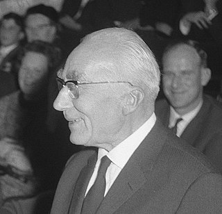
Piet Zwart was a Dutch photographer, typographer, and industrial designer.
Rudy VanderLans is a Dutch graphic designer, photographer, and the co-founder of Emigre Fonts with his wife Zuzana Licko. Emigre Fonts is an independent type foundry in Berkeley, CA. He was also the art director and editor of Emigre magazine, the journal devoted to visual communications from 1984 to 2005. Since arriving in California in 1981, he has been photographing his adoptive Golden State as an ongoing side project. He has authored a total of 11 photo books on the topic, and staged two solo exhibits at Gallery 16 in San Francisco.

Rudolf Koch was a German type designer, professor, and a master of lettering, calligraphy, typography and illustration. Commonly known for his typefaces created for the Klingspor Type Foundry, his most widely used typefaces include Neuland and Kabel.
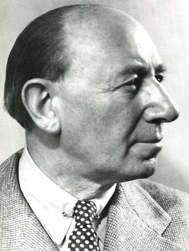
Lucian Bernhard was a German graphic designer, type designer, professor, interior designer, and artist during the first half of the twentieth century.

Ellen Lupton is a graphic designer, curator, writer, critic, and educator. Known for her love of typography, Lupton is the Betty Cooke and William O. Steinmetz Design Chair at Maryland Institute College of Art. Previously she was the Senior Curator of Contemporary Design at Cooper Hewitt, Smithsonian Design Museum in New York City and was named Curator Emerita after 30 years of service. She is the founding director of the Graphic Design M.F.A. degree program at Maryland Institute College of Art (MICA), where she also serves as director of the Center for Design Thinking. She has written numerous books on graphic design for a variety of audiences. She has contributed to several publications, including Print, Eye, I.D., Metropolis, and The New York Times.

Paul Elliman is a British artist and designer based in London. His work combines an interest in typography and the human voice, often referring to forms of audio signage that mediate a relationship between them. His typeface Found Fount is an ongoing collection of found ‘typography’ drawn from objects and industrial debris in which no letter-form is repeated.
Ikko Tanaka was a Japanese graphic designer.
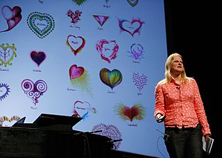
Marian Bantjes is a Canadian designer, artist, illustrator, typographer and writer. Describing her work as graphic art, Marian Bantjes is known for her custom lettering, intricate patterning and decorative style. Inspired by illuminated manuscripts, Islamic calligraphy, Baroque ornamentation, Marian Bantjes creates detailed work, often combining the forms of her disparate influences.
Frederick Henri Kay Henrion, RDI, OBE, was a Nuremberg-born German graphic designer.

Martin Majoor is a Dutch type designer and graphic designer. As of 2006, he had worked since 1997 in both Arnhem, Netherlands, and Warsaw, Poland.
Gerrit Noordzij was a Dutch typographer, typeface designer, and author. He started teaching letters and calligraphy at the Royal Academy of Art in The Hague in 1960. Motivated to make type accessible to his students, he identified the stroke of the pen as the central idea in the making of letter forms. What began as a method to make his students into better graphic designers grew, in various iterations and publications, into a comprehensive approach to type design. The contrast cube became an iconic model of his ideas. Noordzij recognised the possibilities of the computer in type design early on. He encouraged his students to not only study the pens and their shapes, but also adopt a critical view on making digital tools. By the time Noordzij retired in 1990, his methods were in use in type classes and workshops all over the world. His book The Stroke has been translated in English, German, French, Italian, Spanish, Portuguese, Korean, Croatian and Russian. And of course, it has been the practical and theoretical foundation of the KABK TypeMedia master for over twenty years.
The Gerrit Noordzij Prize is given to type designers and typographers for extraordinary contributions to the fields of type design, typography and type education. The prize, initiated by Anno Fekkes during the 1996 ATypI conference in The Hague, is awarded every three years by the Royal Academy of Art in The Hague together with the Museum Meermanno, under the auspices of the Dr. P.A. Tiele Trust. The prize is named after Gerrit Noordzij, who was a professor of typeface design at the Royal Academy of Art. For the continuity of the prize, the Gerrit Noordzij Fund was created.
Andrea Tinnes is a German type designer, graphic designer and university teacher.
“Andrea Tinnes belongs to that rare breed, creating coherent, functional, innovative type families, and using them within a design practice that includes identity design, decoration, personal work, and teaching, with typefaces that range from the bizarre Haircrimes to the relatively sensible Skopex.” – Jan Middendorp

Ruud-Jan Kokke is a Dutch designer who started his career in the mid-eighties and became known for his furniture, inventive objects, interiors and designs for public space. He has received numerous nominations and awards. He is married to the visual artist and jewellery designer Petra Hartman.
Stuart Bertolotti-Bailey is a British graphic designer, writer and editor. In 2000 he co-founded the bi-annual arts journal Dot Dot Dot with Peter Bil'ak. In 2006 he began working with American graphic designer, writer and editor David Reinfurt under the pseudonym Dexter Sinister, which is also the name of their 'just-in-time workshop and occasional bookstore' on New York's Lower East Side. Reinfurt replaced Bil'ak as co-editor of Dot Dot Dot the same year; it continued under Bailey and Reinfurt's direction until the final, 20th issue in 2010 before being replaced by Bulletins of the Serving Library, co-edited by Bailey and Reinfurt together with American artist and writer Angie Keefer until 2017. The journal has since morphed into a non-profit organization that variously serves as a publishing platform, a seminar room, a collection of framed objects, and an event space. The Serving Library Annual is co-edited by Stuart Bertolotti-Bailey, Italian curator and editor Francesca Bertolotti-Bailey, David Reinfurt, and Italian writer and translator Vincenzo Latronico, and published by Roma Publications], Amsterdam. Since 2017 he has held the position of Head of Design at the Institute of Contemporary Arts in London, where he lives.
Piet Gerards is a Dutch graphic designer and publisher.
References
- 1 2 Heiges, Nathan C. "Karel Martens". Faculty. Yale University School of Art. Retrieved 2015-07-26.
- ↑ Fiell, Charlotte; Fiell, Peter (2003). Design Graphique Au 21e Siécle. Taschen. p. 376. ISBN 3822816051.
- ↑ "Karel Martens Exhibition". Royal Academy of Art, The Hague. 2015. Retrieved 3 August 2015.
- ↑ Laranjo, Francisco (2015). "Critical Graphic Design: Critical of What?". Design Observer. Retrieved 3 August 2015.
- ↑ Bil'ak, Peter (2004). "Karel Martens, graphic designer". Typotheque. Retrieved 26 July 2015. "Karel Martens Exhibition". Royal Academy of Art, The Hague. 2015. Retrieved 3 August 2015.
- ↑ Kinross, Robin (Winter 1993). "Let the object speak". Eye Magazine. 3 (11). ISSN 2187-8935 . Retrieved 2024-08-30– via eyemagazine.com.
- ↑ "Karel Martens". Collection of Cooper Hewitt, Smithsonian Design Museum. 2015. Retrieved 3 August 2015.
- ↑ "Karel Martens (1939), the Netherlands". Royal Netherlands Academy of Arts and Sciences. Archived from the original on 25 May 2019.
- ↑ "Gerrit Noordzij prijs" (in Dutch). Dr. P.A. Tiele-Stichting. Retrieved 26 July 2015.
- ↑ "Winners Rotterdam Design Prize 1993-1996". DesignPrijs.nl. Retrieved 8 May 2017.
- ↑ "Karel Martens - People - Collection of Cooper Hewitt, Smithsonian Design Museum". collection.CooperHewitt.org. Retrieved 8 May 2017.
- ↑ "Printed matter / Drukwerk | Books | Hyphen Press".
- ↑ "Karel Martens: | Books | Hyphen Press".
- ↑ "Princeton Architectural Press".