Hypertext Markup Language (HTML) is the standard markup language for documents designed to be displayed in a web browser. It defines the content and structure of web content. It is often assisted by technologies such as Cascading Style Sheets (CSS) and scripting languages such as JavaScript, a programming language.

The World Wide Web Consortium (W3C) is the main international standards organization for the World Wide Web. Founded in 1994 and led by Tim Berners-Lee, the consortium is made up of member organizations that maintain full-time staff working together in the development of standards for the World Wide Web. As of 5 March 2023, W3C had 462 members. W3C also engages in education and outreach, develops software and serves as an open forum for discussion about the Web.
An HTML editor is a program used for editing HTML, the markup of a web page. Although the HTML markup in a web page can be controlled with any text editor, specialized HTML editors can offer convenience, added functionality, and organisation. For example, many HTML editors handle not only HTML, but also related technologies such as CSS, XML and JavaScript or ECMAScript. In some cases they also manage communication with remote web servers via FTP and WebDAV, and version control systems such as Subversion or Git. Many word processing, graphic design and page layout programs that are not dedicated to web design, such as Microsoft Word or Quark XPress, also have the ability to function as HTML editors.
An HTML element is a type of HTML document component, one of several types of HTML nodes. The first used version of HTML was written by Tim Berners-Lee in 1993 and there have since been many versions of HTML. The current de facto standard is governed by the industry group WHATWG and is known as the HTML Living Standard.
XSL-FO is a markup language for XML document formatting that is most often used to generate PDF files. XSL-FO is part of XSL, a set of W3C technologies designed for the transformation and formatting of XML data. The other parts of XSL are XSLT and XPath. Version 1.1 of XSL-FO was published in 2006.
In the context of a web browser, a frame is a part of a web page or browser window which displays content independent of its container, with the ability to load content independently. The HTML or media elements in a frame may come from a web site distinct from the site providing the enclosing content. This practice, known as framing, is today often regarded as a violation of same-origin policy.

In the field of computing and web design, a mouseover, is an event occurring when the user moves the cursor over a specified point on a computer monitor using a computer mouse. Also called a hover effect, mouseovers are graphical controls that respond when a user moves their mouse pointer over a designated area. This area can be a button, image, or hyperlink. This simple action can trigger different responses. The element's color or appearance can change. Additional information or interactive content can be displayed. The mouseover effect is an essential part of user interaction. It adds layers of interactivity and responsiveness to websites and applications.

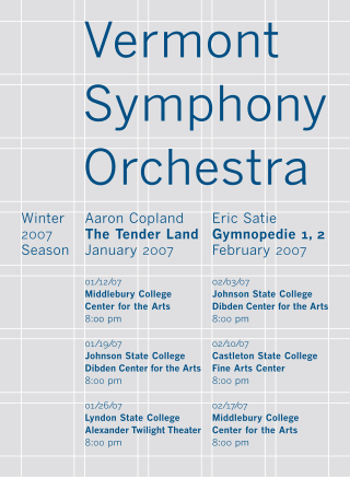
In graphic design, a grid is a structure made up of a series of intersecting straight or curved lines used to structure content. The grid serves as an armature or framework on which a designer can organize graphic elements in a rational, easy-to-absorb manner. A grid can be used to organize graphic elements in relation to a page, in relation to other graphic elements on the page, or relation to other parts of the same graphic element or shape.
In computing, quirks mode is an approach used by web browsers to maintain backward compatibility with web pages designed for old web browsers, instead of strictly complying with web standards in standards mode. This behavior has since been codified, so what was previously standards mode is now referred to as simply no quirks mode.
The marquee tag is a non-standard HTML element which causes text to scroll up, down, left or right automatically. The tag was first introduced in early versions of Microsoft's Internet Explorer, and was compared to Netscape's blink element, as a proprietary non-standard extension to the HTML standard with usability problems. The W3C advises against its use in HTML documents.
In HTML, the standard markup language for documents designed to be displayed in a web browser, <div> and <span> tags are elements used to define parts of a document, so that they are identifiable when a unique classification is necessary. Where other HTML elements such as <p> (paragraph), <em> (emphasis), and so on, accurately represent the semantics of the content, the additional use of <span> and <div> tags leads to better accessibility for readers and easier maintainability for authors. Where no existing HTML element is applicable, <span> and <div> can valuably represent parts of a document so that HTML attributes such as class, id, lang, or dir can be applied.

EPUB is an e-book file format that uses the ".epub" file extension. The term is short for electronic publication and is sometimes stylized as ePUB. EPUB is supported by many e-readers, and compatible software is available for most smartphones, tablets, and computers. EPUB is a technical standard published by the International Digital Publishing Forum (IDPF). It became an official standard of the IDPF in September 2007, superseding the older Open eBook (OEB) standard.

Cascading Style Sheets (CSS) is a style sheet language used for specifying the presentation and styling of a document written in a markup language such as HTML or XML. CSS is a cornerstone technology of the World Wide Web, alongside HTML and JavaScript.

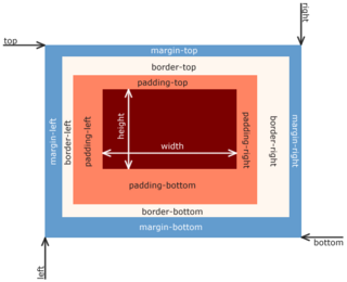
In web development, the CSS box model refers to how HTML elements are modeled in browser engines and how the dimensions of those HTML elements are derived from CSS properties. It is a fundamental concept for the composition of HTML webpages. The guidelines of the box model are described by web standards World Wide Web Consortium (W3C) specifically the CSS Working Group. For much of the late-1990s and early 2000s there had been non-standard compliant implementations of the box model in mainstream browsers. With the advent of CSS2 in 1998, which introduced the box-sizing property, the problem had mostly been resolved.
The Web platform is a collection of technologies developed as open standards by the World Wide Web Consortium and other standardization bodies such as the Web Hypertext Application Technology Working Group, the Unicode Consortium, the Internet Engineering Task Force, and Ecma International. It is the umbrella term introduced by the World Wide Web Consortium, and in 2011 it was defined as "a platform for innovation, consolidation and cost efficiencies" by W3C CEO Jeff Jaffe. Being built on The evergreen Web has allowed for the addition of new capabilities while addressing security and privacy risks. Additionally, developers are enabled to build interoperable content on a cohesive platform.

In web design, the holy grail is a web page layout which has multiple equal-height columns that are defined with style sheets. It is commonly desired and implemented, but for many years, the various ways in which it could be implemented with available technologies all had drawbacks. Because of this, finding an optimal implementation was likened to searching for the elusive Holy Grail.

Responsive web design (RWD) or responsive design is an approach to web design that aims to make web pages render well on a variety of devices and window or screen sizes from minimum to maximum display size to ensure usability and satisfaction.
The emphasis mark, emphasis dot, kenten (圏点) or boten is a typographic mark used in some East Asian languages to indicate emphasis. The markings can take many forms, such as dots or bullets, circles, or triangles. They were more commonly used historically, but with the rise of modern technology, it is now common to use quotation marks or change the font style.
The CSS Working Group is a working group created by the World Wide Web Consortium (W3C) in 1997, to tackle issues that had not been addressed with CSS level 1. As of December 2022, the CSSWG had 147 members.

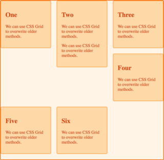
In Cascading Style Sheets, CSS grid layout or CSS grid creates complex responsive web design grid layouts more easily and consistently across browsers. Historically, there have been other methods for controlling web page layout methods, such as tables, floats, and more recently, CSS Flexible Box Layout (flexbox). CSS grid is currently not an official standard although it has been adopted by the recent versions of all current major browsers.


