See more posts like this on Tumblr
#doodles #artists on tumblr #wip #wyvern #gryphon #griffen #hippogryph #hippogriff #tissue box #paint #painted #painting #sketches #sketch #doodleMore you might like
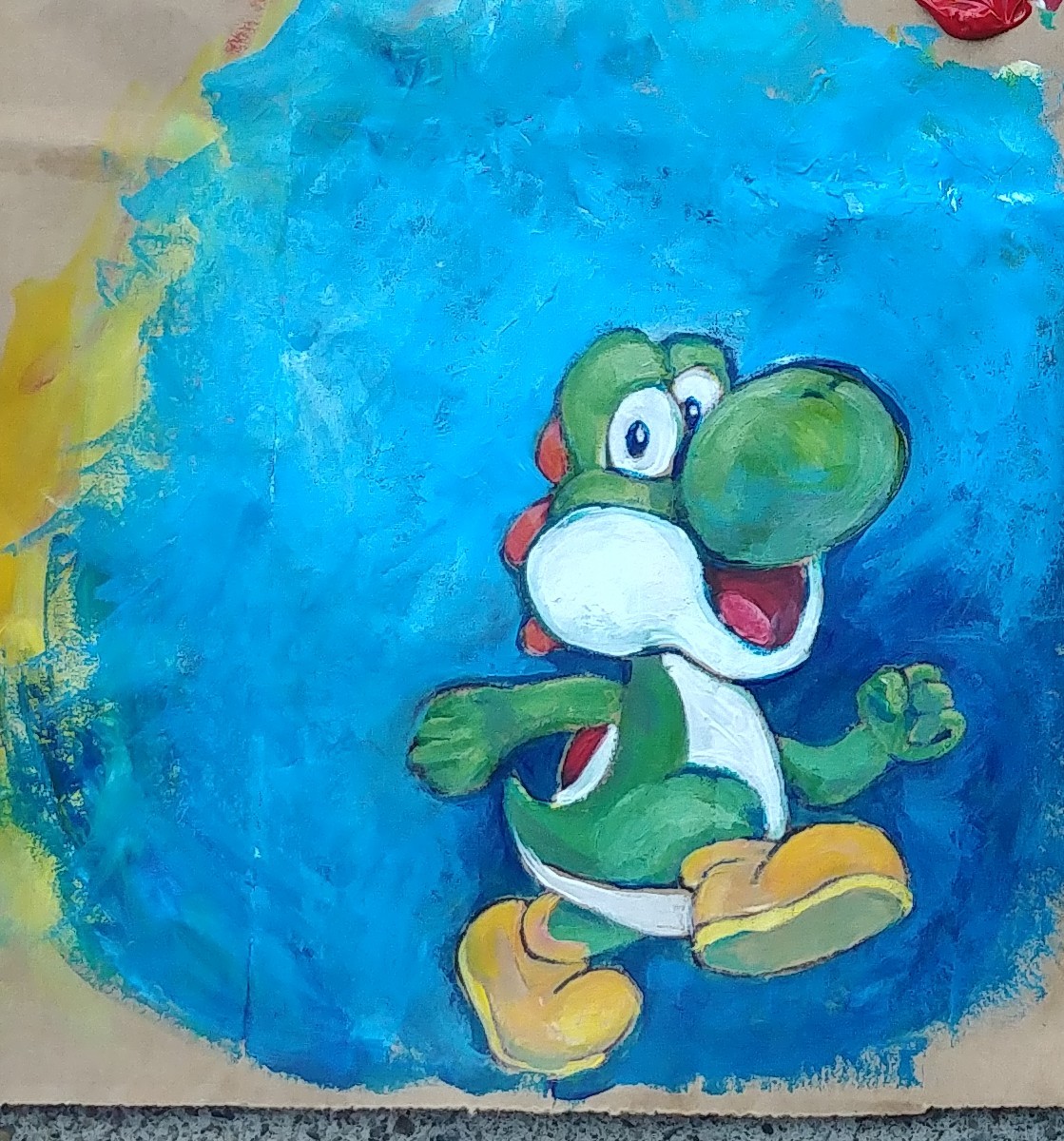
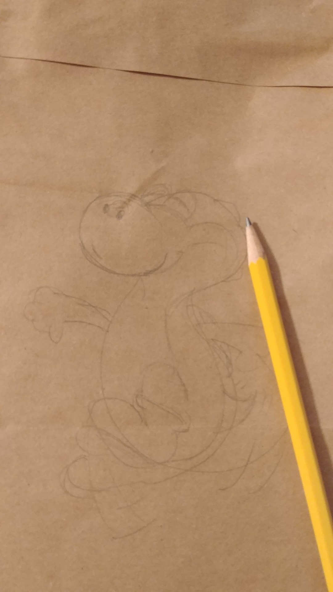
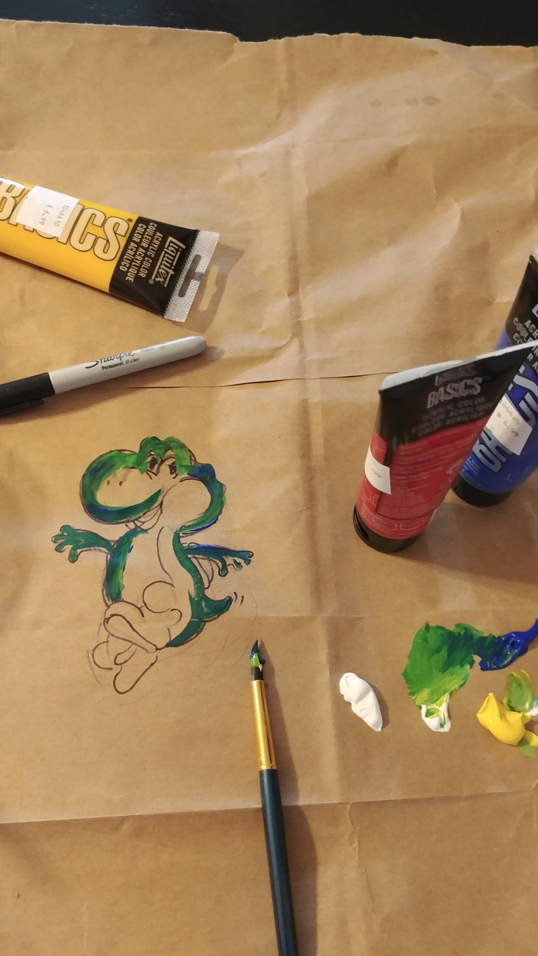
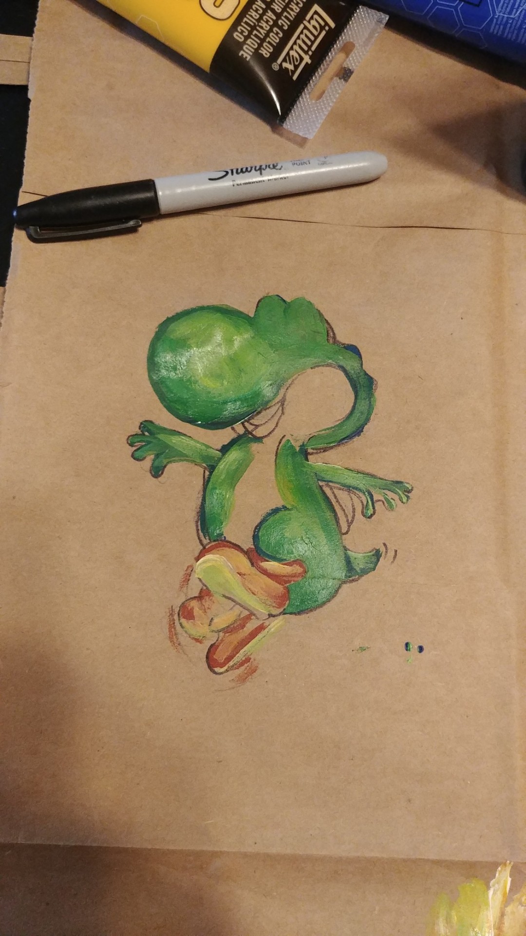
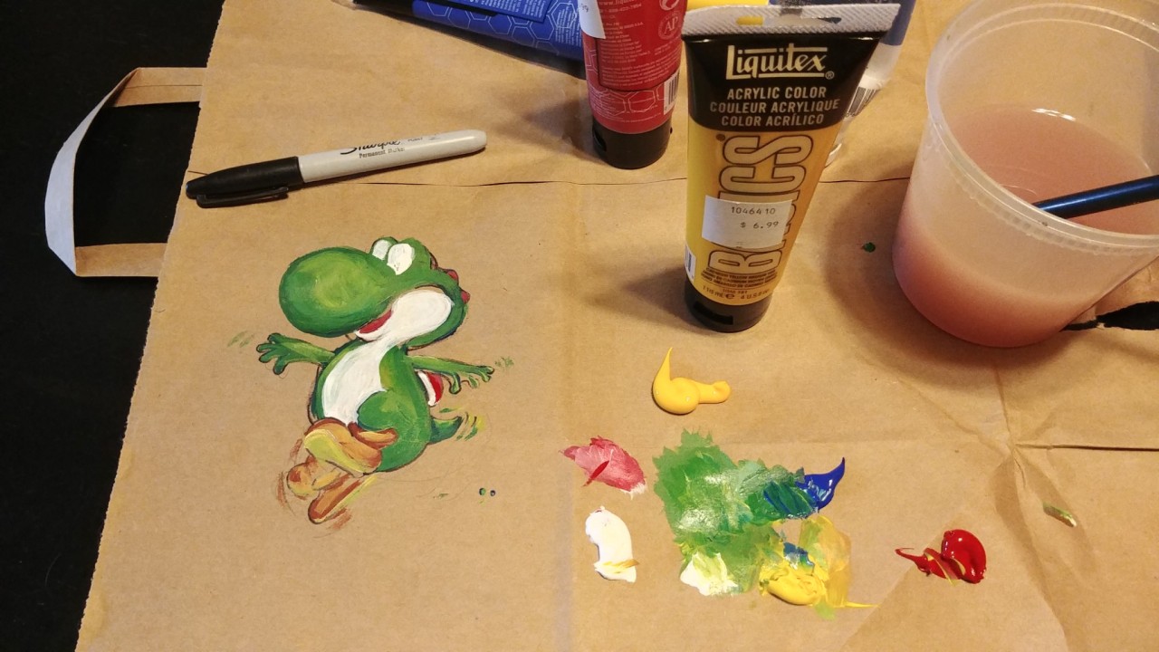
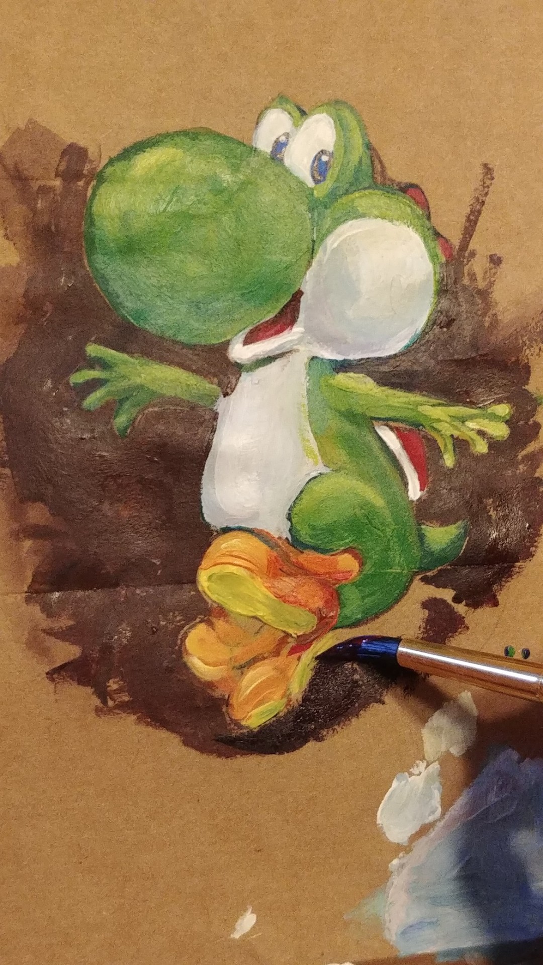
It’s 100F outside. Good day to stay in and paint. My housemate did the sketch for this Yoshi.
He has been teaching me to play Smash Bros.
I like Yoshi for positive representation of a large nosed character. Yoshi is not cute despite his nose. He is cute BECAUSE he has a large nose.
Like me.
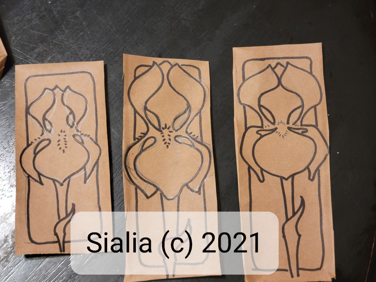
Also, i signed it like this:
Trying to remember actual paint
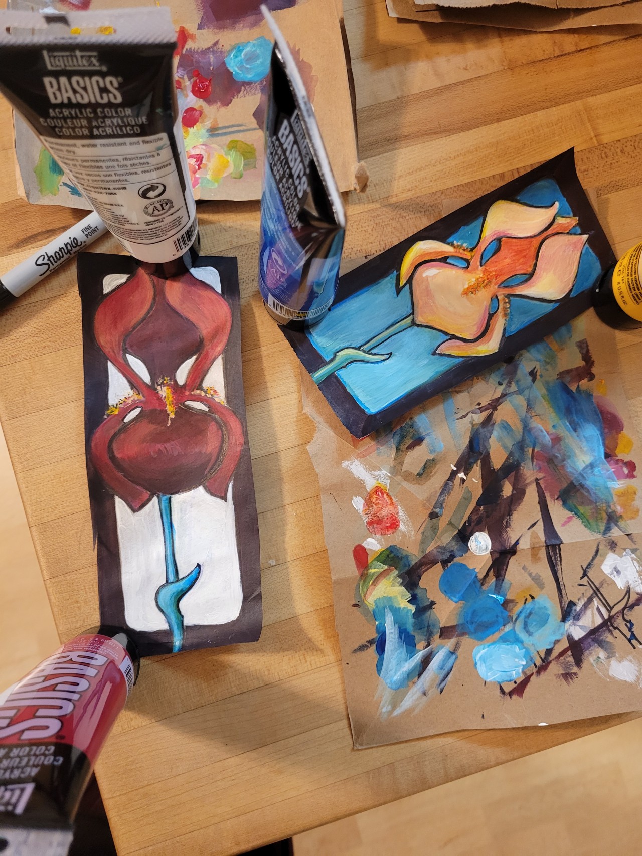
It’s been a really long time since I tried to do anything with actual paint. So I am trying to remember. Before I can paint a picture of some thing, I am trying to remember how to move paint around on a surface. So I’m back to basics: preparing the surface, mixing colors, thinning and extending paint, etc. Smooshing it around. Scraping it with a palette knife. Ragging off. Sponging. etc. just to see what happens. Most of what I’ve made is pretty awful, so I’m not posting it until I get something I like. But in the meantime, I want to post a few things I’ve figured out, just so I won’t have to keep trying to remember this all, and I’ll have a place to look it up again if I need it. So here we go:
The edges of a soft thing are also soft. All of them, even the inside edges. You can’t draw a soft thing with a hard edge.
The edges of fuzzy things are fuzzy: Fur, blankets, hair, grass and far away trees are all fuzzy.
Cool shadows are blue. Warm shadows are red. Yellow is usually hot and better for highlights. Golden shadows are warm.
Warm colors project, cool colors recede.
The sky is generally whiter at the horizon and bluer up above. Except when it’s pink/yellow or some other color. Pthalo blue makes a nice sky. ultramarine gets kind of sentimental, and sometimes separates unexpectedly into pinks and purples I didn’t expect. Cyan makes a painfully bright sky and needs to be blended down. Sometimes a sky is cyan at the bottom and ultramarine at the top. Use lots of white, too.
Clouds have flat bottoms, and soft or fuzzy tops. Also volume and weight. The light source for clouds can be above or below, but you have to know where it is.
Clouds and bushes and trees are darker in the middle and lighter around the edges.
The direction of the brush strokes matters. Sometimes brushstrokes suggest wind. Sometime they suggest the direction of light. The shadows on a round thing are also round—use rounded strokes.
The light source and the wind can come from two different directions/angles.
Shadows are usually transparent, while highlights often need to be opaque.
Drawing/painting with a relaxed line can be imprecise, but full of character and energy. Tight, precise lines tend to be very static.
Use a line/brushstroke that matches the energy level of the subject. If you want to draw something soft, snuggly & relaxed, and you use a hard, tight precise line, it fights with the story you are trying to tell. Tell the story not just in the objects depicted, but also in how you draw/paint them.
Use colors that match the energy level of the subject. If you want to draw something powerful, energetic and dangerous, and you use soft baby pastels, it fights with the story you are trying to tell (unless you are being deliberately ironic). Tell the story not just in the objects depicted, but also in how you color them.
VERY SATURATED AND CONTRASTY COLORS CAN BE A BIT LIKE TYPING IN ALL CAPS!!!!
- very neutral colors can whisper
Do the background before the foreground. You can touch it up later if needed. It’s much harder to go back for it after all the fussy work in the foreground is in place, and you’ll probably wind up re-doing the foreground.
Know when to fix mistakes wet, and when to walk away and let things dry before you do them over. If you’re still making progress, it’s ok to keep working wet. If everything is getting worse and worse, just stop and walk away.
Know when to stop.
Always keep your tools & workspace clean.
Stretch occasionally and focus on distance. Take a break and look at the painting from far away, or backwards in a mirror, or not at all for a few hours. See it with fresh eyes whenever possible.
Here’s how the ink test looks after a few days. Some of these are really “live” and change a lot. Who says watching paint dry is dull? If I did a time lapse film of one of my sketches, you would see magic in how things transform with oxidation. Like watching a tree bloom, then leaf, then turn to autumn fire, and fade to winter browns and grays. Astonishing.


