Dear Reader,
Sometimes I write to you about the parlous state of our democracy, other times about the travails of the pandemic. This month, I write to you about a matter of absolutely no importance to the future of the republic. My subject is peel-off magazine mailing labels.
Explore the July/August 2022 Issue
Check out more from this issue and find your next story to read.
Please stay with me here. First, take a look at the cover of your magazine. You will find, in the lower right corner, a mailing label. (Obviously, this message is directed to our print subscribers. If you are not already a subscriber, I know of a solution to this problem.) Until recently, your mailing address was printed directly onto the cover of the magazine, inside a big white box. Many of us found this aesthetically irritating, because the big white box was laid over a portion of our cover, obscuring both its beauty and its message. We put a lot of time and energy into making our covers, and I believe that they are exquisite. They should certainly not be subjected to defacement by the needs of the United States Postal Service.
So I griped. Griping isn’t seemly, but it is one of the more effective tools available to editors. Late last year, my grumbling bore fruit, and we switched to a glued-on, easily peeled-off mailing label. This was an important victory for the cause of beauty, but a victory only partially realized, because not all of you have yet discovered that these labels are indeed removable. I know this because even some of my own friends weren’t removing these labels. (On several occasions I’ve done it for them, but our readers are too geographically dispersed for me to take on this task alone.)
Why do I care so much? Because The Atlantic has reached new heights of artistic sophistication over the past several years, and I want to share this sophistication with the world. Yes, I know, the baker shouldn’t praise his own bread, but this isn’t really my bread at all. Our appearance—in print, on your laptop, on your phone—is the work of an extraordinary team of designers, artists, and photography editors, a group I credit with making this 165-year-old magazine look as fresh, to borrow from Emerson, as a trickling rainbow in July.
Over the generations, The Atlantic’s enthusiasm for aesthetics has waxed and waned. This was, and is, a magazine of words, and some past editors have felt that the words were enough. This approach was sometimes prompted by a specific sort of Yankee self-abnegation, sometimes by a feeling of superiority directed at now-long-gone New York–based illustrated magazines. To be fair, many periods in The Atlantic’s history were marked by careful and elegant design, and, several years ago, when I asked the design team of Peter Mendelsund and Oliver Munday to reimagine The Atlantic’s aesthetic, they looked directly to the past. Peter puts it this way: “We returned to first principles, meaning that we turned to the magazine’s design source code—Issue No. 1, from November 1857. What we found was a visual system reflecting our editorial ethos, an ethos built in part on rigor, clarity, candor, and principles of the Enlightenment. What this meant for our brand was a return to more classical typography and grids, and a ruthless scrubbing of unnecessary visual elements that had accreted over the past 162 years.”
Our print covers—which, even in the internet age, remain the face of The Atlantic—were a special focus for Peter, Oliver, and crew. I asked them to make our covers uncluttered and elegant, and to design them in such a way as to make the words inside impossible to ignore.
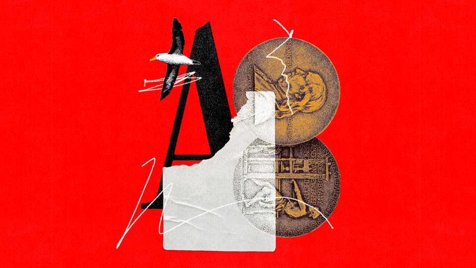
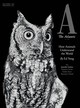
This month’s cover, featuring gorgeous photography directed by Luise Stauss and Christine Walsh, is one of my favorites, only partially because of our perspicacious and knowing owl. It is also a favorite because it features stories by two of our most gifted writers, Ed Yong and Jennifer Senior. It is a coincidence of timing that Ed, who won a Pulitzer Prize last year for his work explaining the coronavirus pandemic, and Jen, who won a Pulitzer Prize this May for her cover story about a family traumatized by the 9/11 attacks, are appearing together on the cover. This coincidence allows me to brag about their achievements, and to note that it is the work of writers and creative thinkers like Ed and Jen, Peter and Oliver, Luise and Christine, that helped The Atlantic win the 2022 National Magazine Award for General Excellence, the top award of the American Society of Magazine Editors.
Self-abnegation, as I suggested before, is embedded in The Atlantic’s DNA, and so I apologize for the crowing, but these awards, combined with the complicated, sophisticated stories our team produces daily, and combined as well with our unusually successful design aesthetic, make it a thrilling time to be at The Atlantic.
Nothing is as thrilling, of course, as peeling off a mailing label. So what are you waiting for?
This article appears in the July/August 2022 print edition.
About the Author
