Like most parking signs, New York City’s are text-based, packing too many rules into too few words. When the city commissioned a fancy design firm to overhaul its signs last year, the results felt like a trivial exercise in typography.
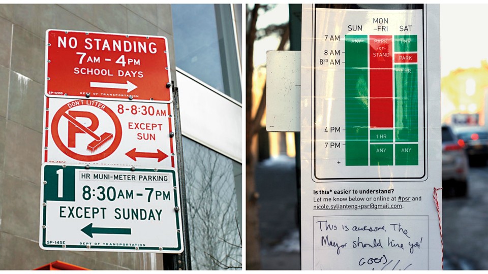
Nikki Sylianteng, a freelance designer who lives in Brooklyn, has a collection of parking tickets resulting from failed attempts to decipher these signs. Convinced that there had to be a clearer option, she mocked up a graphical alternative to one cluster of signs and, guerrilla style, tacked it alongside the originals.
Sylianteng’s approach uses blocks of red and green, similar to a Google calendar’s, to indicate when parking is allowed; all drivers need to do is match the day of the week to the time of day. As critics soon noted, her design leaves out some crucial information: different rules for commercial vehicles, for example, and for the segments of curb on either side of the signs. She is working on incorporating these elements, as well as symbols for color-blind drivers, into a new model.
Sylianteng doesn’t expect New York to adopt her ideas anytime soon, but the notes she found scrawled beneath her design suggest that she has some popular support.