Decorating with primary colors – get these designer do's and don'ts right and you'll create wonderfully uplifting decor
Decorating with primary colors is making a comeback in interior design trends, and here's how to bring them into your home


We will say it now, we have always been fans of decorating with primary colors. In an interior design world that so often favors the neutral, it's refreshing to see even a splash of cobalt blue or vivid yellow. The primaries are just so much, well... interesting. But we understand that they aren't the easiest colors to decorate with, and it's tricky to bring these bolder hues into your home if you aren't one for a statement. Yet, red, yellow, and blue are on the rise and there are ways to bring them into your home even if you are a colorphobe.
Primary colors are featuring again in color trends right now. They are 'true' colors – meaning they are the colors that create all other colors and cannot be created by mixing any other color. Now there is some debate as to whether black and white should also be considered primary colors, but for the sake of argument, we are going with red, yellow and blue as being the primary colors.
'Primary colors are the parents of all the colors in the color wheel,' explains Lick's color expert Tash Bradley. 'From a color psychology perspective, the three primary colors—red, blue, and yellow—relate to the body, mind, and our emotions, respectfully. Primary red attracts the most physical attention. Primary blue is mentally stimulating. And primary yellow gives us a boost of energy and optimism. In short - they demand to be noticed and have visceral effects on our emotions.'
We've asked our favorite designers and color experts how to decorate with primary colors, so we can all try to be a little braver in our color choices. What colors do they work best with? What's the color theory behind these shades? What rooms do they work in? Plus there are plenty of gorgeous spaces that prove just how chic the primaries can look if used correctly.
What colors pair well with primary colors?
Well, this really depends on the look you are after. Since there are touches of all the primary colors in every other color, they tend to pair pretty well with any scheme. A fail-safe option is white or black, but if you are after something softer consider pairing it with different tones of the same primary color – for example, a deep pure blue with a couple of lighter variations, you still get the drama but it's toned down.
Then there's the more striking option of pairing them together. There's a slightly retro vibe to this yes, but done in small quantities, red, yellow, and blue can be a really cool, classic color palette.
8 stylish ways to use primary colors in your home
1. Get the right balance
There's a reason we don't see primary colors being used as much as beiges, or greys in interiors. We get why (and are often guilty of it ourselves) playing safe is the default when it comes to color.
We love how Tash Bradley describes it – 'Incorporating primary colors in your home is a rebellion against restrained, “adult” color schemes. They have an inherent playfulness to them and encourage you to unleash your inner child.' And that's so right, what adult homeowner is going to paint their home in red, yellow and blue? But primary colors are nothing to be scared of, and you can make them as subtle or as statement as you like. It's just about getting the right balance in interior design and only bringing in as much color as you and your home can handle.
'When used wall-to-wall, what will happen is you will get the negative psychological traits of the color. Let's take the primary yellow, for example. If I painted a whole room in primary yellow and I didn't offset it with softer tones, it would actually make you feel anxious and overwhelmed. Wall-to-wall primary red would be overstimulating. As would wall-to-wall primary blue.' explains Tash.
'So I like to stick to the 60-30-10 rule. Primary colors should only be used as 30% or 10% in a room, not 60%. If you ensure your primary colors are sub-dominant accents, you will enjoy their positive psychological traits. The colors will lift a room and inject it with bursts of joy.'
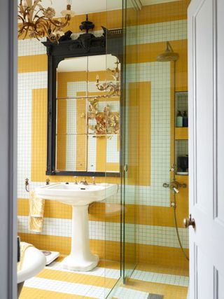
Perfect example is this simple yellow, white, and black bathroom color scheme. . The yellow feels fun and fresh but it's grounded by the contrast of the black and doesn't feel as dramatic paired with the stripes.
2. Look to textures and materials as well as paint
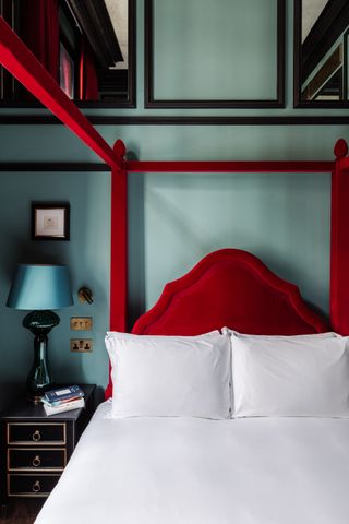
Decorating with primary colors doesn't always have to be about paint ideas. If you want to add depth and interest to a room, use fabrics, finishes, and materials to bring in reds, blues, and yellows. Adding bolder colors in a tactile way softens the overall look – the red and blue combination used in this blue bedroom designed by Natalia Miyar doesn't feel overly dramatic because of all the textures going on. The soft velvet of the bedframe, the hard glossy lamp, and the silky sheen of the shade, it's just more exciting than color blocking with paint.
'With primary colors, there is such a broad range – it can be but doesn't have to be straightforward – red, yellow, blue. It could be a navy with a pink and a yellow-orange. Or a baby blue with a deep red and brass,' explains designer Crystal Sinclair. 'Think about materials too – it doesn't have to just be about paint colors – there are so many materials that could be used to incorporate these colors. Glass has a blue tint. There's brass. There are several different stone options. Wood also works here either as a red or as a yellow depending on the tone of wood. There are many ways to work in primary colors and when all together it really does leave an impression.'
3. Dapple with the primaries on your woodwork

Woodwork (a.k.a trim, architraves and around doors) is the perfect spot to experiment with bold primary colors. It's such a small surface area it's not going to overwhelm the room, but it's not playing it so safe you aren't immediately going to notice that pop of color. It's the less-dated way of doing an accent wall.
We love this pop of yellow around the door frame of this partly open-plan space, it creates such a joyous entrance. And note how the room that follows isn't awash with various neutral tones, that fun play with color continues so that yellow doesn't stand out as an awkward stand-alone feature, it sets the tone for what follows.
And out of all the primaries, yellow works best with this approach, as it doesn't stand out as boldly as its fellow primary colors. 'Whilst blue is very much one of the most popular decorating color families that we all still turn to, red and especially yellow have somewhat been put out to pasture. But it’s time to re-think how to use these colors in a more contemporary and fresh way,' suggests Patrick O'Donnell of Farrow & Ball. 'Yellow, with its energizing and optimistic credentials, makes a wonderful choice for rooms but so it doesn’t overwhelm, temper with a complementary neutral or off-white on your walls.'
4. Bring together the primary colors in subtle ways
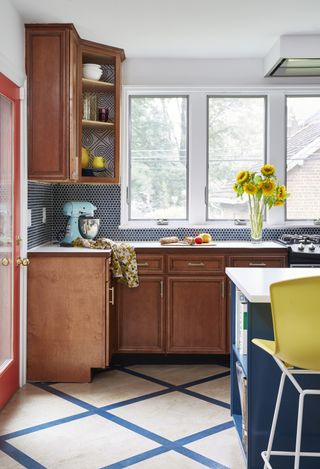
Now how to combine the primaries in a single color scheme? The answer is subtly and with caution. While it can work well, there's can be something quite childlike about the bringing together of the primary colors. And it does risk looking a bit... flat. The key is to be subtle with it and avoid any obvious color blocking.
This colorful kitchen designed by JMorris gets it right. They are all there – red, yellow, and blue – but there are different patterns and textures in there too to break up the colors.
'Kitchen renovation can be so much time and money. We found ways to work with the existing bones and cabinets of this kitchen and using primary colors was key to this facelift,' explains Jennifer Jean Morris. 'A new backsplash can be transformative. Blues are a great neutral and so handsome with natural woods. We carried this blue into an unexpected wallpaper in the corner cabinets and removed the doors here. We mirrored into the bold cork flooring pattern. Then brought in the coral in the door and yellow on the barstools. The key here was having all the saturations and tones of color in the same range.'
5. Use artwork for an easy approach to the primaries

Easiest way to decorate with primary colors? Artwork. It's none commital too if you just want to experiment with these bold hues and can add a real lift to a neutral space. We've in the past been slightly dubious about pairing bolder colors with an otherwise very neutral scheme, especially in the form of just a couple of prints, it can sometimes look too forced and deliberate. Plus, they encourage the eye to just focus on one part of the space.
But in fact, what this dining room, designed by Leanne Ford proves is that primary colors can work with those soft, rustic, ever-on-trend, neutral boho spaces. Red, blue, and yellow are adaptable and don't always have to steal focus from the room. With all the layers and textures and interest going on in the rest of the room, the splashes of color almost just blur into the space.
'Primary colors are bright and bold and can make a strong statement in any room or design. When using primary colors, it is important to keep in mind that they can be quite intense. The key is to use them strategically and sparingly.' suggests Erika Woelfel, VP of Color and Creative Services at Behr. 'One way to use primary colors is to pair them with more neutral or subdued colors. This would help balance out the room or design and create a more harmonious overall look. Another way to use primary colors is to limit their use to one or two small accent pieces in a room. This can create a pop of color and add visual interest without overwhelming the space.'
6. Commit to the color scheme
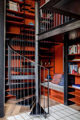
'Don’t be afraid of it! Just go for it,' says Christina Gregoriou, Architect and Director at Michaelis Boyd. 'First, choose your feature color and use it in a bold way – this could be the walls, floor tiles, joinery, a statement piece of furniture. Then, think about how you’ll tie it back into the space through your choice of styling elements like cushions, throws, vases or even artwork. But bear in mind, primary colors make a statement so be wary if you are choosing to combine bold patterns too. There is a method to the madness of maximalism.'
'If you're going to use a primary color, then saturate the space and don’t use it randomly. Be deliberate with the use and placement,' agrees designer Nicholas Kaiko. Sometimes adding a 'pop' or a 'splash' or an accent of color won't cut it, you need to really commit with going wall to wall. This can work especially well in smaller, less live-in spaces like hallways and staircases – you can afford to be bolder here because you won't have to sit with the color for long periods of time.
Just a word of warning though, when you go this bold with a color, consider what's going on in the rest of your home too, in the surrounding spaces. Nicholas recommends a balance. 'Being bold requires moments of rest for the eye. Every room and space can’t be turned up to 100, it's overwhelming. You need a color story which makes sense as a whole, not just designed as isolated rooms.'
7. Bring together the five primaries
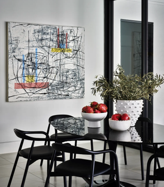
Whether you see black and white as being primary colors or not, there's no denying that when you bring all these pure colors together it creates the chicest of color schemes. So fresh and sharp and modern. It's a color palette that needs to have the right balance, the right furniture, the right lighting, the right home even, but when it works it really works. And it doesn't have to be as bold as it sounds, this space designed by Nina Magon takes what would be a simple monochrome scheme and adds some soft subtle hints of primary colors.
As Nina explains, 'There are so many easy, modern ways to incorporate primary colors into a space. For example, you could use a bold, primary-colored accent wall, or add bright pops of color to furniture and accessories. You could also create an eye-catching focal point with a bright, primary-colored rug or piece of artwork.'
8. Use furniture to inject primary colors

If you are looking for a kitchen color scheme refresh, primary colors can bring an unexpected vibrancy into such a practical space. And you don't have to commit to painting your cabinetry to make a statement, using larger pieces of furniture, accessories, or lighting can add a playful touch.
This green kitchen has all the retro vibes we love to see with primary colors, and it still feels chic and sophisticated. Just a nod to the era of the home in a way that feels on-trend now.
'While designing the interior of this kitchen I wanted to refer to classic interiors and a classic color palette,' explains Marta Chrapka, founder of Colombe. 'The house was designed in the 1920s, so for me it was obvious that I should refer to the original palette of colors and patterns from the era, but also my aim was to modernize the project and refer to the current lifestyle, (a young family with 3 kids). We treated some aesthetic solutions less literally, hence the strong color stain on the chairs and the bold checkerboard flooring.'
The most stylish primary color accessories
Be The First To Know
The Livingetc newsletter is your shortcut to the now and the next in home design. Subscribe today to receive a stunning free 200-page book of the best homes from around the world.
Hebe is the Digital Editor of Livingetc; she has a background in lifestyle and interior journalism and a passion for renovating small spaces. You'll usually find her attempting DIY, whether it's spray painting her whole kitchen, don't try that at home, or ever changing the wallpaper in her hallway. Livingetc has been such a huge inspiration and has influenced Hebe's style since she moved into her first rental and finally had a small amount of control over the decor and now loves being able to help others make decisions when decorating their own homes. Last year she moved from renting to owning her first teeny tiny Edwardian flat in London with her whippet Willow (who yes she chose to match her interiors...) and is already on the lookout for her next project.
-
 Meet 'Stacey' — A Pale Gray, "Spill Proof" and Washable Rug That is the Secret to Throwing Stylish Soirées
Is the risk of red wine putting you off buying that beautiful cream rug you've always wanted? Rugs USA has a solution
By Maya Glantz Published
-
 Every 'Quiet Luxury' Devotee I Know Is Buying This Beautiful Bouclé Lamp From H&M Home
Bouclé is the cozy upholstery fabric du jour... but on a table lamp? Now that's a bright idea I can't overlook
By Maya Glantz Published
