I love my maps. It sounds conceited, but...oh, heck. Who am I kidding? I'm proud of my work. Everyone should like what they make. Creating my own maps compliments my writing and gives my posts a visual style that sets them apart from other weather websites and blogs.
I have fun with it. It wasn't fun when I first started, though. I have no formal training in GIS software. I started tinkering without knowing what "GIS" stood for and it took years of trial and error to find a style that I like. While it takes some work, making maps is basically plug-and-play. You just have to know where all the pieces go.
From Bad to...Less Bad
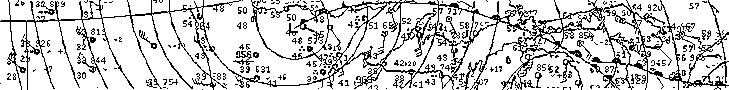
I'm terrible at making weather maps by hand because I'm not particularly good at drawing and my hands are shaky. To give you an idea of how awful I am at drawing, here's a map I created for
my Facebook page a few years ago:
See what I mean? It's cartographic argle-bargle.
My total inability to draw maps was frustrating as someone who liked to write about the weather. The maps produced by the Storm Prediction Center and The Weather Channel are just fine to post on the fly, but anyone can republish those. It's impersonal. It feels like cheating off the smart kid's homework if you do it too often.
I tried to figure out how to make maps with a computer for a long time. It did not go well. I tried to make a snowfall totals map for a blizzard in New England a few years ago and downloaded some weird little contouring program to try to create something that looked halfway decent.
It did not look halfway decent.
So, fast forward a few years and I land a gig at Gawker running my own weather blog (RIP
The Vane). Pretty cool for some awkward dude still in college. I suddenly found myself with hundreds of thousands of people reading my posts every month and I knew that copying and pasting other people's maps wasn't going to cut it.
My first adventure in mapmaking was a fine program called
MapWindow. It wasn't particularly powerful at the time but it did a good job letting you create nice, quick maps in a hurry.
That was my first map. I created it on June 23, 2014. It's nothing to write home about, but it's a heck of a lot better than the nonsense I created before it. It took a week or two to get the hang of plugging in data and playing around with different colors and styles and layers.
Here's a map of tornado reports and tornado warnings I made about four days after I started playing around with mapping software:
...and a forecast map for Hurricane Arthur that I made about a week after that...
...and this lovely, completely easy-to-read map, which could generously be described as a severe weather forecast verification:
I took screenshots of the map from the program, plunked them into Paint, and created legends using Microsoft PowerPoint. It was sloppy and embarrassing now that I look back on them, but it worked for me while I was still learning.
Jump ahead a few more years and this is what my maps look like now:
It takes time, but you do get the hang of it.
Here's how you can make your own maps without any previous experience.
The Basics
'GIS' stands for Geographic Information System. GIS allows you to map out data about the world around you. Professional GIS software can cost thousands of dollars, but there's plenty of free software available to anyone who wants to make a map. More on that in a bit.
The two data files you'll use most often in GIS programs are shapefiles and rasters. A shapefile is basically—and, oh man, I can hear geographers breathing heavily as they read this sentence—a souped-up Microsoft Excel spreadsheet. A shapefile tells the GIS program where to place lines, points, and polygons to create a map. Shapefiles also contain different variables for those features so you can make sense of the data after you create your map.
I quickly created the above map, showing state outlines, state names, and each state's median rent in 1997, using the data included in a single shapefile.
Shapefiles (.shp) are bundled with other important files (.dbf, .prj, .shx),
but you don't have to worry about those. You have to keep them with the
.shp file in the same location—the software needs them—but all you'll need to plug into your GIS
software is the .shp file itself.
Rasters are images that are pinned to certain coordinates so you can create maps on top of the images. The most common rasters you'll come across are satellite imagery and terrain data. You can layer rasters and shapefiles on top of each other to create complex and visually appealing maps. The above raster shows terrain data for the eastern United States and Canada before it's colorized and shading is added for texture.
When it comes to making weather maps, you'll be dealing with shapefiles if you want to analyze things like severe weather warnings or tornado tracks, and you'll have to use rasters if you want to map out observed rainfall data or Doppler radar images
QGIS
QGIS (
download here) is a powerful GIS program and it's the best software you'll find for free. I use QGIS to make all of my maps. Getting used to all the buttons and settings in the program is a learning curve, but it's worth it if you want to make professional-quality maps without the skills or income involved.
Most of the things I do in QGIS are saved as templates to make things easy. I've spent dozens of hours tinkering with styles and templates so that it only takes me five or ten minutes to make a map from start to finish.
The screenshot above shows the home screen for QGIS. Most of the tools you'll use are already along the left and top toolbars. Your recently saved projects will appear in the window on the home screen for easy access.
Instead of awkwardly trying to point out each individual feature in a confusing jumble of screenshots, let's just dive right into an example to show how it works. We're going to make a map of tornado tracks in the U.S. from 1950-2016.
Here are direct links to download the files we'll use, courtesy of
Natural Earth and the
Storm Prediction Center.
I have
an entire page of GIS resources here on my blog that lists out just about every public source of data I use. It's mostly weather, though there are some basic GIS resources listed at the bottom of the page. If you ever lose the link, it's right at the top of this site.
(
Update 6/26/2018: I just realized that I originally linked to a different cities shapefile than the one I used in my examples below. I've corrected the link above. I apologize for my error and hope it didn't cause any headaches. Here's a link to the city shapefile I originally included, featuring lots of cities around the world. )
Starting Out

Download all of the shapefiles linked above and move all of the files from their .zip folders into one common folder. The names of the files are all pretty straightforward. When you have everything on your computer, open up a new project in QGIS and click the "vector" button on the left toolbar.
Clicking the vector button will bring up the data source manager. You can search for files by clicking the [...] button under the source section. Search for the shapefiles on your computer. You can filter the shapefiles by selecting "ESRI Shapefiles (*.shp, *SHP)" from the bottom-right dropdown menu in the file window.
For now, let's load the ocean, lakes, and states shapefiles.
Layering your data is important. All of your shapefiles and rasters will appear in the Layers window on the left side of the screen. (If the window isn't there, you can open it by going to View > Panels > Layers.) Features appear in order on your maps, so if you put your lakes beneath your states, you won't see the lakes.
The map is going to look wonky at first because QGIS randomly assigns colors to new shapefiles. You'll have to go in and change the fill and line colors of each shapefile. You can do that by double-clicking each file in the Layer window to bring up the Layer Properties window.
Pretty Colors
For this map, I chose to use hex code #6BAEFF for the fill color on the oceans and lakes and #C1C1C1 for the fill color of the land. This will make your map a little less psychedelic.
The good news is that you can save style files for easy designing later on. These style files are extremely useful for repetitive maps—severe weather outlooks, snowfall forecasts, hurricane tracks, all that fun stuff. You can save styles by clicking the "Style" dropdown menu on the bottom-left side of the Layer Properties window.
Now let's add the cities and tornado tracks. Click the Vectors button again on the left toolbar and open the two remaining shapefiles. Make sure they're above the other shapefiles or the states and lakes will block them.
You can style the tornado tracks however you like. The Storm Prediction Center includes F/EF-Scale ratings, tornado width, path length, monetary damages, and human casualties for each tornado where the data is available. For the purposes of this map, though, I chose to make all tornado tracks the same color red (#FF000).
Labels
To style the cities, double-click the file in the Layer window just like the other files and style the points on your map to your liking.
In order to get labels to show up, we have to click the "Label" option in the list on the left side of the Layer Properties window. Click the dropdown menu to change "no labels" to "show labels for this layer."
Next, click the "Label with" dropdown and select NAME. You can label your cities with any of the variables available within the shapefile, but the NAME variable will show you the name of the city. The variable you want is obvious most of the time, but the names of variables in some shapefiles aren't always obvious.
Most of the formatting is straightforward. You can add a buffer to your text to give the letters a thick outline. This helps them stand out more. You can also add a background to your label (sometimes it's good to house your label in its own little box so it's easier to read) or include a drop shadow for aesthetics.
Now your map should look something like that. Let's finish it up.
Print Layout
The Print Layout window is your best friend (and biggest pain in the butt) in QGIS. This is the part of the program that lets you finish up your map and publish it as an image. You can use the print layout window to include things like legends, title boxes, and distance scales on your final map.
I have dozens of layout templates saved to speed up the process. Style files and pre-made templates are the reason I'm able to turn around maps so quickly. You can create a new template by clicking the New Print Layout button on the top toolbar, and you can access your Print Layout Manager by clicking the button (featuring a wrench) to its right.
Now that we're in a new layout window, the fun begins.
The white box is your canvas. Click the "draw map" button on the left toolbar to begin. You can click and drag to create a map window that covers as much or as little of the canvas as you'd like. If you fill the whole thing up, the map will be enormous when you publish it—something like 4500x3500 pixels. That's fine. You don't lose many details if you resize it after publishing.
If you want to make your map smaller, bigger, or a different aspect than the canvas, you can drag the map to your desired size and then click the "resize layout" button under the Layout tab on the right side of the window. This fits the canvas to the features on your screen. You can adjust the margins to create a neat buffer around your map.
Once you add your map to the canvas, you can adjust the view by clicking the "move map" button on the left toolbar and clicking and dragging the map. You can use your scroll wheel to zoom in and out, but be careful—each click of the wheel is a big zoom step. Holt the CTRL key while you scroll in and out to refine your zoom levels.
I chose to add a thick frame to my map using the Item Properties tab in the window on the right side of the screen. The Item Properties tab works for whatever feature is currently highlighted/selected on the canvas.
I added a legend to the bottom-left corner of my map. You can edit the names in the legend by deselecting the "Auto Update" tick box in the Item Properties tab. You can double-click each legend item and use the text box that pops up to change its name. You can use the blue up and down buttons to arrange the order of items on the legend.
I added a scale to the bottom-right corner of the map and adjusted it to display distance in miles.
Finally, I added a text box to the top of the map and included a frame so it matches seamlessly with the frame surrounding the map. Placement is easy because the program automatically snaps the edges of features together.
When you're happy with your work, click the publish button along the top toolbar and save the file where you want on your computer. You can resize in any image processing program or keep it in its full-size beauty.
There you have it. It's a nice, easy beginner map. The sky is the limit with how you can design the template and what you can do with all the data you plunk into the program.
If you have any questions, comments, concerns, hate mail, please feel free to
email me or ping me on Twitter
@wxdam and I'll be glad to help if I can.
Other Tips
It's worth noting that you'll probably have to adjust the thickness of lines and font sizes once you get your map finalized in the print layout. If you look at the map before and after the print layout, the lines are considerably thicker and the font is much larger than what appears in the program itself. Remember that you're sizing features for publishing, not what you see as you're manipulating data.
Playing with different projections is a whole different headache. You can view/change projections with the button on the bottom-right corner of the main QGIS window. It usually has "EPSG:" followed by a number. I hardly ever use the standard, flat WGS 84 projection we used for the example in this post. For national overviews I use U.S. Albers Equal Area Conic and different projections when I focus on smaller regions.
Save your work frequently. QGIS has a nasty habit of crashing at the worst possible moment.
If you're trying to colorize a raster, open the file's Layer Properties and change "Render type" to singleband pseudocolor. This brings up the option to add color ramps and colorize your data. It can be a pain, especially for beginners.
Some files are a bit sloppy around the edges. Some county and state line files bulge out beyond the coast as they cover territorial waters. The SPC's severe weather outlooks include coastal waters, which leads to unsightly skirts of color hanging out offshore (see also: one of my awful maps above). You can remedy this by layering your ocean on top of the problem files.
[
Maps: Dennis Mersereau |
Raster: USGS]


 I did my very best to map out the heat index required for a heat advisory for areas east of the Rocky Mountains.
The criteria for a heat advisory is different across the country. It's pretty
hard to map out the exact criteria because it's subjective for some offices and
the temperatures needed can change quickly across short distancse.
I did my very best to map out the heat index required for a heat advisory for areas east of the Rocky Mountains.
The criteria for a heat advisory is different across the country. It's pretty
hard to map out the exact criteria because it's subjective for some offices and
the temperatures needed can change quickly across short distancse.