Reviews - page 159

Griffin Technologies AirCurve and Clarifi – iPhone Accessories Worth a Look

By

post-2880-image-117bb5ac99cbd561e4f2230a1c4519b0-jpg

Griffin Technologies unveiled two iPhone accessories worth investigating at Apple Expo Paris on Wednesday: AirCurve is an acoustic amplifier that requires no power to amplify the iPhone’s built-in speaker, and Clarifi has a lens for taking close-up photographs built in to its protective polycarbonate iPhone case.

AirCurve borrows design elements from Bose “wave technology” to turn your iPhone into a no-power-drain alarm clock on your nightstand, or a mini sound system that never needs batteries or adapters, according to Griffin. An internal coiled waveguide collects sound from the iPhone’s built-in speaker, amplifies it, and projects it into the room. Designed with a pass-through slot that allows you to charge and sync your iPhone with a dock cable (available separately), AirCurve’s see-through translucent body lets you appreciate the acoustic curves inside that do all the work. Look for the AirCurve selling soon for $20 at major American electronics retailers.

Clarifi is similar to dozens of other protective polycarbonate iPhone cases on the market but is distinguished by the built-in lens that trurns the iPhone’s 2 megapixel camera into something more than just a snapshot device with focus set to ∞. Without Clarifi, iPhone requires about 18 inches to focus properly. Slide Clarifi’s lens into place and, according to the product specs, you can move in to 4 inches for crisp, detailed macrophotography. The case has cutaways for access to the power switch, headphone jack, volume controls, and dock connector. Clarifi will sell for $35 at major electronic retailers beginning in October and is compatible with iPhone 3G only.

Was Spore Worth the Wait?

By

post-2775-image-1735c5face587e480056b21eb54b0adf-jpg

For a while Spore seemed to have gone the route of Duke Nukem’ A game often hyped, frequently shown, and never delivered, but Sunday September 7th I finally got my copy of the God of God Simulators. Follow me after the jump to see if it was worth the 3-year wait.

First impressions: BBEdit 9 versus Coda 1.5

By

post-2724-image-956be06d932dffae35b4bcf4e52b735f-jpg

It’s the grudge-match of the century (well, of the month… at least if you’re a web designer and are sick of iPod coverage): BBEdit 9, the old warhorse that’s been around for 17 years, versus the young pup from Panic Software, Coda 1.5. I’ve been using both over the past week, and my first impressions are below. Over the next 60, I’ll be using both apps for my web-design workflow (not programming nor copywriting) to see how the new versions measure up in that space and how much they can reduce my reliance on other software. In the meantime, here’s a brief overview, in brand-new, patented “yay” and “yuck” categories…

BBEdit 9

Yay: Non-modal windows for search finally don’t suck( ® etc.), speeding up find and replace massively. Being able to directly edit in results windows is great. Code-folding is now much easier to deal with using the keyboard. Projects work fairly well, providing a rapid way of caning through loads of files when editing. Document stats (live word count, line count and character count) are really good.

Yuck: Text completion just feels wrong: although it’s beneficial to writers as well as coders (due to including words rather than just code), it feels awkward, sluggish and not particularly accurate—it just doesn’t seem to ‘get’ what I want to input. The interface, while better than it was a few versions back, is starting to feel old. The preferences make me want to cry. Speed differences with large files don’t appear pronounced (or, frankly, in existence).

Coda 1.5

Yay: It’s like someone stuck a rocket up Coda’s bottom—the app feels so much faster than version 1.0, which I found borderline unusable. Coda’s speed bump has suddenly made its auto-complete very lovely indeed. The Clips window’s been sorted out, and you can now group clips; with tab triggers, you can easily add huge chunks of code or single elements. Multi-file search and replace is lovely.

Yuck: Still no custom shortcuts for invoking Clips from the keyboard. (C’mon, Panic! This is one area everyone else—even Dreamweaver—runs rings round you.) No code-folding. CSSEdit’s CSS tools still make Coda’s look a bit rubbish.

Overall

I’d rather like someone to smush these two apps together. Either that or improve BBEdit’s text-completion, workflow, and interface, or add to Coda code-folding, and keyboard shortcuts to its clips. Still, here’s to the next two months, where I’ll figure out which one’s really worth your time, web designer chums.

iPhone 3G Hardware Reviewed

By

post-2437-image-b33448377356edbb19525bbd90c7221a-jpg

If you’ve not quite had your fill of news and information about the new iPhone 3G in the past three weeks, AppleInsider has launched a comprehensive review of the hardware and software for Apple’s latest advance in mobile computing, with a promise to assess its standing among other smartphones and mobile platforms in a weeklong series starting today. Complete with big pictures.

Review: Mail.appetizer 1.3b1

By

post-2268-image-54315f76db4fb8ba91933f669c9d1a4c-jpg

Whenever you upgrade an operating system, you inevitably end up leaving a few old friends behind—faithful applications that, for whatever reason, no longer work on your new system of choice. With Leopard, losing Mail.appetizer was a particularly painful wrench, but the current beta now plays nice with Apple’s latest and greatest.

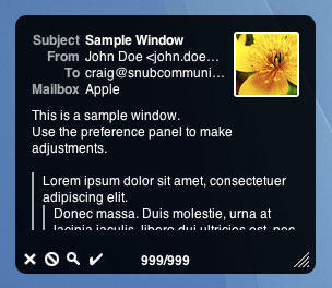
What Mail.appetizer does is save Mail users time. Mail’s Dock icon merely lists the number of new emails, but Mail.appetizer provides a resizable and customizable notification window that enables you to glance at the first few lines of each incoming email. Usefully, the window provides controls, enabling you to mark an email as read, delete it or open it in Mail.

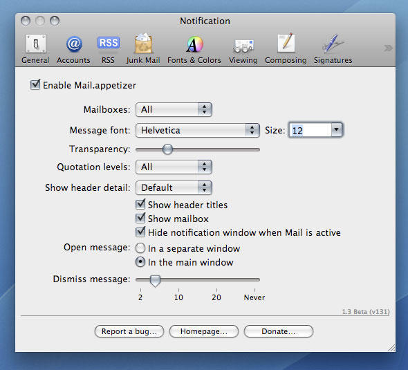
What elevates Mail.appetizer from being merely very handy to being utterly essential is the level of control you have over the notification window’s content. The most obvious settings are all present and correct: the time each message appears for, the window transparency level, font settings, and so on. However, you can also restrict notifications to specific Mail accounts and fine-tune which aspects of messages are shown, including quotation levels and header titles. You can also decide whether Mail.appetizer hides when Mail is active and if it should open messages in separate windows or in the main Mail window.

It’s attention to detail that lifts Mail.appetizer to the dizzying heights of a Cult of Mac Essential award, and although the current release has a couple of niggles (a clash with GrowlMail and not marking as read items deleted using the notification window), it nonetheless comes very highly recommended for all Mail users.

Cult of Mac essential badge

Mail.appetizer prefs

Mail.appetizer provides various options for changing the way its notification window works.

Further information

Manufacturer: Bronson Beta
Price: free
URL: bronsonbeta.com/mailappetizer/beta/

Six of the best: Mac OS X menu extras

By

post-2234-image-a27fa7e674dae5163a36295ea76c8ae6-jpg

In the first of a new series covering overviews of collections of Mac ‘stuff’, we present our favorites from the slew of apps vying for a place in your menu bar.

iStat menus 1.3

($free) islayer.com
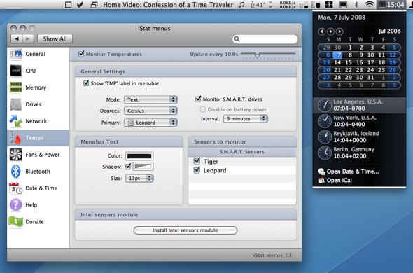
There are loads of system monitors available for the Mac, but few hold a candle to the flexibility, good looks and usability of this beauty. With almost no effort, you can bung usage statistics for CPU, memory, disks and networks into the menu bar, along with fan, temperature and Bluetooth information. Drop-downs then provide access to extended data.

But perhaps the best trick iStat menus has up its sleeve is the Date & Time module, which offers many more settings than Mac OS X for displaying the date and time in the menu bar. It also offers a handy option for bunging a set of user-configurable world clocks in the drop-down, an implementation that manages to better the competition. The fact that iStat menus is free means you’re a bit strange if you don’t at least check it out.
iStat Menus
All the times in the world, at your fingertips, with iStat Menus.

iTunesMenu 0.1

($free) programmerslife.co.cc
With the alumin(i)um Mac keyboards, Apple finally provided built-in system-wide iTunes controls, thereby placing dozens of iTunes controllers on to the ‘soon to be redundant’ list. However, when you’ve hundreds of CDs that have been ripped to iTunes, chances are you won’t know every track that pops up. iTunesMenu cunningly commendeers some menu-bar space for displaying the current track, and you can mess about with the preferences to include the artist and album name, too. Growl notification and scrolling support also exist, along with the option to define system-wide hot-keys for common iTunes controls. We’d love to also see iTunesMenu display the current track’s rating, but aside from that minor shortcoming it’s fab.

Cult of Mac recommended

Check Off 3.8

($free) checkoffapp.com
With everyone and his dog rattling on about Get Things Done (GTD) processes and applications, it’s a wonder anyone actually does get anything done. By the time you’ve learned how to use applications and rigorously apply procedures, entire days have been sucked up by trying to be more efficient, which has resulted in many a Mac user being harshly beaten by the giant no-no stick of ironic doom. Check Off keeps things simple–it sits in the menu bar, and enables you to create a list of labelled things to do. Once you’ve done a ‘thing’ you can check it off (bonus points, Mr. Developer, for actually using a sensible name for your app!).

It’s simple, it does the job, and we like it. And Version 4’s due soon, so pop over to the developer’s website and offer your two cents regarding the feature set for the next major release.

Cult of Mac recommended

ASM 2.2.7

($15) vercruesse.de
Time to show our age (or experience, depending on your point of view). Back in the days where OS X was just a glint in the mailman’s eye, there was no Dock. App-switching was instead done via a menu at the top-right of the screen. Old-hands often tearfully think back to those halcyon days, wishing nostalgia could replace the present day–at least when it comes to switching apps. ASM makes such dreams come true.

If you’re thinking “that’s great, granddad, but really what is the point, you old fart?”, we’ve some wise words for you, young whippersnapper. First, it’s irritating how the Dock’s apps can’t be ordered outside of launch order, unless they’re permanently housed. ASM enables you to list open apps in alphabetical order. Furthermore, ASM can dim hidden apps, and force single-application mode (auto-hiding everything else when you switch apps) or ‘Classic Window Mode’, which brings all of an application’s windows forward when one is clicked.

Cult of Mac recommended

Simple WindowSets 2.0

($12.95) hamsoftengineering.com
If you regularly work on projects requiring a bunch of Finder windows, you’ll know how much of a pain it can be to set them up every time. Also, Finder isn’t the most stable of apps, and one quick crash is all it needs to take with it your careful planning. This latest release of Simple WindowSets does away with such problems, enabling you to define window sets based on currently open Finder windows and restore said sets from its menu-bar extra’s drop-down. Usefully, existing sets can be updated, and preferences settings enable you to append or replace on-screen Finder windows with a selected set. Simple WindowSets doesn’t currently play nice with smart folders, but that’s our only niggle and it’s therefore an essential download.

Isolator 3.3

($free) willmore.eu
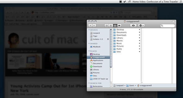
A bit of a leftfield choice, this one, but it’s useful for the easily distracted, like your correspondent. Having grown increasingly used to WriteRoom’s ‘block out all distractions’ display option, it’s interesting to see another app provide similar focus for any application, and once installed, Isolator does just that. Click on the menu-bar icon and all background apps are hidden behind a user-definable level of blur and darkness. Another click and normality resumes. Options for system-wide hot-keys, Dock-hiding and the ‘clickability’ of dimmed windows and icons ensure this application is on the right side of the ‘configurable but simple’ line.

Cult of Mac recommended

Isolator
Isolator helps you focus on your work by displaying background apps in fuzz-o-vision.

So, that’s our half-dozen menu-bar wonders. What do you think of our selection? Do you have any favorites of your own that you think we should have covered? (We already hear Butler uses grinding some axes!) Let us know in the comments!

First Look: Firefox 3

By

post-2098-image-ff5403945fc061f410f5b03e0f78f243-jpg


I’m a fan of both Firefox and Safari and regularly use both on my Macs. I like Firefox because it lacks some of Safari’s “Squirrely-ness” with some websites –particularly those using scripting, and I like Safari for private browsing, and because it is so fast. So after a day of use, am I prepared to drop Safari forever for the Fox? Click through, and lets discuss.

Review: Amnesty Singles 1.3.3

By

post-1977-image-09233c4a17ace8b88d5f09c203e872b7-jpg

Mac users seem split on whether Mac OS X’s Dashboard is the Best Thing Ever or a mildly irritating component that’s accidentally accessed when fingers stray on to a function key. Opinion appears to be drifting towards the latter option, but there are a few Dashboard widgets that are staggeringly useful.

For some, the Dashboard mechanism itself is the main barrier to working with widgets. Although Vista didn’t win fans by grabbing a chunk of desktop space for its Dashboard wannabe, having the option for widgets to remain on-screen would doubtless be handy for many Mac users, and it’s this functionality that shareware application Amnesty Singles provides.

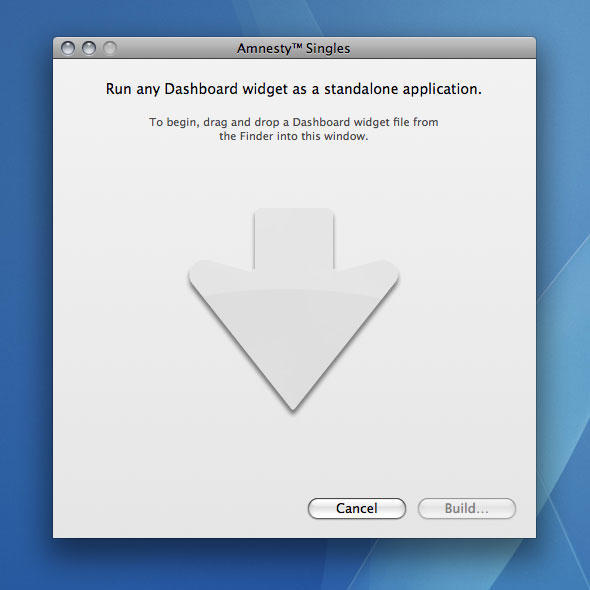
The interface is pretty much idiot-proof. You drag a widget from Finder to the whopping great arrow in its sole window, decide whether you want to create a standalone bundle or an application with a dependency on the original widget (as in, nuke the original and your Amnesty application won’t work), and click ‘Build’. Once Amnesty Singles does its thing, your app will be sitting wherever you saved it, ready for use.

When the application is launched, it should work like the original widget, but free from Dashboard. (Quick caveat: not every widget we tried worked and a few simply aren’t suited to being outside Dashboard; most, however, work fine.) Using your new application’s menus, you can force it to desktop or ‘on top’ level, along with defining a refresh rate. With some widgets being more akin to mini-applications, chances are you’ll get more use from them in this form than if they were hidden behind F12 (or F4 if you’ve a shiny new Apple keyboard).

Mac OS X ninjas will no doubt start bellyaching that Amnesty Singles doesn’t really offer anything you can’t do yourself. And, yes, if you’re keen to muck about with Terminal, you can toggle Dashboard’s dev mode and detach widgets from Dashboard. However, you don’t get the flexibility that Amnesty offers, nor the ability to hide and quit widgets like regular apps, nor the ease of use.

Amnesty Singles
If you can’t figure out how Amnesty Singles works, there’s really no hope for you.

Amnesty Singles 2
Amnesty applications can be created as standalones or by loading the widget from disk.

Further information

Manufacturer: Mesa Dynamics, LLC
Price: $9.95
URL: amnestywidgets.com

Review: Fluid 0.9.1.3

By

post-1977-image-09233c4a17ace8b88d5f09c203e872b7-jpg

Increasingly, people work online, using web-based applications for day-to-day tasks. Unfortunately, web browsers aren’t the most robust of applications—a single unruly website or advert is enough to lock up Firefox or bring down Safari unexpectedly. At best, you’ll waste time reopening a browser and signing back in; at worst, you’ll lose work and a precious little nugget of sanity.

Inspired by Prism by Mozilla Labs, Fluid offers an approach referred to as Site-Specific Browsers (SSBs). As the method’s name suggests, this enables you to create browsers for specific sites, making them akin to desktop applications. This is great from a stability standpoint—there aren’t other windows with content that can cause problems—but it’s also handy in making you focus on the tasks at hand, rather than getting tempted to check out other websites.

Creating SSBs using Fluid is child’s play—you bung a URL, name, location and icon (if you don’t have one to hand, an application icon is created based on the site’s favicon) into Fluid’s sole dialog, hit ‘Create’ and wait a few seconds. Fluid then invites you to launch your new SSB, which is basically a honed-down Safari with your site preloaded, restricted to site-specific content (click on an ‘external’ link and it launches in your default browser). Usefully, some SSBs (such as those based on online email) provide Dock badge updates, just like Mail, and each SSB can be restyled (UI, opacity, fonts) and set to various window levels. Not so usefully, Fluid doesn’t work particularly well with some sites (during our tests, Flickr was a notable culprit) until you tinker with the SSB’s advanced preferences and add some extra URLs that it’s allowed to peruse.

Interestingly, Fluid’s creator appears keen to take his application further. Recent builds have seen Fluid become a reasonable browser for general use, and while the ability to browse via Cover Flow won’t win it many friends, forthcoming tabbed browsing improvements and menu-extra SSBs mean Fluid has the potential to gain a strong foothold in the Mac browser market, rather than remaining a purely niche concern.

Fluid screen grab
Cover Flow in a web browser! (Don’t worry, Cover Flow objectors—you can turn it off.)

Further information

Manufacturer: Todd Ditchendorf
Price: Free
URL: fluidapp.com

Review: TapeDeck 1.0

By

post-2000-image-c65e27980d78a1987c7440513f988d6e-jpg

If you grew up in the pre-digital age, you might fondly remember the tactile qualities of what would now be summarily dismissed as ‘retro’ recording kit. There’s a definite immediacy to a tape deck: big buttons, with large text that leaves you in no doubt regarding function, and this is something that cannot be said for the bulk of audio-recording software. TapeDeck now aims to bridge old and new.

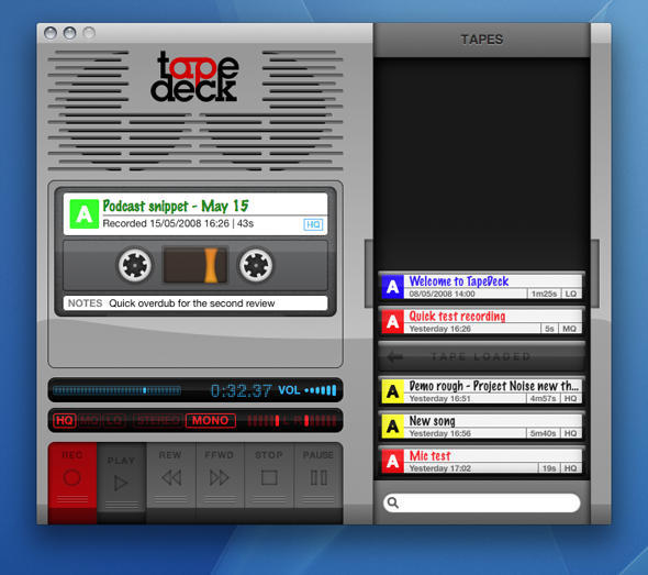
Boot the app and a digital tape deck appears on the screen. The buttons all work as you’d expect, even making suitably chunky noises when clicked. However, SuperMegaUltraGroovy has made plenty of concessions to the modern age: mono, stereo and quality levels can be selected with mouse clicks; tapes can be labelled and relabelled with ease; and keyboard shortcuts provide an alternate means of controlling the virtual tape deck (with system-wide shortcuts also available for ‘Record’, ‘Pause’ and ‘Stop’).

In keeping with the application’s aesthetic, each chunk of recorded audio is displayed in a slide-out drawer as a cassette tape. (In reality, this is merely a pretty way of displaying the contents of the M4A files TapeDeck stores in ~/Music/TapeDeck, and so users can also manage TapeDeck recordings in Finder.) Tapes can’t be recorded over, although they can be dropped in the Trash via Command-drag (Command-dragging elsewhere copies the tape to a Finder folder).

Other handy features become evident with a little exploration. Control-click on the current tape and the contextual menu provides shortcuts for adding the tape to iTunes or emailing it. And when the drawer becomes full, you can drag tapes around until you find what you want, or use the built-in search field to hone down the displayed tapes.

Strictly speaking, TapeDeck offers nothing new in terms of functionality—the likes of GarageBand and a slew of other recording apps do everything TapeDeck can and more. Also, importing is strictly limited to M4A, which is a shame—it would be great if you could drop MP3s and audio files saved with lossless formats into TapeDeck.

However, as iPhone continues to bludgeon into people’s minds, the interface is often key, and where TapeDeck excels is in making the audio-recording process totally idiot-proof and fun. It’s not quite enough for TapeDeck to garner a Cult of Mac recommendation badge, but it comes close, and if you’re flush and fancy dropping 25 bucks on a fun, straightforward and surprisingly original take on audio recording, TapeDeck more than fits the bill.

TapeDeck: handily lacking a ‘randomly chew up tape’ option.

Further information

Manufacturer: SuperMegaUltraGroovy
Price: $25
URL: tapedeckapp.com

Review: Pixelmator 1.2

By

post-1998-image-e8f06d47a5391d27b96970aaf8c59cec-jpg

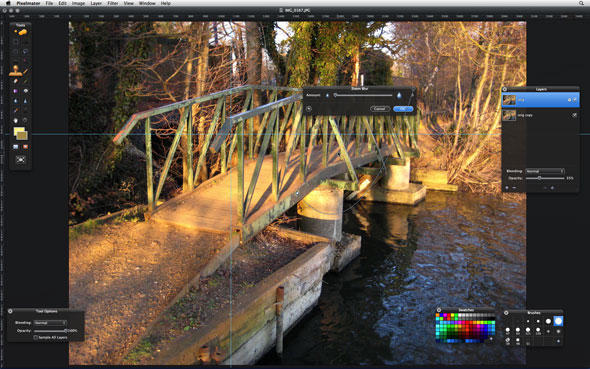
The level of hype upon budget image-editor Pixelmator’s debut was such that it would have made a Hollywood marketing executive giddy with glee, but the glossy pretender to Photoshop’s throne (rather brazenly lifting much of Photoshop’s interface and many of its features) divided the Mac audience. Many were sucked in by Pixelmator’s semi-transparent palettes, relative ease-of-use, and occasionally useful interface animations. I wasn’t, deciding that its beauty was skin deep, and that Pixelmator had a hell of a lot to do if it had any chance of taking on Adobe’s powerhouse, or even its errant offspring, the takes-ages-to-be-released-for-Mac Photoshop Elements. Now, with Pixelmator hitting its second fairly major revision, I figured it was time to take another look. Frankly, I think I’ll wait until version 2.0 before I bother again.

To be fair to the Pixelmator team, new features have been added: the application now boasts rulers (which neatly highlight your cursor’s location, but have an odd habit of vanishing when you switch from a different Space in Leopard), guides, grids and snap settings, a curves tool, and a color balance tool—although one might argue they should have been present from the start. Some of the existing tools have been tarted up a little, and a polygonal lasso tool has mooched on in.

Also, the translucent interface has been toned down. If you’ve not seen Pixelmator before, it’s largely dressed in a HUD-style skin, but rather than restricting this to dialogs or temporary palettes, you can even see through the document window background and title bar. (Seriously, guys, this is a distraction, and while the new version is an improvement, we’d much prefer an option to turn off the transparency entirely.) Unfortunately, similar improvements haven’t filtered through to other areas of the interface: in an area where precision is often key, it’s bizarre that you still can’t directly input numerical values into filter dialogs, instead being forced to mess about with sliders. Still, the small ‘string’ that attaches a filter dialog to its focal point remains, and shows that some of Pixelmator’s effects aren’t just eye-candy. If only more of the interface had the same level of practicality.

However, despite these grumbles, Pixelmator is now fairly fully-featured (at least if you’re editing RGB imagery—inexplicably, there’s still no CMYK support), and there’s a decent range of filters, so why am I still pulling a sour face? Performance is the answer—or, rather, lack of performance. When using a low-cost image editor feels like a treacle-wading session, on a machine where even the bloatware that is Photoshop CS3 is pretty damn nippy (a Mac Pro with 5GB of RAM, fact fans), it’s time to throw in the towel. The biggest culprit is perhaps the Clone Stamp tool, which is simply unusable in real-time, but many of the other tools proved similarly sluggish, such as the Brush tool, which seemed to take a half-second or so to start displaying what I was drawing. When using a Wacom tablet, Pixelmator was also prone to ignoring fairly speedily drawn curves, instead rendering them as a series of straight lines.

So, Pixelmator: you’ve got me beat. And if I have to make a recommendation, it’s this: Photoshop Elements 6 is only 20 bucks more than Pixelmator when grabbed from Amazon, and, when the current state of both applications is considered, Adobe’s effort is about 20 times better.

This could almost be a real-time movie of how fast Pixelmator is sometimes.

Further information

Manufacturer: Pixelmator Team Ltd.
Price: $59
URL: pixelmator.com

Review: Tangle 1.1.1

By

post-1977-image-09233c4a17ace8b88d5f09c203e872b7-jpg

I’m sure there’s a major discovery to be made in the world of science that would explain how my iPod headphones get tangled up so thoroughly and rapidly. It seems that no matter what cunning tricks I employ, nor how tidy I try to be, my headphones always appear in a knotted mess when I want to use them, which tends to make me angry on the scale of ‘want to kick a puppy’. Surprisingly, then, I really like Tangle, which, in a broad sense, is rather like untangling a set of iPod headphones or ten.

It’s safe to say that Tangle is gaming at its purest level. There are no characters or storylines. Instead, there are a bunch of green circles, connected with gray lines, displayed in an aesthetic manner that most 8-bit computers would have little trouble with. The idea is to drag the circles around until no lines are crossed, whereupon you’re provided with a jaunty little jingle, a time, and a means of accessing the next level (which has more lines to uncross).

Tangle isn’t rocket science—it has a kind of mindless quality that’s akin to Tetris. But as most people who’ve sampled Alexey Pajitnov’s classic will testify, it’s often the simplest games that are the most enduring. Although Tangle isn’t on a par with the Russian block-stacking game, and, frankly, is a little overpriced, it’s still a fun title to while away the odd half-hour. And despite the extremely basic visuals, on-screen feedback is clear, and the online leaderboard enables you to pit your capabilities against Tangle ninjas around the world.

Tangle screen grab
If this reminds you of your iPod headphones, I sympathize. I really do.

Further information

Manufacturer: MC Hot Software
Price: $20
URL: mchotsoftware.com/tangle/

Review: Default Folder X 4.0.5

By

post-1956-image-97268faee05b15c7b6d398acbfa9edae-jpg

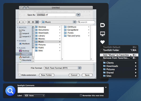
Open and Save dialogs are as unsexy as things come on the Mac, but every Mac user has to deal with them daily. Despite Mac OS X being in its fifth major incarnation, these dialogs are still limited, but with Default Folder X, everything changes, and even a little sleekness is thrown into the mix.Once Default Folder X is installed, a black HUD-style overlay surrounds Open and Save dialog boxes, its toolbar providing access to user-definable favorites, recent folders, and a slew of handy options (such as rename, reveal and move) that puts Apple’s own dialogs to shame. Usefully, favorites can have hot-keys assigned via Default Folder’s preferences pane, which also provides the means to create a default Open/Save folder for each installed application.

Other included niceties are the menu/Dock item, providing a system-wide means of rapidly navigating mounted volumes and defined favorites, and a superior preview within Open dialogs, which automatically stretches to fill available vertical space. Spotlight comments and file properties are also possible to manipulate from Open and Save dialogs when Default Folder X is installed.

Although at the pricier end of the shareware spectrum—especially for a one-shot utility—Default Folder X is nonetheless an essential purchase. The seconds it saves every time you open or save a file soon add up, and after a few months’ use, you’ll find Macs lacking the application feel naked by comparison.

 Default Folder X screen grab

Default Folder X continues to excel in its fourth major revision, making it much easier for Mac users to open and save files.

Further information

Manufacturer: St. Clair Software
Price: $34.95 (upgrades from $14.95)
URL: www.stclairsoft.com/DefaultFolderX/

Mac Bundle Battle Royale

By

post-1924-image-c1c91bc39d1c6226424c80156360dcb6-jpg

Pitting two great software bundles head-to-head in CultofMac cage match? What the heck, we have to do something to amuse ourselves until WWDC

Mac users this week are presented with two choices for bundles of shareware. The MacHiest bundle that includes 12 titles, bundled together for $49, and the MacUpdate promo that includes 10 titles for $64.99 (albeit 3 of them are locked until they reach specific sales numbers).

We get under the covers of these bundles to see which are worth your hard-earned duckets.

Aperture Uber Alles? (Apple Attacks Photoshop)

By

post-1863-image-c26bfd0d7a22ceb17bc24fe62b43a0e6-jpg

Filed under, it’s never too soon.

This evening, without so much as a beating drum to alert the dogs of war, Apple fired a shot right across the bow of Adobe Photoshop’s dominion over photo editing.

Aperture is already my favorite photo organizing and fine-tuning software –it’s brilliant, and offers a seamless upgrade to the familiar iPhoto. What’s been frustrating however is the need to export to Photoshop to perform anything more than basic RAW adjustments to highlights, shadow, sharpness and re-touch.

Today, this all changed. Apple has released an example plug-in “Dodge and Burn”, and with it, demonstrated Aperture’s plug in architecture. Per this review, additional plug ins are in the works from Nik Software, PictureCode, and Digital Film Tools.

Sure we won’t be able to “paint” in it (and why would we), but if Aperture will shortly have access to the kind of plug-in library available to Photoshop, there may be virtually no need for Adobe in any professional photographer’s workflow. This is clearly one step further in Apple’s strategy to dominate their core “creative professionals” market. Remember when Avid/Adobe Premier owned film editing? Who is going to pick that over Final Cut now?

I’ve been playing with the version 2.1 now for a few hours and love the new functionality, but what’s got me more exited is the potential, I see a huge library of plug-ins on the horizon. So Aperture users, sound off, what plug-ins do you desire most? Me, top of the list, I want an HDR merge and tone-map plug-in, Right Now.

Apparently, Some Love the MacBook Air

By

cult_logo_featured_image_missing_default1920x1080

Back in January, I was fairly effusive in my disappointment in the MacBook Air. I still think it’s a product that has a long way to go before it fulfills its promise as a thin, light, road warrior’s machine (the fact that it isn’t standard with an SSD is a pretty poor statement about its long-term reliability), but I’m now willing to admit that it hits the mark with at least some people, including people I really respect, like BusinessWeek’s Reena Jana, their innovation editor.

I’ve had a lot of conversations with Reena in the past, and she’s a constantly on-the-go kind of person, meeting with design and innovation leaders around the country. She probably travels for business more than I do. And she loves her MacBook Air:

OK, so I personally don’t have the need for many USB ports, nor for a huge, huge hard drive. And I don’t even feel that bad that there’s no Ethernet port, although I could get an attachment for it, which to me isn’t such a big deal (I rarely use the Ethernet jack). I’m reminded of when MacBook’s stopped having a floppy drive, or a dial-up jack. People were upset. But other laptops followed, because these features became obsolete. I see a parallel here, and my laptop lifestyle was starting to reflect the phasing out of DVDs and Ethernet jacks before the Air was released.

Fair points all, though I think I’d be more comfortable with the Air’s lack of a DVD drive if Apple distributed its own software, such as iWork, on USB key instead of DVD… Still, this is another reminder that a lot of people don’t need anywhere near the file storage capacity that I do. Just this weekend, I learned that my sister-in-law is desperate for an Air, as well. I’ll be very interested to hear how the Air performs in the market. I still think it will meet a fate similar to the G4 Cube, but there are some people who are incredibly excited by it.

For me, I think I’m stuck in Steven Levy’s camp: If I even had one, I think I’d probably throw it out with the newspapers by accident.

The Longest MacBook Air Review Ever

By

131583-mbair_large.jpg

The MacBook Air is starting to reach customers, and early reviews of the Apple’s thinnest laptop is starting to trickle down the wire. None trickles with as much force as Jason Snell’s astoundingly thorough dissection of everything about the Air, from software to hardware, from connectivity to battery life and more. I highly recommend the review (which is positive, but laden with caveats). I think it might be the most even-handed review of the Air so far. I mean, who knew that its headphone jack was as wonky as the iPhone’s?

New Batch of iPhone Competitors Miss Big On Software

By

post-1467-image-d4251b98485f242938f08b0b8ae6015d-jpg

Several handset-makers, including LG, HTC, Palm, and Nokia, have launched new “iPhone-killers” in the last couple of weeks, hoping to prove that the phone guys understand something that Apple doesn’t. And according to David Pogue, one such effort, the T-Mobile Shadow does a great job of making that point. Until you start using Windows Mobile 6, which is a blight on phone-dom. The review is a riot:

When you’re assigning a contact to one of the five “My Faves” slots, a T-Mobile calling plan that gives you unlimited calls to your five favorite numbers, three confirmation screens is two too many.

If it takes four presses on the More button just to see everything in the Start menu and you provide no direct way to get to the first page from the last you need to redesign.

And that’s the big difference, for me. Until someone comes out with an interface half as intuitive as the iPhone’s, I can’t be swayed. I guess we’ll see what Google’s got when it rolls out the Android SDK today, but it looks like Apple’s lead is insurmountable.

Technorati Tags: ,

Ars Technica’s Sublime Leopard Review

By

post-1420-image-cc31823a24e7740bc2cc23a3bd25c87e-jpg


Updated: Ah, John Siracusa. Is anyone else capable of such sublime operating system reviews? His Leopard manifesto (17 action-packed pages) is sublime:

That’s the Downloads folder on the left, and the disk image file on the right. It’s slightly bigger.

If you are not shaking your head, uttering something profane, or taking some deity’s name in vain right about now, congratulations, Apple may have a position for you in their user interface design group.

He’s complimentary where Apple got it right, mean where it got it wrong, and always insightful and funny.

World’s Fastest Vista Notebook

By

post-1414-image-e8d1f152ef087ff8898cb53e69001b70-jpg

PC World: In Pictures: The Most Notable Notebooks of 2007

The fastest Windows Vista notebook we’ve tested this year is a Mac. Try that again: The fastest Windows Vista notebook we’ve tested this year–or for that matter, ever–is a Mac. Not a Dell, not a Toshiba, not even an Alienware. The $2419 (plus the price of a copy of Windows Vista, of course) MacBook Pro’s PC WorldBench 6 Beta 2 score of 88 beats Gateway’s E-265M by a single point, but the MacBook’s score is far more impressive simply because Apple couldn’t care less whether you run Windows.

Via Daring Fireball

Apparently, Leopard UI Not Perfect Yet…

By

1796409880_2f73eaac38_m.jpg

Buzz on Leopard is mostly quite positive as we roll into the first full week of its availability on the market. That’s mostly, mind. R.L. Pryor, owner of ThinkMac Software and creator of such shareware gems as NewsLife and InstantGallery, has a few complaints about the UI in Leopard. I’ll share just one, then you must click through for more. Absolutely hysterical.

Stars in their eyes: Where do the stars end and the status lights begin? I suppose it could be worse, no one buy Steve Jobs one of those infinity mirrors OK?

ThinkMac Software – Blog

Thanks, Andrew!

Tags: , ,

Flock 1.0 Public Beta is the Best Mac OS X Browser

By

1753913346_ae316d9c64.jpg?v=0


Ladies and gentlemen, Flock, the Mozilla-based open-source Web browser trying to make the social aspects of the Internet central, is finally useful. And oh, is it, useful. First introduced in the fall of 2005, the program, which integrates Facebook, Twitter, Flickr, YouTube, del.icio.us and blogging software was for years a slower, more crashable alternative to Firefox. I never used it for more than about 10 minutes before. Suddenly, as of last week, it has vaulted over Firefox, Camino and Omniweb. It’s by far the best web browser for anyone with friends online that I have ever used. You should all download Flock 1.0 Public Beta at your nearest convenience. It even takes Firefox add-ons.

The marquee feature of the new version is the People Sidebar, a screen real estate gulping interface for a few key social media services. Essentially, once you register, you get a constant stream of new status and upload updates from all of your contacts of Facebook, Twitter, Flickr and Youtube. It just moves along. You can send messages, Poke people, send photos, or what have you, all without heading over to the hosting web page. The other key feature is the Media Bar, which allows subscriptions to the media streams from Flickr, Photobucket, Facebook or others. There’s drag and drop image, video and text support, as well as an incredible clipboard that goes far beyond the typical features to optimize for reuse.

Then, in addition to all of that, there’s a built-in blog editor that’s widely compatible and nearly as capable as ecto, my dedicated blog app of choice. Its only limitation right now is that it requires the use of one of its supported hosting services for images, not native image hosting.

Other than that, it’s revolutionizing the way I consume information and connect with the people around me. And it’s made blogging almost preposterously easy.

Thanks, Stuart — for showing the way!

Test-Drive Flock 1.0 | Flock

Blogged with Flock

Tags: , , ,

Mossberg Reviews Leopard

By

cult_logo_featured_image_missing_default1920x1080

Leopard has been with journalists for awhile. Uncle Walt thinks it’s not a huge improvement, but it’s much better than Vista.

Leopard: Faster, Easier Than Vista
Upgrade of Apple’s OS Isn’t Revolutionary, But It Beats Microsoft’s
The Mac is on a roll. Apple Inc.’s perennially praised but slow-selling Macintosh computers have surged in popularity in the past few years, with sales growing much faster than the overall PC market, especially in the U.S. By some measures, Mac laptops are now approaching a 20% share of U.S. noncorporate sales, up from the low single digits where they once seemed stuck.

Personal Technology – WSJ.com

Blogged with Flock

Tags: , ,

Verdict: iPhone Alternatives Don’t Measure Up

By

post-1068-image-7cb081da4175df44f419570f54fdc19d-jpg

Several hundred thousand people across the country are now happy iPhone users. They’re also all AT&T users, whether they wanted to be or not. Until Apple shipped their wonder-phone, I was never that interested in phones focused on e-mail and web browsing — then it all changed. However, as a T-Mobile user, my options are limited. Much as I would like to say I’m glad that my service agreement will force me to wait until at least the second-generation iPhone, I’m not. I want a great phone. And so I headed to the T-Mobile store yesterday, in search of hope. And I found none. To read the gory details, hit the jump.

The Three Word iPhone Review – It Fuckin’ Rocks!

By

post-936-image-9c664ae1fc88df9d5edf31a91fbc1803-jpg

The iPhone is gadget heaven. It really does restore your sense of childlike wonder. I’ve had a blast all weekend running my greasy finger over its glassy surface.

It’s a Crackberry for the masses. Finally, mobile email, messaging and web browsing is fun and easy — how did it take so long?

I’ve had a Treo and cell phone email for years, but never, ever used them — they’re a mess. Now I’m an iPhone text addict — a 41-year-old acting like a teenager.

I bought one on Friday and have been out around town with my kids all weekend. The little angels monopolized it, surfing the web and watching YouTube. They figured it out immediately. I showed them one thing — how to use your fingers to shrink and zoom — that was it. I took some calls, surfed the web and sent some email.

I found it’s not all roses — there’s serious issues using it for work — but in general, we’re true believers.

The Good and The Bad after the jump. Plus camera phone samples.