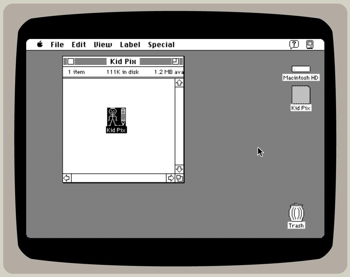
MacPaint

Read Cult of Mac’s latest posts on MacPaint:

Artist uses vintage Mac to re-create Flatiron Building, one pixel at a time

By

Wahyu Ichwandardi image
Imagine the hours it took to draw this.
Photo: Wahyu Ichwandardi

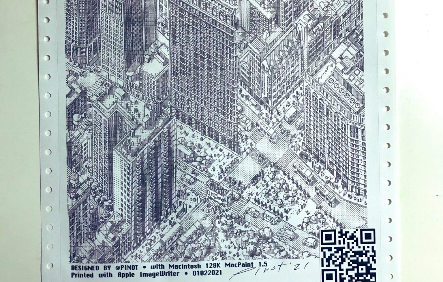
Using a 1984-era Macintosh 128K and various retro tools, Pinot W. Ichwandardi painstakingly crafted a beautiful pixel art drawing of one of New York City’s most stunning skyscrapers.

Ichwandardi created his stunning image of the Flatiron Building one pixel at a time, a process he calls “pixel knitting” due to its time-intensive nature. But the incredibly detailed artwork isn’t even the point.

“The most rewarding thing from it is the process,” the 50-year-old designer told Cult of Mac.

It just goes to show that even a Mac that’s nearly 40 years old can still be used to make amazing pieces artwork. And you can buy a print of Ichwandardi’s Flatiron Building art — printed on a vintage dot-matrix printer, naturally!
Apple II screenshots required a whole lot of extra hardware

By

Running Apple II programs on a Mac with an Apple IIe Card was pretty darn awesome.
Kids today don't know how lucky they are.
Photo: Microwavemont/YouTube

Taking a full-screen screenshot on a modern Mac or iPhone is just a matter of tapping a couple of buttons. But things used to be a whole lot more challenging, as longstanding Apple employee Chris Espinosa recently shared on Twitter.

Kids (and “how to” article writers) today don’t know how good they’ve got it!

Artist re-creates Childish Gambino’s ‘This Is America’ video on vintage Mac

By

This Is America recreation
Donald Glover looks even cooler in pixel form.
Photo: Wahyu Ichwandardi

Donald Glover’s video for “This Is America” is one of most talked-about music videos of the year, but one brilliant animator is adding an extra dose of old-school cool by painstakingly re-creating it on a vintage Mac and software from the ’80s.

New York City illustrator Wahyu Ichwandardi (aka @pinot) is animating the entire “This Is America” video pixel by pixel. There’s still a lot of work to be done, but he’s currently 375 frames deep — and it looks incredible.

Watch the first minute of the video:

Don’t skip this crucial step if you want your app to be awesome [Pro Tip]

By

Bill Atkinson, the creator of MacPaint, has crucial advice for coders.
Photo: Jim DeVona/Flickr/CC

Pro_Tip_Cult_of_Mac SAN FRANCISCO — If you want to make a truly killer app, here’s a crucial part of the creative process you shouldn’t overlook: Give your “finished” software to someone, ask them to do something with it, and then shut the hell up.

Observe their interaction with the app, and you’ll learn what you’re doing right — and what you’re doing wrong.

That priceless piece of advice comes from Bill Atkinson, an Apple veteran who coded some of the greatest Mac software of all time, including HyperCard and MacPaint.

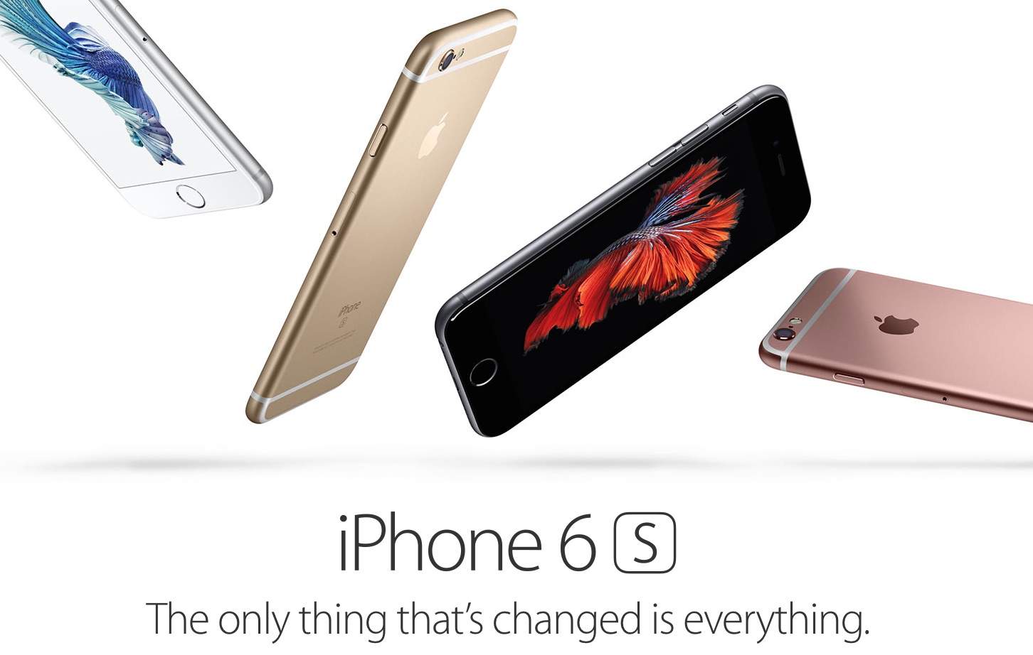
What iPhone 6s ads designed in MacPaint would look like

By

What would ads for iPhone look like if it came out in 1985?
Photo: Apple

Apple’s marketing team creates gorgeous ads that show every minuscule detail of new iPhones, but what would the images look like if they were produced using the original Macintosh and MacPaint?

Some redditor with way too much time on his or her hands decided to dig out an old Mac and find out, and the results are actually pretty fantastic.

Inspired by MacPaint, Rogue Invader mixes retro art with modern gameplay

By

Modern game, retro look. Does FOX know about these Zenos?
Photo: Squishy Games

Upcoming sci-fi shooter Rogue Invader looks like a massive HyperCard stack in glorious motion. Currently on Kickstarter to fund the last bit of development, the roguelike game is the brainchild of Squishy Games founder Nathan Rees, who’s been making games ever since he discovered the joys of MacPaint as a kid.

The Twiggy Mac Lives! The Quest To Resurrect The World’s Oldest Macintosh

By

Hello I'm a Twiggy Mac
This rare Macintosh 128K prototype with Twiggy floppy disk drive has been lovingly restored to working order.

Nearly three decades after Apple Computer introduced the Macintosh, a pair of incredibly rare Mac prototypes have been discovered and restored to working order.

The computers, known as Twiggy Macs because they used the same 5.25-inch Twiggy floppy disk drive found in Apple’s doomed Lisa, were tracked down and painstakingly brought back to life by Adam Goolevitch, a vintage Mac collector, and Gabreal Franklin, a former Apple software engineer.

“Throughout the past 15 years, I have heard stories of and researched the fabled ‘Twiggy Macintosh’ computer,” Goolevitch told Cult of Mac in an email. “It was a thing of myth and legend — like a unicorn.”

Locating these Macs was the first step, but getting them to work was the real challenge. Goolevitch and Franklin embarked on an all-out effort to resurrect these long-lost pieces of Macintosh history.

Now two Twiggy Macs have been returned to life in full working glory. They are — without a doubt — the oldest Macs in the world. With auction prices for Apple-1 computers nudging upward toward the half-million-dollar mark, these incredibly rare prototypes — which look a lot like something you might find at a garage sale — could prove priceless. Here is the story of their amazing resurrection.

Enjoy the Timeless Appeal of Apple’s Picasso Artwork [Gallery]

By

Picasso-Artwork-Collage

The famous Macintosh Picasso logo was developed for the introduction of the original 128k Mac back in 1984. A minimalist line drawing in the style of Pablo Picasso, this whimsical graphic implied the whole of a computer in a few simple strokes. It was an icon of what was inside the box, and became as famous as the computer it represented.

The logo was designed by Tom Hughes and John Casado, art directors on the Mac development team. Originally the logo was to be a different concept called The Macintosh Spirit by artist Jean-Michel Folon, but before the release Steve Jobs changed his mind and had it replaced by the simple and colorful drawing by Hughes and Casado. It’s been beloved ever since, and the graphic style has endured across decades.

How The AIDS Epidemic Caused Apple To Change MacPaint

By

aids

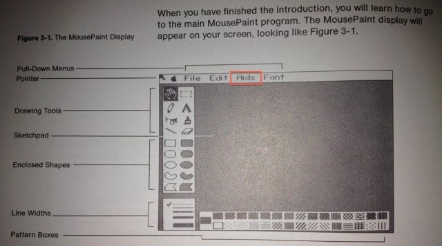
Back in 1983, when Apple was first developing MacPaint and its less-featured sister app for the Apple II, MousePaint, they had a menu option called “Aids” which contained image manipulation tools. You can see this menu in documentation for the original AppleMouse II.

Before release, though, this menu was renamed Goodies, and intriguingly, it was done so because of rising awareness of the AIDS epidemic. The more you know!

Source: IMGUR
Via: Reddit

Check Out This Nice Video History Of MacPaint [Video]

By

post-147616-image-c9659aadc1bca39440b466736560ec64-jpg

Here’s another lovely short video from Matthew Pearce, the man behind the Matt’s Macintosh YouTube channel.

MacPaint doesn’t just explain what MacPaint was, but is more about why it was an important part of the software lineup back in those days. Things we take for granted today (like copying a graphic and pasting it into another document) were new and exciting back then.

As Matt points out, MacPaint in 1984 laid foundations for features you still see today in modern graphics applications.

(And one other thing: Matthew’s original Macintosh 128K looks pristine, and the screen as clean and bright as the day it was made. He even has an as-new copy of the original printed manual. Where does he find this stuff?)

Enjoy!