All products featured on Architectural Digest are independently selected by our editors. However, when you buy something through our retail links, we may earn an affiliate commission.
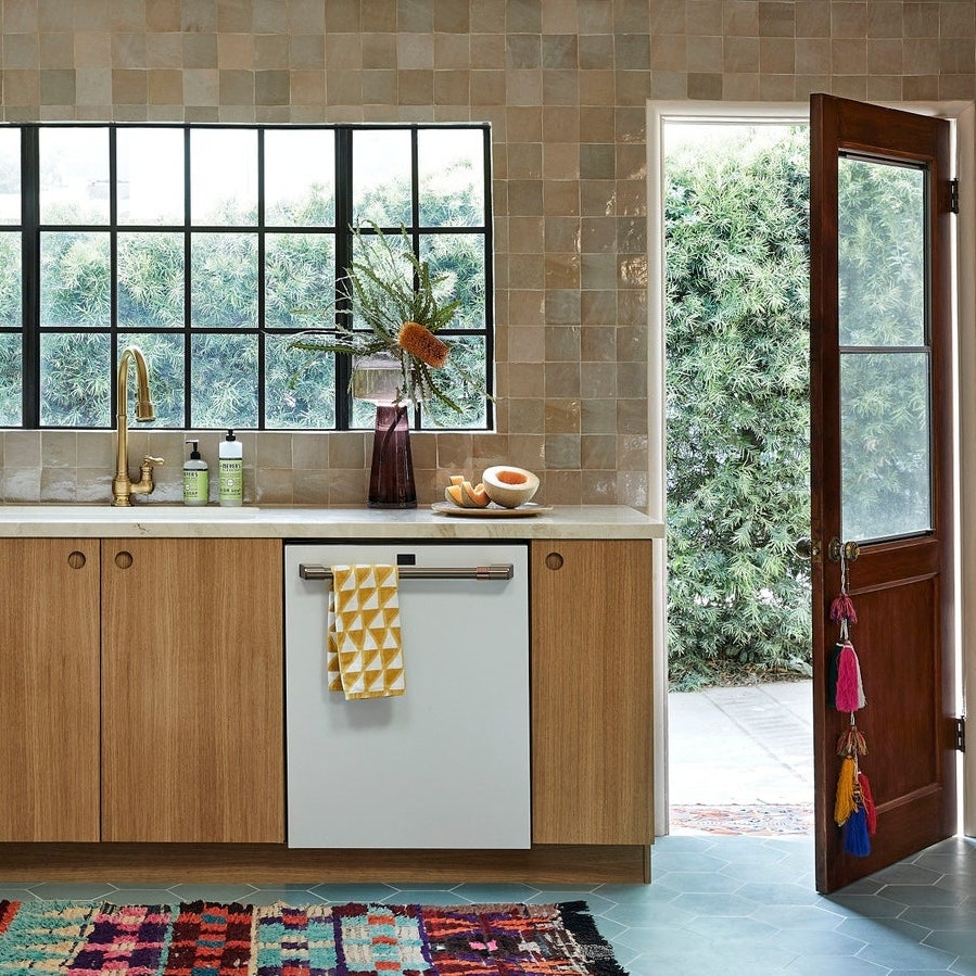
“Dinged-up.” That’s how Cheryl and Cody recall the condition of their circa-1915 St. Paul, Minnesota, bungalow the first time they set foot inside a few years ago. Nonetheless, the couple—who share two kids, a dog, and some chickens—deemed it not too shabby. They saw it as an upgrade from their existing 900-square-foot condo and the perfect size for their growing brood. Convinced it was the right move, the couple decided to call off all bets and make an offer. “We loved the historic charm of the bungalow. It had housed several large families before us and felt comfortable and lived-in,” Cheryl says. In fact, it was so lived-in that the rooms were falling apart, the layouts were obsolete, and the kitchen—a strange galley curiosity—could barely squeeze two cooks inside at once. But Cheryl and Cody (she’s a nurse, he’s a land surveyor) saw the potential and were confident in their ability to make the home livable (and lovable) with some help from interior designer Julia Miller of Yond Interiors. Their brief? To expand and update the kitchen while keeping one foot in the past.
As Julia further explains, the first step was moving the kitchen altogether. “Luckily, a previous owner had added a sunroom next door, so moving the kitchen there to gain some elbow room seemed like the obvious choice,” says the designer, who connected the space to the main living area to encourage natural light. As for the aesthetic, she gave the interior a sunshiney, detail-filled British slant. “The clients love traditional cabinetry so we obsessed over every little trim and measurement,” she adds.
If the end result is anything to go by, it’s safe to say that the kitchen is bigger—and better—than ever before. As Julia puts it, “it really reflects the homeowners’ bright and relaxed style.”
Location: St. Paul, Minnesota

The before: The previous version was pinched for space and wasn’t ideal for big cookouts.
The inspiration: “The clients came to us wanting an anything-but-normal-colored kitchen,” says Julia, who looked to English country kitchens for inspiration. “This aesthetic often marries bolder colors with traditional cabinetry, and that vibe felt right for the age of this home.” In an effort to avoid skewing too rustic, she opted for clean lines, modern lights, and pared-back details.


Budget: It was enough to get the English country look down pat.
Square footage: 300 square feet
Main ingredients:
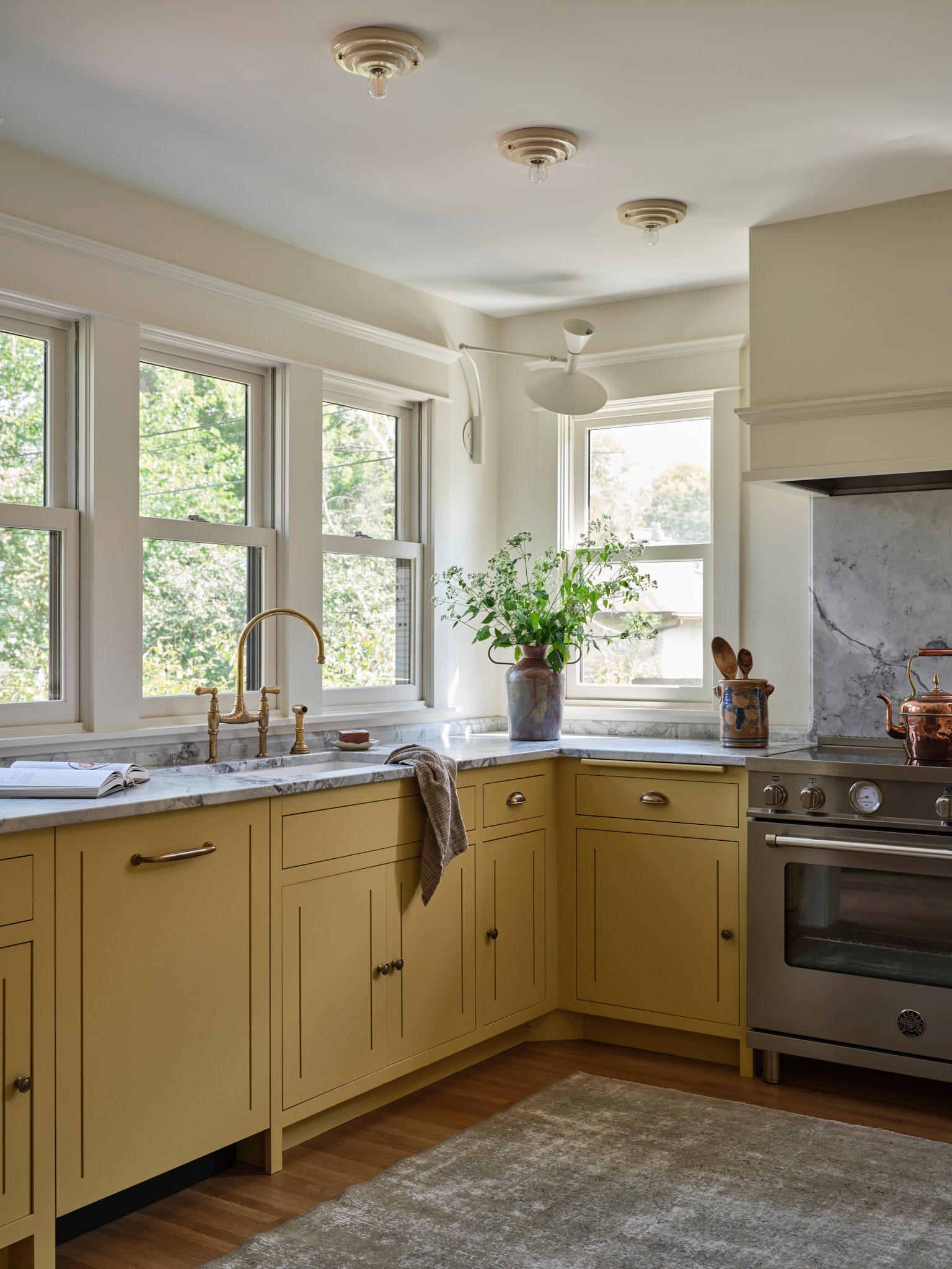
Cabinetry: According to Julia, the cabinetry is the crown jewel of the kitchen. “We knew that it would set the tone for the rest of the house, so we made sure to keep it historic so it would complement the home’s bones,” she says.


Hood: “We were inspired by the existing Craftsman millwork and applied similar details to the hood,” Julia says of the alabaster-toned hood insert. “Our goal was for it to feel like an extension of the house.”
Flooring: Two-inch red oak planks warm the floor, as they do the rest of the home.
Rug: “It’s held up perfectly over the decades, and, contrary to popular belief, it’s a durable option for such a high-traffic area,” Julia says of the vintage gray rug.


Counter stools: “We adore anything and everything handmade, and the stools by Andrew Finningan were perfect for under the breakfast counter—just the right size with the right amount of quirk,” Julia shares, the “we” in question being herself and the homeowners.
Wooden bench: Given that the kitchen is right off the mudroom, Julia thought of creating a little in-between spot with a cozy wooden bench.
Ceramic ceiling lights: Ceramic ceiling lights by Brooklyn-based ceramicist John MacLaren cast a soft glow come sundown.
Plate rack: The rustic plate rack is a great substitute for upper cabinetry, and, unlike the latter, doesn’t obstruct any natural light.

Backsplash and counters: Julia elected to use dolomite—a natural stone known for its durability and geometric veining—for the counters and skirting-style backsplash, maintaining a two-inch height for the latter to keep the spotlight on the cabinetry below. She used the same stone as a backdrop for the range.
Appliances: Julia chose a range by Bertazzoni for its classical styling and induction elements. The fridge is by Sub-Zero and the dishwasher is by Cove.
Most insane splurge: “Without a doubt the custom cabinetry,” Julia says. “The details and unique configuration are what make this project extra special.”
Sneakiest save: “Opting for the two-inch dolomite backsplash rather than investing in walls of tile.”
Favorite part: “The additional natural light and the increased function.”
What we’d never do again: “It went off without any glitches, so I’d do it all over again if I could,” Julia says.
Final bill: It was right on target.