Typography Tuesday
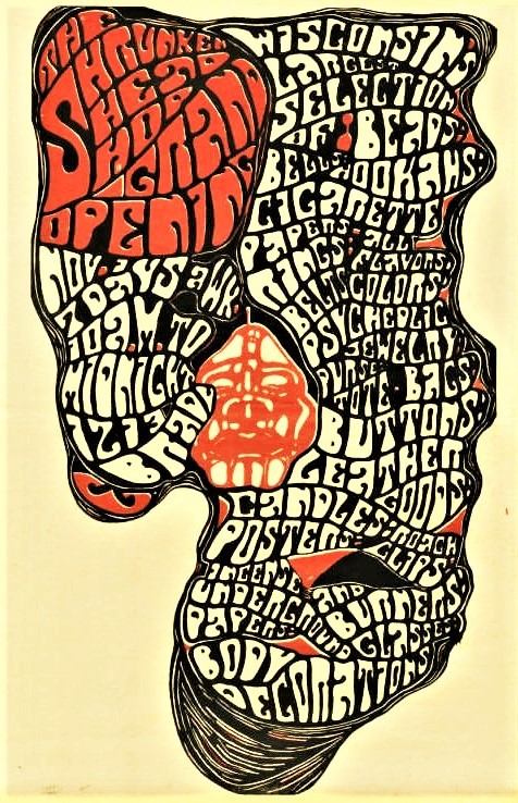
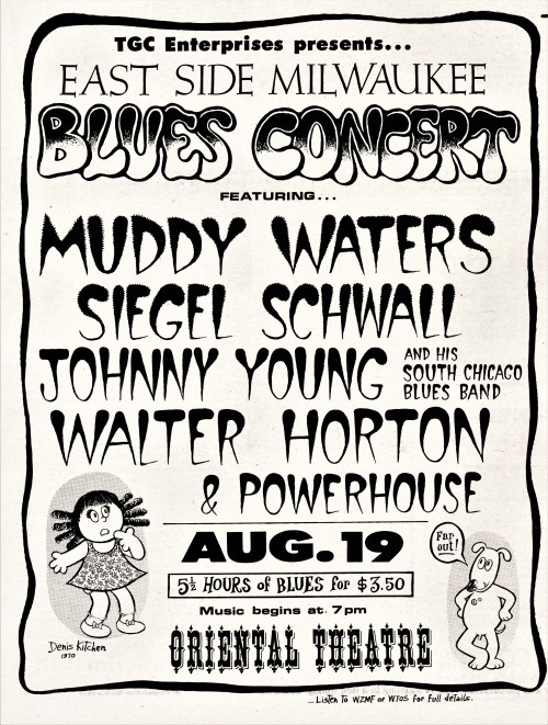
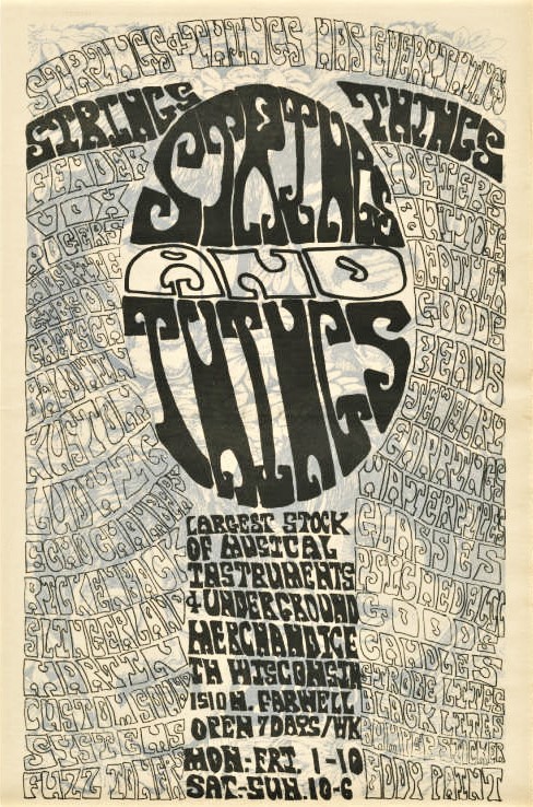
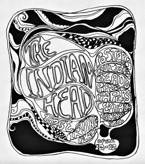
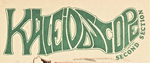
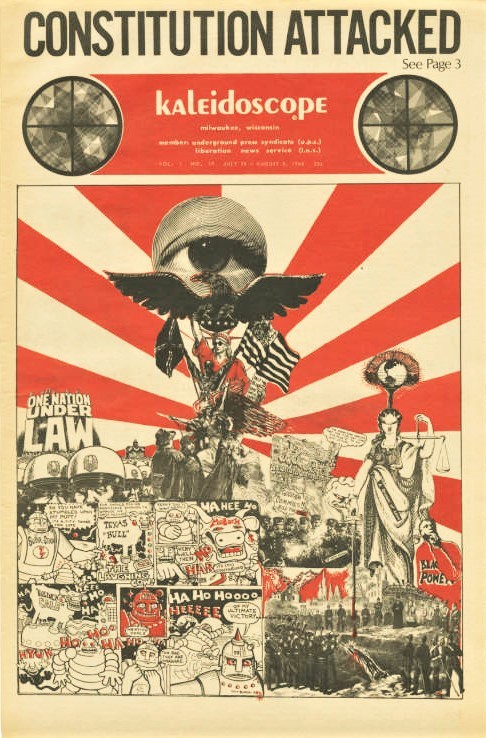
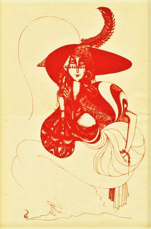
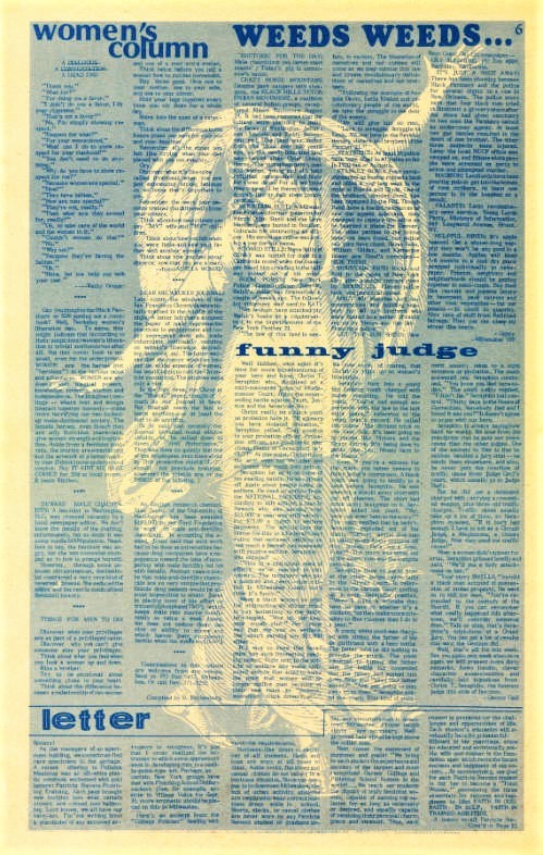
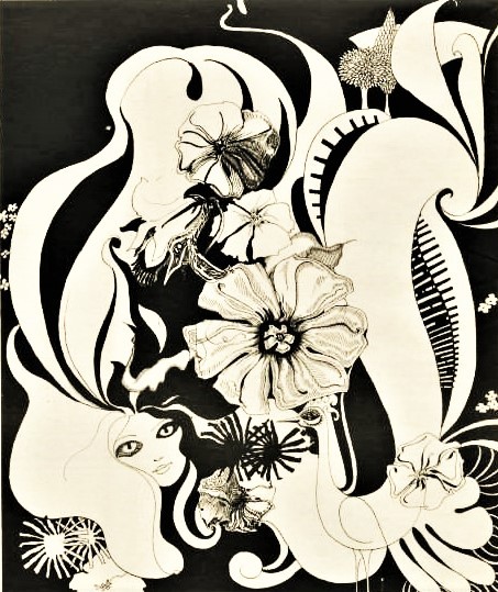
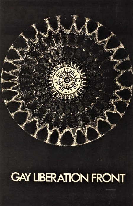
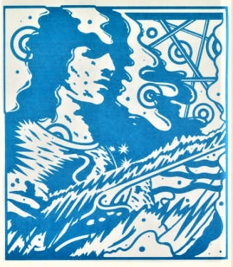
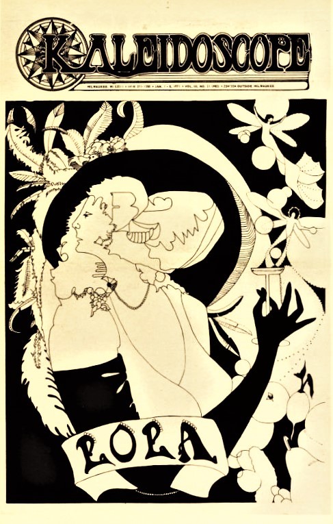
Last weekend we showcased some psychedelia from Milwaukee’s radical underground newspaper of the 1960s and 1970s, Kaleidoscope. Today we display some letter forms from this groovy time. Some of us may want to forget this lettering style, while others might wish for a comeback. For the latter, be cheered that psychedelic letters didn’t die with the 1970, but continue to live on with a range of psychedelic fonts.
With its abstract, swirling patterns, and very loud colors, the vividness and intensity of these letter forms recall the hallucinations of those under the influence of psychedelic drugs. While these designs certainly derive from the drug culture of the 1950s and 1960s, graphic designers of this period were also influenced by traditional design trends, such as Art Nouveau, Dadaism, and Pop Art. Psychedelic letters and fonts share the common elements of distortion, extremely ornate lettering, strong contrasts, collage components, and weird iconography.
We hope you groove on some of these letters, and if you want to see more, you can hang out with our digitized version of the collection.
View more posts on Kaleidoscope.
View our other Typography Tuesday posts.

