image
image

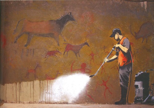
Whitewashing Lascaux, 2008. Leake Street Tunnel, Waterloo Station, London. Created for the Cans Festival, a 3-day street art street festival hosted and organized by Banksy in a tunnel under Waterloo Station.

image

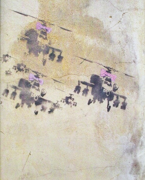
Happy Choppers, 2002. Hoxton, London. Produced during the “Operation Enduring Freedom” campaign in Afghanistan.

image

Kissing Coppers, 2004. Originally in Trafalgar Street, Brighton, UK. In 2011, it was cut out and shipped to New York to be sold by art dealer Stephan Keszler at a 2014 auction in Miami for $575,000. A replica has replaced the original.

image

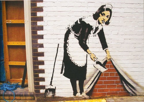
Sweeping it Under the Carpet, 2006. Hoxton, London where it appeared on the side of the White Cube Gallery, but has since been buffed.

image

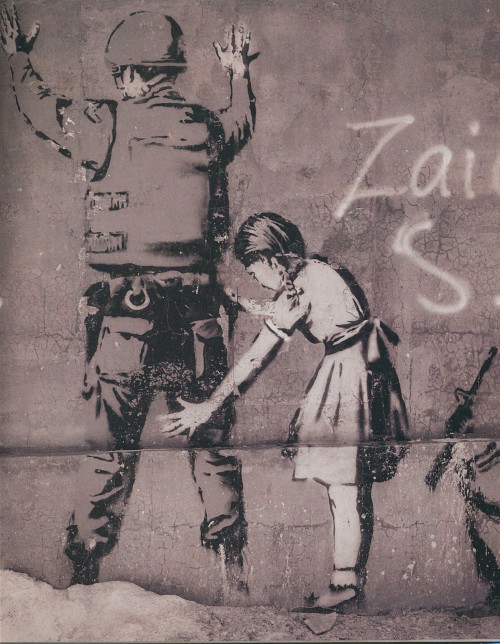
Girl Searching Soldier, 2007. Bethlehem, West Bank, Palestine. “Whilst the image is delightfully absurd, there is also a warning for Israeli occupying forces. One day, Banksy seems to be saying, our children will be investigating you for what you have done.”

image

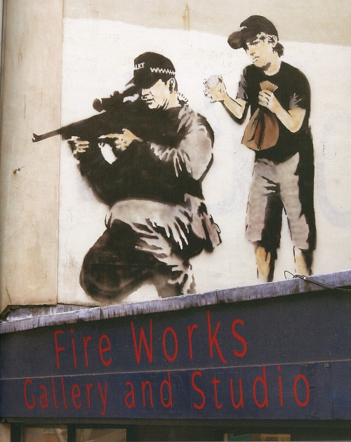
Police Sniper with Boy, 2007. Bristol, UK, but in 2012 was painted over with black paint and replaced by another work, the Queen as David Bowie, by a different street artist.

image

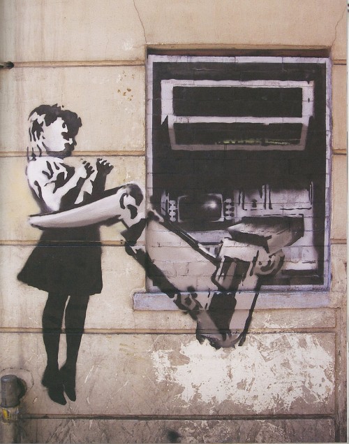
ATM Girl, 2007. Exmouth Market, Finsbury, London. Created a few months before the biggest financial crash since the 1930s.

image

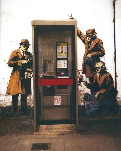
Eavesdropping, 2014. Cheltenham, UK, a sleepy, conservative, quintessentially English market town in Gloucestershire, but just three miles away from the Government Communications Headquarters (GCHQ).

image

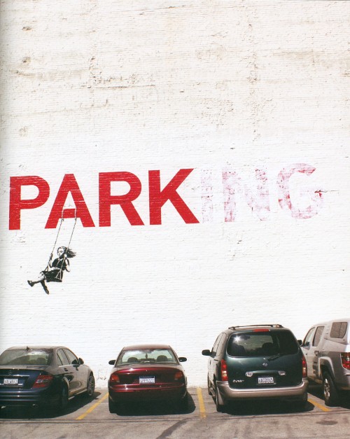
Park, 2010. Downtown Los Angeles on the side of designer Tarina Tarantino’s showroom a few blocks from the Los Angeles Theatre, painted just days before the premiere of Exit Through the Gift Shop at the Theatre.

image

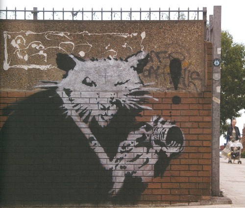
Photographer Rat, 2005. Islington, London. “Rats are a good role model … they have no respect for the hierarchy of society and the have sex 50 times a day.” – Banksy.

—————————————————————————-

Decorative Sunday: BANKSY

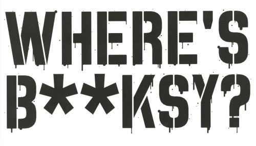
Decorative art, street art, fine art, political cartoon, all four? Where’s B**ksy?, an unauthorized selection of works by the infamous street artist by street art specialist Xavier Tapies published by Gingko Press in Berkeley, California in 2016, is the first survey of Banksy’s art career from 2002 to 2016. Arranged chronologically, every period has a double-spread world map showing where each of the stencils was painted, what happened to the work (destroyed/sold/auctioned/still there) as well as a summary of the direction Banksy’s art took in that period.

image

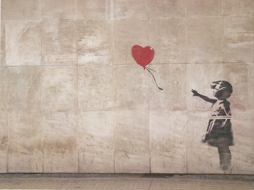
There is Always Hope, 2002. East staircase leading up to Waterloo Bridge, Southbank, London.

View more posts featuring Decorative Plates.

image
image
image
image
image
image
image
image
image
image

Staff Pick of the Week

Décoration moderne dans l'intérieur by Henry Delacroix (1907-1974) was published in Paris by S. de Bonadona, likely around 1935. Delacroix studied architecture at the National School of Decorative Arts of Paris joining his father’s architectural firm upon graduation. He made a name for himself reconstructing French cities after World War II, most notably City of 4000 in La Courneuve.  

Capturing Delacroix’s penchant for modern art deco inspired interiors, Décoration moderne dans l'intérieur is a portfolio of the genre’s luminaries. The publication contains forty-eight vibrant pochoir (stencil coloring) printed plates of designs by Francis Jourdain, Pierre Chareau, Georges Djo-Bourgeois, and the author, Henry Delacroix himself. He also included a seemingly heartfelt introduction that loosely translates to the idea of a man’s physical and spiritual needs being met through the luxury of a home that can facilitate the rest needed to nurture his imagination.  

Delacroix produced several portfolios of this kind showcasing ideas for an array of architectural settings and including painterly accessories inspired by Chagall and Matisse. A delight for anyone interested in interior design or color theory! Our copy of Décoration moderne dans l'intérieur is part of a gift from the estate of our dear friend Dennis Bayuzick.  

View other books from the collection of Dennis Bayuzick

View more posts featuring Decorative Plates.

View other Staff Picks.

– Jenna, Special Collections Graduate Intern 

image
image
image
image
image
image
image
image
image

Decorative Plates

It’s been awhile since we last posted something on the theme of the decorative arts, so I’m happy to have found this book—especially because it was mis-shelved in the stacks! This book is House and Garden’s Book of Color Schemes, which contains “over two hundred color schemes and three hundred illustrations of halls, living rooms, dining rooms, bed chambers, sun rooms, roofs, garden rooms, kitchens and baths; the characteristic colors of each decorative period; how to select a color scheme, with unusual treatments for painted furniture and floors; a portfolio of crystal rooms and eight pages of unusual interiors in color.” It was edited by long-time editor of House & Garden Richardson Wright (1887-1961) and Margaret McElroy, associate editor, and published by Condé Nast Publications, Inc. in 1929.

The book includes a large number of photographs of rooms, however, they are mostly in black and white—an unfortunate thing for a book about color! The promised eight color illustrations of rooms are not all present in our copy, but the five that are still in the book are shown here, alongside some of their black and white compatriots. I especially love the one titled “Tawny Yellow in Variety” that features a shocking amount of leopard print.

If you’ve read any of the posts I usually write, you know that I love a good binding—this one is a publisher’s binding in a chartreuse-y yellow book cloth with art deco-style silver tooling featuring stars and leaves. Somebody took it upon themselves to write the publication date on the cover above the title—how thoughtful!

View more posts featuring Decorative Plates.

– Alice, Special Collections Department Manager

image
image
image
image
image
image
image
image
image
image

A Wisconsin Decorative Arts Feathursday

This week we present some decorative avian motifs form the 1948 portfolio Decorative Art in Wisconsin by Anne Kendall Foote (1910-1986) and Elaine A. G. Smedal (1922-2014), published in Madison, Wisconsin by Screen Art Company. The portfolio is a follow-up to the authors’ 1946 portfolio Norwegian Design in Wisconsin, and was funded by a grant from the University of Wisconsin’s Committee on the Study of American Civilization. The portfolio includes 15 original silk-screened prints with photographs and descriptions of the artifacts that the designs are drawn from.

We were delighted that bird images were included, and particularly delighted that some of them were … CHICKENS!!

View more Feathursday posts.

View more posts on the decorative arts.

View more posts with CHICKENS!!

image
image
image
image
image
image
image

James Trissel’s Color for Letterpress

After being away from UWM Special Collections for the first part of the Summer, I was delighted to spend some time looking through some of the gorgeous work we recently acquired from the estate of Dennis Bayuzick. I was particularly taken by Color for Letterpress, published in an edition of seventy-five by The Press at Colorado College in 1978. The book was designed and printed by founder of the press, Jim Trissel. Over two decades, Trissel raised the press to a level of excellence attained by only a handful of academic letterpresses in the United States.

Jim’s son Ben, who worked beside him at the press, reflected on his father’s exacting standards in a memorial essay shortly after his death in 1999: “I remember once abandoning the initial layout of the Color for Letterpress book because the registration was off by a 1/32 of an inch. He stopped the press run, reconfigured the book’s enture structure, and printed it right.”

Color for Letterpress was printed on a Vandercook Universal Power 3 press. Trissel used mostly lithographic inks on BFK Rives paper from Arches, which he describes in the introduction as “very white,” and “dimensionally stable.” The book consists of an introductory text and three sections of plates housed in a white acrylic case. The plates of the first section, The Quartered Spectrum, utilize single hues with variations in density and temperature. Families of Analogous Color, the second section, “contrasts hues by temperature but prints individual hues in closely related groups or families.” The last grouping is called Six Complementary Pairs and shows contrasts in both hue and temperature. “The book is accordion-bound,” writes Trissel, “to permit an easy display of the plates.”

image

Check out more from the Collection of Dennis Bayuzick here.

Find more Decorative Sunday posts here.

-Olivia Hickner, Special Collections Graduate intern

image
image
image
image
image
image
image
image
image
image

Decorative Sunday

This week we present some dados from volume 9 of the Jeypore Portfolio of Architectural Details, published in twelve volumes by Bernard Quaritch between 1890 and 1913. A dado is the lower part of a wall, below the dado rail and above the skirting board, that is often given over to decorative treatment.

Issued under the patronage of Maharaja Sawai Madhu Singh, the Jeypore Portfolio was prepared under the supervision of Colonel Samuel Swinton Jacob, Indian Staff Corps, Engineer to the Jeypore State, and Lala Ram Bakhsh, head draftsman and teacher in the Jeypore School of Art, and was photo-lithographed by William Griggs of London, the inventor of photo-chromo-lithography. The Portfolio was intended to serve as a record of the architectural heritage of the Jeypore State and the north-west region of Rajasthan. As a record, it would “rescue (such) designs from oblivion and give them new life.”

Of the 12-volume set we only hold volumes 7 (String and band patterns), 9 (Dados), and 10 (Parapets). These have been digitized and may be found in our digital collections.

View other posts from the Jeypore Portfolio.

View more Decorative Sunday posts.

Decorative Sunday

A few months ago, I posted images from the first Graphis Annual, check out that post for some background on the early days of Graphis. Since that inaugural Graphis Annual in 1952/53, the Graphis family of publications has expanded to include a number of annual reviews, starting with the Graphis Photo Annual in 1966 and the Graphis Poster Annual in 1973. The images here are from the Design Annual 2022, published by Graphis Inc. in New York, NY. Graphis also now publishes annuals in advertising as well as a New Talent Annual highlighting exceptional student work.

It is interesting to compare more current Graphis Annuals with earlier ones, not only to note changes in aesthetic sensibility, but also to note the expansion of ambitious design work into areas like corporate annuals and/or environmental reports. The image above that looks like the cover of a manga, for example, is actually the annual report for Nissin Foods Holdings Co., LTD., a Japanese company that specialized in convenience foods like Cup Noodles (which I was very surprised to learn hasn’t been called Cup O’ Noodles since 1993 … Mandela effect?). I was also pleased to see how much book design was featured in the annual, though I do admit to over-representing book design in my choices here. I just couldn’t help myself!

Find more Decorative Sunday posts here. 

-Olivia, Special Collections Graduate Intern

Decorative Sunday with Henry P. Kirby

These charming sketches are the work of New York architect Henry P. Kirby (1853 - 1915). Architectural Compositions contains fifty loose plates printed on Whatman paper and housed in a portfolio. It was published in Boston in 1892 by Bates, Kimball & Guild, publishers of one of the United State’s leading architectural journals of that time, The Architectural Review (Boston), not to be confused with the longer running Architectural Review still in publication out of London. 

Kirby would have been working as a draftsman for George B. Post at the time of publication, for whom he later worked as lead designer before striking out on his own. Some of the subject matter also evokes Kirby’s time in France, where he studied at the École des Beaux-Arts after training with his father, also an architect. Per the subtitle, some of the sketches were “made in connection with actual projects,” while many were “the result of study during leisure moments.” I found Kirby’s eye for the human elements in his sketches particularly endearing, from the foreground figures to details on the buildings themselves, like open widows and overgrown foliage, or what looks like a duvet cover hanging out to dry (first image above). 

For any music buffs reading, the final sketch includes some bars of “Très-jolie” from the opéra comique smash hit La Fille de Madame Angot

Our copy of Architectural Compositions was gifted to UWM by Gustav A. Elgeti in 1966. 

Find more Decorative Sunday posts here.

-Olivia, Special Collections Graduate Intern

Decorative Sunday

This week’s plates are from the first volume of La Décoration Primitive, a collection of portfolios documenting the decorative art of Africa, Oceania, and the Americas (the last in two volumes, separated by pre- and post-Columbian). The four volumes were published in Paris by the photography and decorative arts publisher A. Calavas for Librarie des Arts Décoratifs, likely in 1922. The art critic and theorist Rosalind Krauss postulated that these volumes, along with Calavas’s other publishing for Librarie des Arts Décoratifs, were “published specifically for the instruction of arts and design students” in her 1985 work The Originality of the Avant-Garde and Other Modernist Myths.

While the Oceania and two American volumes contain introductory texts by Daniel Réal, a painter and curator at the Musée d'Ethnographie du Trocadéro, the text of La Décoration Primitive Afrique is by P.-C. Lepage. Lepage opens his introduction by addressing the use of the term “primitive,” insisting it is not used pejoratively. Indeed, “primitive art” was the most pervasive term used to describe non-Western art at the beginning of the 20th century. The term has declined in use as more of the art world has recognized the explicitly derogatory connotations. The rest of Lapage’s introductory text goes on to extoll the richness of the artistic tradition of the African continent, and laments the “disastrous influence” of les blanches in Africa, first by destroying “tout ce qui était à portée de leur ardeur iconoclaste (everything within reach of their iconoclastic ardor).” 

-Olivia Hickner, Special Collections Graduate Intern

The Berlin Painter

Of all the vase painters of ancient Athens, there is one who continues to captivate all those who witness their works, not only for their splendor and skill, but also for their mystery. The identity of the artist dubbed the Berlin Painter is something we may never know. Although over 200 pieces have been identified as being painted by this individual, none of them hold the name of the artist. This is highly unusual, since by the time of the early 5th century BCE, the period when the Berlin Painter’s vases are dated, both master potters and painters would commonly place their names on their favored works.

The Berlin Painter and His World: Athenian Vase-Painting in the Early Fifth Century B.C. edited by J. Michael Padgett, Curator of Ancient Art at the Princeton University Art Museum, and published by the Museum in 2017 on the occasion of exhibitions of the same name at the Princeton University Art Museum and the Toledo Museum of Art, is the definitive work on this ancient Greek artist, and includes an updated catalogue raisonné, With contributions by several leading scholars, the work seeks to rebuild the ancient city of Athens though the ceramic remains by artists such as the Berlin Painter.  

The highly decorated pottery of ancient Athens allows us to see the wide spread of influences this culture had on both the Mediterranean world and Central Europe. While beloved by those in the Hellenic world, others imported the pottery, as luxury items and elaborate symbols of wealth. The Etruscans from the Italian peninsula regularly furnished their tombs with kraters, wine mixing vessels, and the Celts of modern-day France and Germany would regularly feast using the Athenian pottery. Though lacking the fast-traveling methods available today, the broad distance where Athenian pottery can be found demonstrates that the cultures of the Mediterranean and Europe were closely connected.

View more Decorative Sunday posts.

View more of my Classics posts.

View more posts on Ancient Greece.

– LauraJean, Special Collections Classics Intern.

  • Archive