James Trissel’s Color for Letterpress
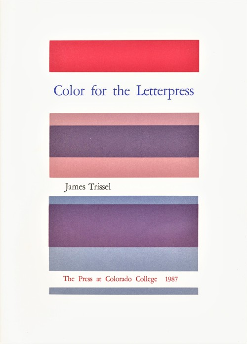
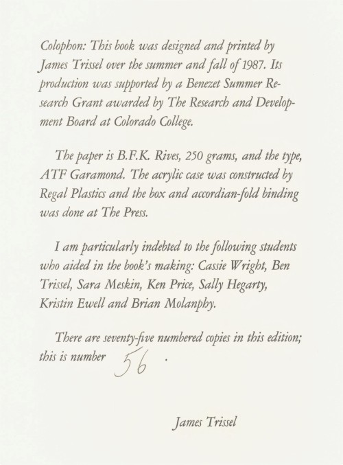
After being away from UWM Special Collections for the first part of the Summer, I was delighted to spend some time looking through some of the gorgeous work we recently acquired from the estate of Dennis Bayuzick. I was particularly taken by Color for Letterpress, published in an edition of seventy-five by The Press at Colorado College in 1978. The book was designed and printed by founder of the press, Jim Trissel. Over two decades, Trissel raised the press to a level of excellence attained by only a handful of academic letterpresses in the United States.
Jim’s son Ben, who worked beside him at the press, reflected on his father’s exacting standards in a memorial essay shortly after his death in 1999: “I remember once abandoning the initial layout of the Color for Letterpress book because the registration was off by a 1/32 of an inch. He stopped the press run, reconfigured the book’s enture structure, and printed it right.”
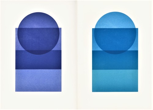
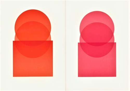
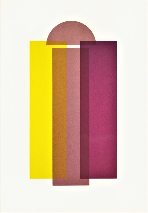
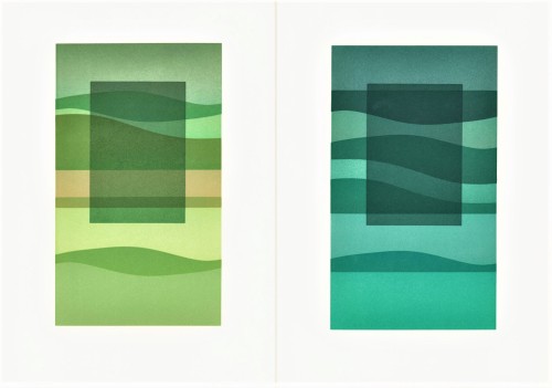
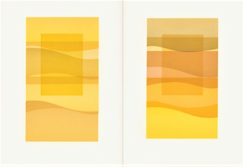
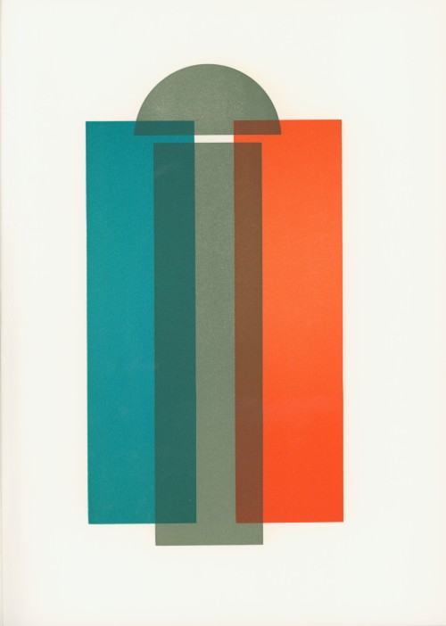
Color for Letterpress was printed on a Vandercook Universal Power 3 press. Trissel used mostly lithographic inks on BFK Rives paper from Arches, which he describes in the introduction as “very white,” and “dimensionally stable.” The book consists of an introductory text and three sections of plates housed in a white acrylic case. The plates of the first section, The Quartered Spectrum, utilize single hues with variations in density and temperature. Families of Analogous Color, the second section, “contrasts hues by temperature but prints individual hues in closely related groups or families.” The last grouping is called Six Complementary Pairs and shows contrasts in both hue and temperature. “The book is accordion-bound,” writes Trissel, “to permit an easy display of the plates.”
Check out more from the Collection of Dennis Bayuzick here.
Find more Decorative Sunday posts here.
-Olivia Hickner, Special Collections Graduate intern
