Velo: Working with the Monitoring Dashboard
When managing a site with backend code and Wix Data API requests, it's important to monitor the code's performance. That way, you can make sure your visitors have the best possible experience. This article describes how to use Velo's built-in Monitoring dashboard as a solution for monitoring site performance.
In addition to this tool, you can also monitor site performance using Wix Logs. These are internal and external logging tools that allow you to track and store your live logs.
Access the Monitoring dashboard
To access the Monitoring dashboard, do the following:
-
Enable coding:
- Wix Studio: If necessary, click
and then Start Coding.
- Wix Editor: Enable Velo Dev Mode for your site.
- Wix Studio: If necessary, click
-
Select Developer Tools from the Code sidebar (Wix studio), or the Velo Sidebar (Wix Editor). Under the Monitoring section, select Monitoring. Alternatively, you can select Developer Tools in your site's dashboard. Then select Monitoring.
About the Monitoring dashboard
The Monitoring dashboard helps site owners, in-house developers, and other service providers do the following:
- Track the performance of your backend code and data requests over time.
- Monitor the amount of storage space your collections are using.
- Detect when your site isn't performing as expected.
- Troubleshoot and determine the causes of a site not functioning well. Is it because of a temporary problem or an ongoing issue? Is it because a quota was reached? Did a Wix or a user error occur?
Understand the dashboard
The Monitoring dashboard is divided into several sections:
Overview
The top section of the dashboard displays a high-level overview of backend requests, data requests, and collection storage on your site. Exclamation icons  indicate which parts of the site performance need attention. The section includes links for more guidance.

Breakdown
The middle section of the dashboard displays a breakdown of your site's performance. There are separate tabs that display information about backend requests, data requests, and collection storage. When you open the dashboard, the Backend Requests breakdown displays by default. To see one of the other breakdowns, click the appropriate tab.

Here's what you'll find in each of the breakdowns:
Backend Requests
This breakdown displays information about requests to your backend code made from your site's frontend. Backend requests include HTTP functions, router hooks, and web module calls made from your frontend code. By default, the dashboard displays aggregated information about all the requests made to all the backend functions on your site. You can use the filters to display request data for specific functions and time periods.

The Backend Requests breakdown includes these panels:
Total requests
This graph shows how many backend requests ran over time. Use this graph to look for unusual numbers of requests running on any particular day.

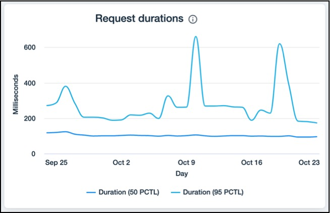
Request durations
This graph displays the durations of the 50th and 95th percentiles of the most time-consuming requests.
The 50th percentile (blue line) is the mean average of the duration of the requests. This means that at any point on the blue line, 50% of the requests took that long or less to complete during that day/hour.
The 95th percentile (turquoise line) indicates the 5% of the requests with the longest durations. This means that at any point on the line, 95% of the requests took that long or less to complete during that day/hour.
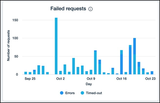
Failed requests
This graph shows the requests that failed due to request-per-minute (RPM) throttling, timing out, or an error. Errors might be caused by your site's code or an internal Wix error. Several things might cause a spike in the number of failing requests. These spikes need investigation.
Top backend functions
This table shows the backend functions with the most traffic and their corresponding details. If there are more than 100 functions, the table only displays the first 100. You can resize and sort each column. When sorting, all functions are taken into account, not just the first 100 that are displayed.

Data Requests
This breakdown displays information about data requests made by your site. This includes requests from your site's code to the Wix Data API as well as requests made by the Content Management System (CMS) and dynamic pages. Data requests include querying your site's collections, as well as saving and deleting data. By default, the dashboard displays aggregated information about all the requests made to all the collections on your site. You can use the filters to display request data for specific collections, operations, and time periods.

The Data Requests breakdown includes these panels:
Total requests
This graph shows how many data requests ran over time. Use this graph to look for unusual numbers of requests running on any particular day.

Request durations
This graph displays the durations of the 50th and 95th percentiles of the most time-consuming requests.
The 50th percentile (blue line) is the mean average of the duration of the requests. This means that at any point on the blue line, 50% of the requests took that long or less to complete during that day/hour.
The 95th percentile (turquoise line) indicates the 5% of the requests with the longest durations. This means that at any point on the line, 95% of the requests took that long or less to complete during that day/hour.

Failed requests
This graph shows the requests that failed due to request-per-minute (RPM) throttling, timing out, or an error. Errors might be caused by your site's code or an internal Wix error. Several things might cause a spike in the number of failing requests. These spikes need investigation.

Top data requests
This table shows the data requests with the most traffic, and their corresponding details. For each request, the table indicates a collection and a request type. If there are more than 100 functions, the table only displays the first 100. You can resize and sort each column. When sorting, all functions are taken into account, not just the first 100 that are displayed.

Content Collection Storage
This breakdown displays the amount of data stored in your site's content collections. Each Wix site can store up to 10 GB of data in its collections. This quota doesn't apply to external database collections or Wix app collections. It also doesn't apply to other media stored on your site or documents and multimedia referenced from a collection.
Learn more about the content collection storage quota.
The Content Collection Storage breakdown has only one panel, Collection storage breakdown. This table lists the largest collections on your site, indicating both the collection name and ID. You can resize and sort each column.

Further Guidance
The bottom of each breakdown section in the dashboard has two links. The first is to a guide for optimizing your site to prevent failed requests or minimize storage usage. The second is a link for connecting your site to Google Cloud Logs. If you have already connected your site, the link opens Google Cloud Logs.

Example: Use the Dashboard
Here is an example of how you can use the dashboard to solve an actual issue that might arise.
-
In the overview, notice a peak of 622 failed backend requests over the past 30 days.
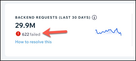
2. Let's look at the Failed Requests breakdown to detect whether the main reason for the issue is RPM throttling, timed-out requests, or errors. We can see that most of the failed requests are timed-out (turquoise).

-
Our next step is to look at the graphs and table for specific functions to see if we can identify problematic ones. We noted in the previous step that timeouts are our issue. To see the functions with the most timeouts, click the Timed-Out column in the Top Backend Functions table, to sort in descending order.

- The getUserDetails function has timed out the most. Focus on this function by filtering for it. Filtering affects all the charts and the table.

-
We can view the Request Durations graph to see the median duration of the function. This gives us a better sense of the durations for the getUserDetails function.
-
We can also look at the Failed Requests chart again for this function to understand if the problem is ongoing or if it peaks on a specific day.
-
View Wix Logs in Google Cloud Logs to see if you find information about why requests are taking so long.
-
Now that we've identified the problematic function, we can start recognizing any quotas that the site reached and looking for possible solutions. Solutions might include batching the requests, combining Wix Data requests, and/or upgrading to a premium Wix site. Optimize your code according to the suggestions and publish your site.
-
Monitor your site using the Monitoring dashboard in the coming days to make sure the problem is resolved.