Nashville Predators
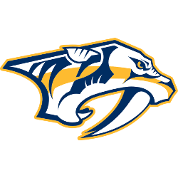
This logo is a slightly different take on the original, with an altered color scheme and simpler design. Also, the tiger’s eye now has a more distinct pupil. The logo features the side head shot of the saber-toothed tiger with blue and gold highlighted features and a gold trim around the logo.
Predators Wordmark Logo
In 2003, it was time for an update as part of a league-wide redesign project that saw many teams revamp their logos and uniforms. The new look for Nashville featured a more realistic saber-toothed tiger head inside a shield shape with five stars representing each point on its outline – four white ones along its sides plus one gold one at the top center symbolizing victory or success in battle (which is fitting given hockey's competitive nature). It also had two crossed swords beneath it, which could be interpreted as either protection or aggression, depending on how you view them; either way, they added another layer of symbolism to this already powerful mark!
Finally, after nearly 15 years with this design, 2018 marked yet another rebranding effort from Nashville, which included updating both their primary logo & wordmark logo - replacing “Predators” lettering within the shield shape & starry background, respectively - but keeping the same overall concept intact so fans can still recognize team instantly even if some elements are different now than before! With all these changes over time, though, one thing has remained constant: Nashville Predators' commitment towards excellence both on the ice and off, making sure everyone knows who they are every step along their journey to winning Stanley Cup someday soon, hopefully sooner rather than later...

Nashville Predators
2012 - Present
Double lined wordmark "NASHVILLE" in blue and "PREDATORS" in white with blue and yellow outline.
Font: Interdiction Font
http://fonts.simplythebest.net/font/853/Interdiction-font.font

Nashville Predators
1999 - 2011
Double lined wordmark "NASHVILLE" on top in solid blue and "PREDATORS" on the bottom in white with blue and yellow outline.
Font: Interdiction Font
http://fonts.simplythebest.net/font/853/Interdiction-font.font

Nashville Predators
1999 - 2003
Double lined wordmark "NASHVILLE" on top and "PREDATORS" on bottom. Both wordmark is in white with blue and yellow outlines.
Font: Interdiction Font
http://fonts.simplythebest.net/font/853/Interdiction-font.font


