(1) DONE ✅ - checked in commons wmf.7 - looks as designed. **In Category (optional) and Location (optional) labels the font for optional looks larger than in the figma design
| figma design | commons beta |
|---|---|
 |  |
"optional" text size should be the same as the title text size. If it is already the same size then its okay but looks slightly bigger as pointed our above. Also it looks slightly darker than it is in Figma.
(2) DONE ✅ - checked in commons wmf.17 spacing and other minor improvements
@sneha's comment
the spacing around the "Additional information" label's description needs to be fixed
In the current spacing it seems like there is equal amount of spacing above and below the description line "Add the following to make your work more discoverable. Be as specific as you can."
This line should be closer to the title "Additional information" and more space under it.

Correct spacing

Split from comments - T361050
| commons wmf.17 |
|---|
 |
(3) DONE ✅ - checked in commons wmf.17 additional spacing corrections from @Sneha

| commons wmf.17 |
|---|
 |
(4) Location DONE ✅ - checked in commons beta- Should the map icon be displayed in one row, aligned with the coordinates fields or to be placed on a separate row?
| commons wmf.7 | commons beta |
|---|---|
 |  |
(works as expected) - un-collapsed map is presented as a popup; figma design displays a map differently:
| figma design | commons wmf.7 |
|---|---|
 |  |
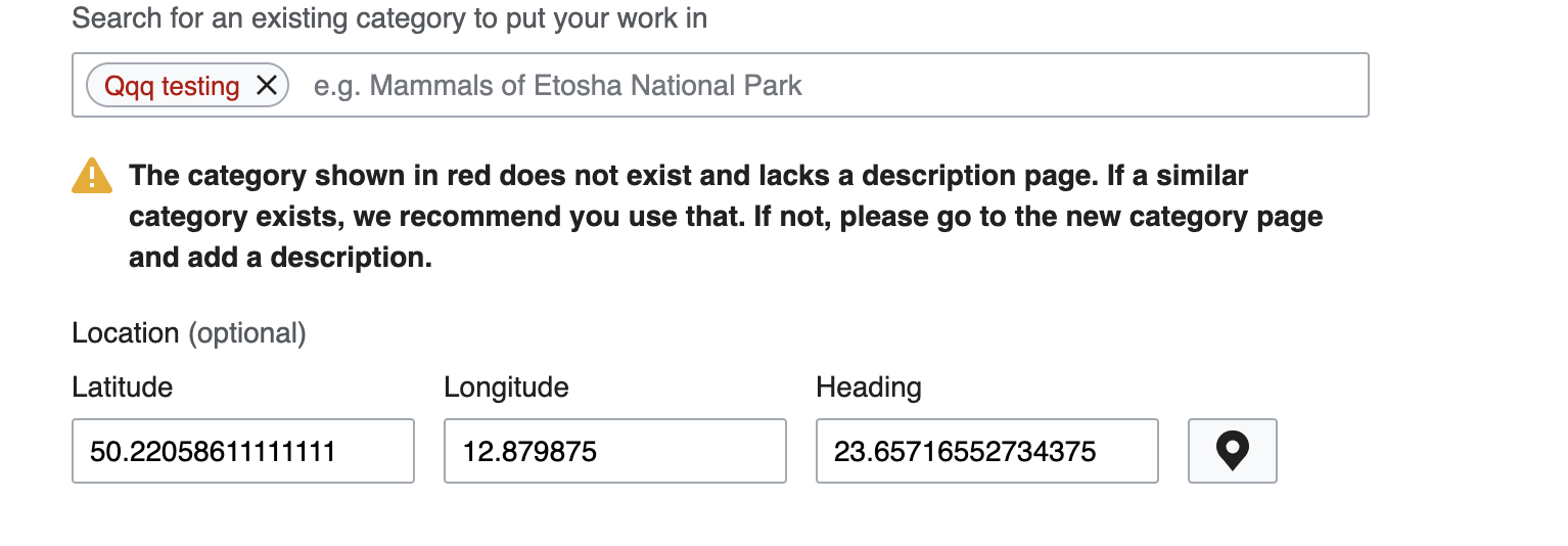
(5) DONE ✅ - checked in commons beta non-existing Category warning has a different icon and styling (refer to figma design for category warning)
| figma design | commons wmf.7 | commons beta |
|---|---|---|
 |  |  |
DONE ✅ - checked in commons wmf.17 Other minor improvements
some of the label description has period at the end of it some don't. We need to make them consistent.
