WCAG 2 vs APCA Comparisons #30
Replies: 11 comments 17 replies
-
|
When you look at this entry about CSS https://www.w3.org/TR/css-color-5/#colorcontrast |
Beta Was this translation helpful? Give feedback.
-
|
Yes, definitely helps clarify between CIE Luminance, CIELAB, CIELUV and SAPC with the latter being a mixture of curves. |
Beta Was this translation helpful? Give feedback.
-
|
@Myndex – at your leisure, I would appreciate having the numbers provided in OP. Fails and passes is good, but I also want to see how close each sample gets. An APCA pass/fail is also not an unambiguous term for me (at this moment in time). Relatedly, and maybe this should be its own discussion, I would like to understand better the statement that The lookup table for 12pt/16px normal weight has |
Beta Was this translation helpful? Give feedback.
-
|
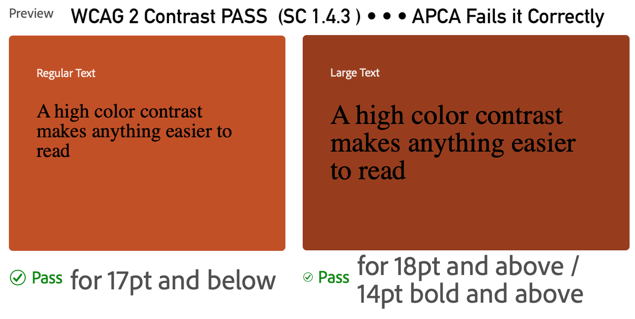
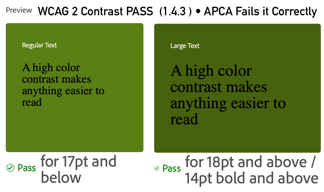
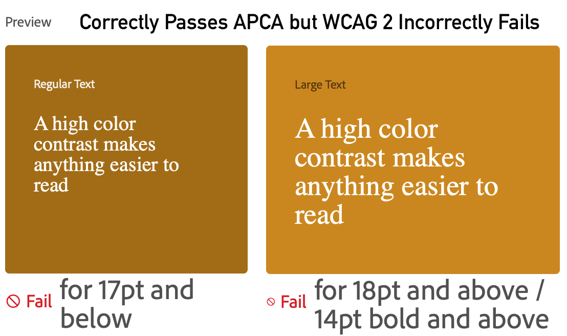
Hi Bruce @bruce-usab Sorry for the delay, to answer your question of what the values were for the pass fail tests. I made them small below just for reference. In reference to the below values, In the worst case when WCAG_2 is incorrectly passing colors it should fail, APCA is failing them by about Lc30 or so which is about half the contrast needed to properly pass. For the colors WCAG_2 is failing but should reasonably pass, APCA is passing them by about Lc15 or so. This is with the full APCA. With Bridge-PCA, the false failings are the same (must be for backwards compatibility). This also means that Bridge-PCA fails the false passes by more like Lc45. If we convert this to ratios similar to WCAG_2, then that means for dark colors that WCAG_2 rates as 4.5:1 are actually about 1.8:1, and colors light colors (white text on a color) that WCAG_2 rates as failig 3:1 should be about 4.5:1, and 4.5:1 should be about 6:1 Examples of WCAG 2 incorrect passes of unreadable contentIn these examples with black text
Examples of WCAG 2 incorrect fails of okay contentIn these examples with white text
|
Beta Was this translation helpful? Give feedback.
-
|
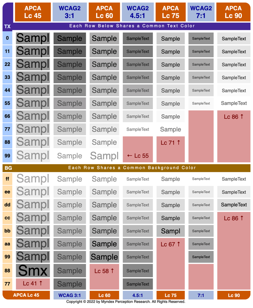
Hey Bruce, @bruce-usab I created this chart that really lays out the differences incrementally. In the top half of the chart, each row has the same TEXT color, in the bottom half of the chart, each row has the same BG color. I think this does the best job of demonstrating how the different key levels compare. The blank light-red areas indicate where the end of the visible range was reached for the given contrast level.
DISCUSSIONOn the far left column, the text is obviously bolder, as required under APCA guidelines per the current APCA tool, for that font size and weight. While WCAG_2 degenerates to an unreadably-low-contrast as colors get darker, APCA maintains readability across the visible range, and you may notice a slight increase in contrast for darker colors to address the cases of display flare and misadjusted black levels in monitors, and particularly the psychophysical phenomenon relating to colors in the mesopic range of vision where rod-intrusion impacts contrast perception (Rudd et al 2007). Thank you! Andy |
Beta Was this translation helpful? Give feedback.
-
|
Hi Bruce @bruce-usab
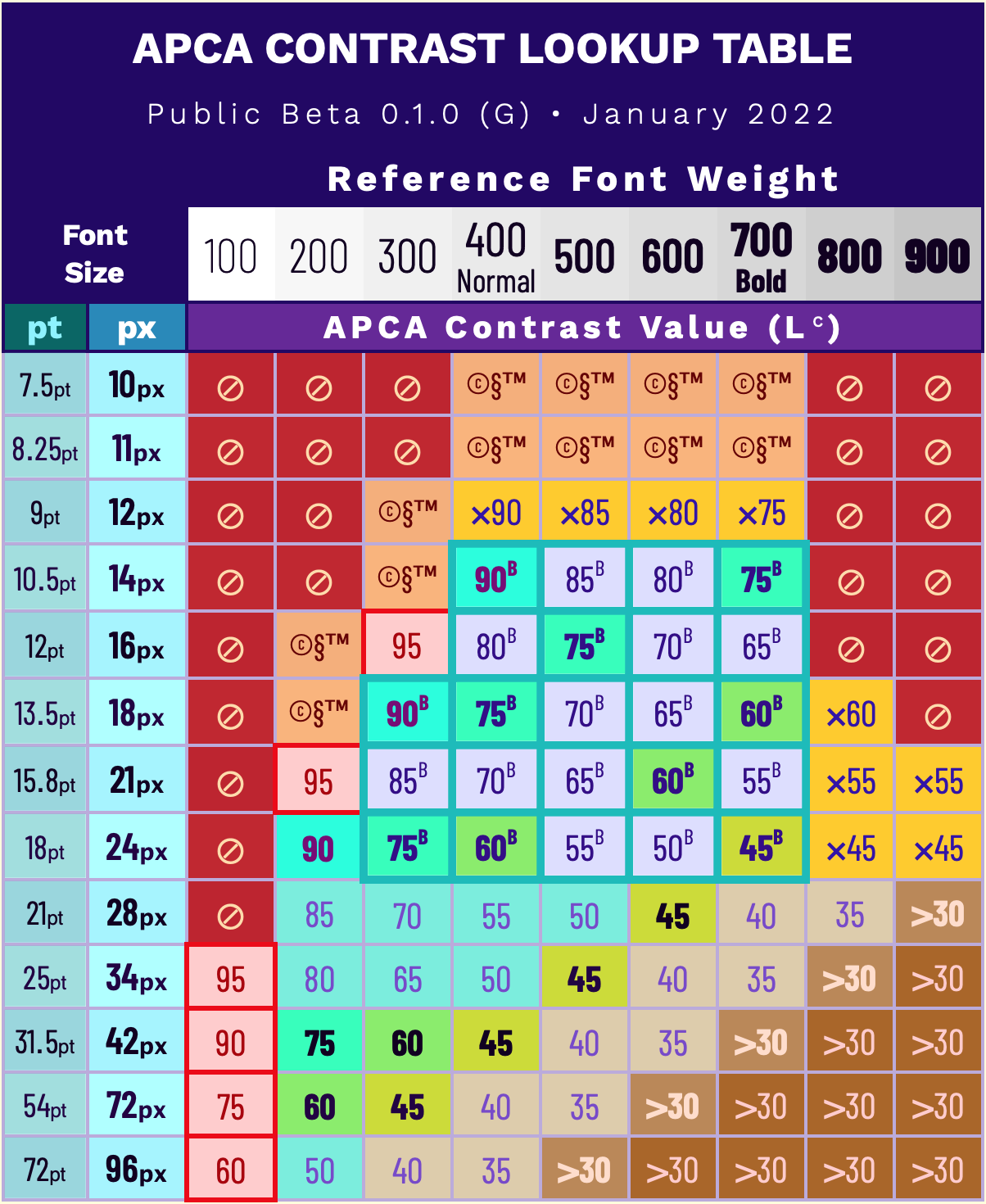
I want to address this one further:As you know one of the things I have tried to balance is that of not failing existing sites that are generally well designed, and a desire to have a "certain amount" of alignment with WCAG 2 and 1.4.3. This led to some of these values. Among the issues that are not as well resolved (though "stuff is in the works") are that of x-height, and uniform font weight properties, and some issues relating to how different browsers rasterize fonts, etc etc... The pressing question has been, what is too much, what is not enough — too much degrades design flexibility, and too little does not achieve the desired results of accessibility and readability. WCAG 2 has both of these problems. At times, demanding more than reasonably needed causes "false fails" and the more serious problem on the other end allowing false passes. The false fails annoy designers and clients who want to know why something perfectly readable is being rejected. Meanwhile skilled designers get no benefit from the false passes, as they would not choose color pairs so unreadable in the first place. The fact that anyone can see that something is unreadable even when WCAG_2 passes it led to the current climate of confirmation bias as in "oh it works". But it doesn't, it only seems to work because people manually toss out the false passes. But CSS is planning an automatic color contrast property which will won't be particularly useful without someone to intervene and toss out the bad colors manually, which is demonstrated in the comparison I discuss in this article on TangledWeb. (written in a different style that I write here fwiw.) No ifs ands or LUTSThat said, I've been working with the LUT, rebalanced a bit again, moving Lc 75 to apply to 18px, and moving 16px to Lc 80, and considering bumping the entire 16px row up another Lc 5 so that 16px normal weight is Lc 85, and keeping 14px as the hard minimum for body text at Lc 90. At the same time, fonts larger than 32px were getting a bit more than needed. If you look at the chart, the central "body text zone" has the most movement, Lc 60 for 24px rapidly climbing to Lc 90 for 14px. This is in keeping with well established contrast sensitivity/spatial frequency curves. 24px normal was chosen as the pivot on Lc60 for alignment with WCAG_2. That and in working with Bridge-PCA, I see two ways to handle conformance.
For These general levels are appropriate for use without reference to the lookup table.
The Revised Lookup TableSame guidance as before except to add:
As I mentioned, considering bumping the entire 16px row up 5px, and also extending the body text range up to 28px or 34px. And in these cases, the key is if the indicated value is less than Lc 75, then add Lc15 to it. NOTES ON FONT SIZEFont sizes listed above assume an x-height ratio of at least 0.52. Font weight is based on highly standardized reference fonts such as Helvetica or Arial. "px" means the CSS reference px not device pixels. The reference px is defined as 1.278 arc minutes of visual angle. All for now, thank you for reading! Andy |
Beta Was this translation helpful? Give feedback.
-
|
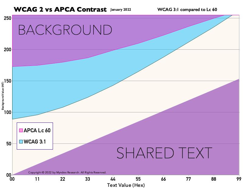
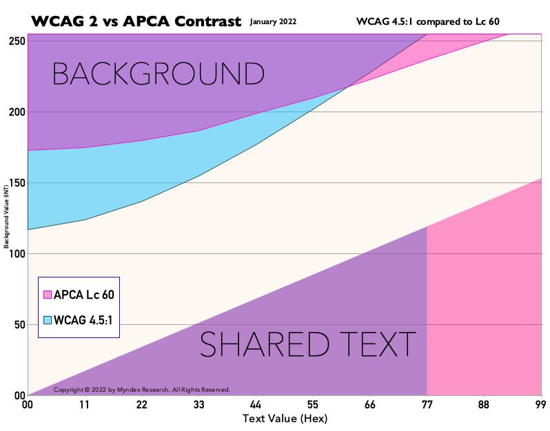
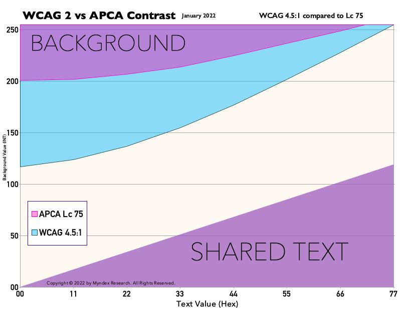
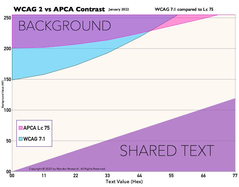
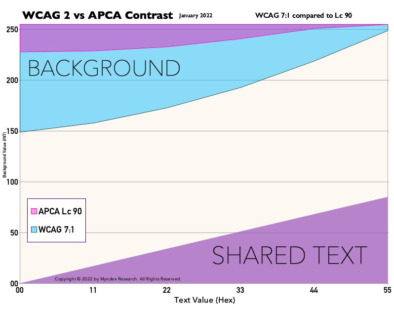
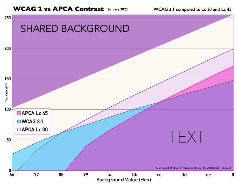
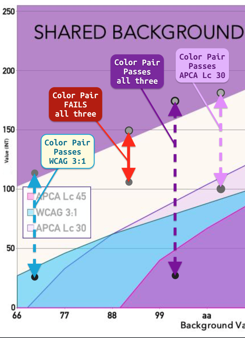
Hey Bruce @bruce-usab Venn-Type DiagramsLet me know if this answers your questions as far as Venn diagrams-type charts are concerned. Except for Lc30 and Lc45 against 3:1, I just did two are a time to make things most clear. WCAG is cyan, and APCA is magenta, and transparent so you can see the overlays. These charts use the data that created the greyscale chart above, with some adds. Like the greyscale chart, the first set of these charts all have a common text color (hence the straight line/triangle). The second set is for a common background. The white area in the middle is "contrast' — the larger the vertical distance between the top and bottom colors is more contrast. You'll notice that WCAG_2 vertical distance decreases as color get darker, the opposite of what needs to happen for readability contrast. This is the current "G series" constants which haven't changed since February 2021. These are also for dark text on a light background. Reverse polarity would be slightly different. WCAG 2 & APCA Common Colors as per Key LevelsThis is a test of the WCAG 3:1, 4.5:1, and 7:1 levels relative to the closest APCA levels, Lc 30, Lc 45, Lc 60, Lc 75, and LC 90. A discussion of how to read the charts after. COMMON TEXT COLORCOMMON BACKGROUND COLOREDIT TO ADD: How to read the charts More Descriptive DescriptionThe Y axis is the RGB value of both colors as an integer (0-255). The X axis is the HEX value (00 - ff) of the shared text (or the shared background) value. "shared" means that both WCAG and APCA are using the same color. For the first charts, both are using the same text color, but the BG color is different, and vice versa for the last set of charts. An rgb value of 123 means The white are is where both WCAG and APCA say the contrast in insufficient for the given level. Chart Legend
This means any background color in the colored area above passes when matched to a text color in the colored area that is directly below per a vertical straight line, at at least the indicated ratio or Lc value. Colors to be compared with those directly below/above.
If a text color is at 000, then that defines the last background color possible. Similarly if the background hits 255, then that defines the last text color available. The vertical line in the shared color indicates the point that APCA hits that end wall before WCAG does. DISCUSSIONAs can be seen, and we already knew this, for certain key levels APCA provides just a few additional colors at the very high-end when colors are lighter. However WCAG passes a very large quantity of colors in the dark area. And what's worse, is that at some levels WCAG actually reduces the sRGB color distance as colors get darker!! That's the opposite of what we would want to see for readability. Note on "number of colors"Looking at these charts, it's probably obvious that APCA presents fewer colors than WCAG. However, that's for fluent text, AND the APCA colors are all useable, whereas the "extra" colors of WCAG are by and large not useable. The magenta areas are where APCA has more colors than WCAG, and these ARE usable per the APCA guidelines. BUT ALSO: APCA has additional use cases that permit Lc 30 for some non-text items like large buttons or map areas (I still need to answer your post on that), and some ancillary text like placeholder and disabled items and copyright, which expands the useable colors to exceed WCAG. See the first and seventh chart, the light lavender area defines this extended zone. (And even then, as you can see Lc30 is STILL stricter than WCAG in the dark areas). The upshot:YES, APCA demands higher contrast for TEXT than WCAG, especially for body text. BUT APCA extended use cases improves design flexibility by relaxing contrast in accordance with human perception of low spatial frequency elements. Please le me know if you have any questions! Andy |
Beta Was this translation helpful? Give feedback.
-
@Myndex can you explain this a little more? |
Beta Was this translation helpful? Give feedback.
-
|
Hi Bruce @bruce-usab (Also @danhollick this post more clearly answers your question)
Thank you! Based on your suggestion last year, I've been trying to "show" as opposed to "write unwieldy long essays on the minutiae of photons impacting retinal cells and stimulating neurological responses"
There is an openOffice spreadsheet with the basic APCA math in the "PORTED" folder. BUT that does not have these charts... let me clean up the file and I'll email it. Remind me if I forget LOL.
Thank you for being patient with ME. One of the more painful discoveries is my communications deficit, and on that there is a recent study that was like a "oh, that" where things suddenly fell into place. THE STUDY. More Descriptive Description
My bad for labeling it that way. The Y axis is the RGB value of both colors as an integer (0-255). The X axis is the HEX value (00 - ff) of the shared text (or the shared background) value. "shared" means that both WCAG and APCA are using the same color. For the first charts, both are using the same text color, but the BG color is different, and vice versa for the last set of charts. An rgb value of 123 means
Insufficient
Doh to me for not being clear. The white are is where both WCAG and APCA say the contrast in insufficient for the given level.
Here is what I should have written: Chart Legend
This means any background color in the colored area above passes when matched to a text color in the colored area that is directly below per a vertical straight line, at at least the indicated ratio or Lc value. Colors to be compared with those directly below/above.
If a text color is at 000, then that defines the last background color possible. Similarly if the background hits 255, then that defines the last text color available. The vertical line in the shared color indicates the point that APCA hits that end wall before WCAG does. Note on "number of colors"Looking at these charts, it's probably obvious that APCA presents fewer colors than WCAG. However, that's for fluent text, AND the APCA colors are all useable, whereas the "extra" colors of WCAG are by and large not useable. The magenta areas are where APCA has more colors than WCAG, and these ARE usable per the APCA guidelines. BUT ALSO: APCA has additional use cases that permit Lc 30 for some non-text items like large buttons or map areas (I still need to answer your post on that), and some ancillary text like placeholder and disabled items and copyright, which expands the useable colors to exceed WCAG. See the first and seventh chart, the light lavender area defines this extended zone. (And even then, as you can see Lc30 is STILL stricter than WCAG in the dark areas). The upshot:YES, APCA demands higher contrast for TEXT than WCAG, especially for body text. BUT APCA extended use cases improves design flexibility by relaxing contrast in accordance with human perception of low spatial frequency elements.
Thank you for asking! I would not have built this otherwise, as I'm scratching my head right now trying to figure out how to communicate what is a fairly abstract and densely complicated subject. |
Beta Was this translation helpful? Give feedback.
-
|
two quick questions from someone new to the space. understanding that these use cases demonstrate the superiority of the APCA standard (which appears to still be a work in progress): |
Beta Was this translation helpful? Give feedback.
-
|
Hi @Myndex
I'd like to learn more about BPCA and think of applying it as you suggested. The first thing I noticed on BPCA calculator is that "WCAG compatible" ratio changes while swapping text and background colors. If my memory serves well, WCAG contrast ratio should remain the same in case of text/background color swapping. Then I checked the default sample colors (#1234b0 on #e9e4d0). Its WCAG 2.1 contrast ratio should be 7.68:1 rather than 5.1:1 or 5.6:1. Perhaps I misunderstand the meaning of "WCAG compatible" here? |
Beta Was this translation helpful? Give feedback.










-
WCAG 2 vs APCA Comparisons
A lot has been made of the idea that WCAG 2 "helps people with Color Vision Deficiency". However this is not demonstratively true as we can see by these simulations. In fact, WCAG 2 creates situations that are harmful especially to protanopia.
APCA clearly provides more accurate and useable guidance, and by a wide margin — and by wide, I mean that WCAG 2 incorrectly passes colors by as much as Lc 30. WCAG 2 incorrectly fails color pairs by as much as Lc 15 or even more.
Examples of WCAG 2 incorrect passes of unreadable content
In these examples with black text
Examples of WCAG 2 incorrect fails of okay content
In these examples with white text
Here are those again, processed to simulate various CVD types
A lot has been made of the idea that WCAG 2 "helps people with Color Vision Deficiency". However this is not demonstratively true as we can see my these simulations. In fact, WCAG 2 creates situations that are harmful especially to protanopia.
Bad Passes
Bad Fails
Beta Was this translation helpful? Give feedback.
All reactions