Velo: How Page Layout Is Affected When Elements Change Size
When you work with Velo, the height of your page elements can sometimes change, which in turn can affect your page layout and the height of the page itself:
- You can use code to make page elements collapse or expand. (Collapsing an element essentially sets its height to 0.) When elements change their height, it can affect the positioning of other elements on your page and even the page size itself. Sometimes collapsed elements can leave behind more white space than you want.
- Page elements that display dynamic content can change their height to accommodate the amount of content in your database. Specifically, text elements, tables, galleries, and repeaters can change their height based on their settings, the number of items in your collection, and the amount of text in a given field. Large amounts of information in the database can force other elements to shift down your page, which makes the page size grow.
This article explains the rules that govern when and how the changing height of page elements affects your page layout so that you can control how your page looks under every circumstance.
The Quick Fix
There are many factors that will change the way your elements react to other elements expanding, collapsing, and dynamically resizing.
If things get complicated and you need a quick fix, use a container box. Container boxes are used to group elements that you want to react together, and isolate elements that you do not want to react. Set the size and position your container box according to the guidelines below to interact or not, with other container boxes on the page. Set the container box to transparent if you do not want it to be visible on the page.
Note : Everything described below is also relevant within each container box, and between boxes.
Rules for Collapsing and Expanding Elements
When an element on your page is collapsed, the elements below it on the page can either shift up the page or stay where they are. This behavior is controlled by:
- The size of the gap between each element and the element directly above it.
- Whether an anchor has been added directly above the element on the page.
Specifically, when an element on the page is collapsed:
-
Gaps that are 70 pixels or less disappear.
In other words, an element that is within 70 pixels of the element above it automatically shifts up to take its place.
-
Gaps that are greater than 70 pixels are maintained.
In other words, an element that is over 70 pixels below the element above it doesn't move.
-
Gaps for collapsed elements below an anchor are maintained.
In other words, some space is maintained in place of the collapsed element starting at the anchor position.
Let's look at some examples. In all the images below, the page on the left shows the starting position, while the page on the right shows what happens when the blue element is collapsed.
Example 1: 50-pixel Gap and 100-pixel Gap
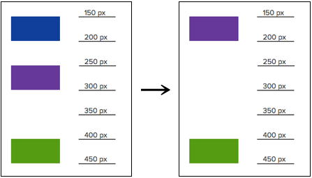
In the image above, the first gap is 50 pixels (that is, within 70 pixels). This means when the blue shape is collapsed, the gap disappears and the purple shape moves up to take the place of the blue shape.
The green shape, however, is 100 pixels away from the purple shape (that is, more than 70 pixels). So when the blue shape is collapsed, and the purple shape moves up the page, the green shape remains where it is. Note how this results in 200 pixels of empty space on the page.
What's important is the gap between each element and the element immediately above it, not the gap between an element and the collapsed element.
Example 2: 2 50-pixel Gaps
Now let's look at what happens if the elements are all spaced within 70 pixels from each other.
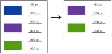
In the image above, when the blue shape collapses, the purple shape again moves up. The difference is that now the green shape also moves up to take the space of the purple shape because its gap is also within 70 pixels. Note how the page itself is also shortened as a result of the green shape changing its location. (See the section on the footer, below.)
The rules for expanding elements are the same as for collapsing elements. When an element is expanded, the elements below it on the page either shift down or remain where they are depending on the gap between each element and the element above it.
Calculating the Gap Between Elements
The gap between elements is the distance between the bottom edge of the upper element and the top edge of the lower element. In order to calculate the gap, we must know the exact size and position of each element. We can see this information in the Wix Editor Toolbar, or in the Wix Studio Inspector panel.
- The first step is to find the exact position of the bottom edge of the upper element. To do this, add the element's Y value to its height. In the image below, the shapes are each 50 pixels high. The position of the blue shape is 150 pixels, so its bottom edge is at 200 pixels (150 + 50).
- The second step is to calculate the gap, by subtracting the Y value we just calculated from the Y value of the lower shape. In our case, the purple shape is positioned at 250 pixels. We subtract from that the Y value we calculated before (200 pixels) to get a gap of 50 pixels (250 - 200).
We use the same process to find that the gap between the purple and green shapes is 100 pixels.
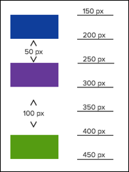
In summary:
- Add the Y value of the upper element to its height to find the exact position of the bottom edge of the element
- Subtract that number from the Y value of the lower shape.
It is important to know exactly how far apart elements are on your page because the distance between them controls their behavior when elements collapse, expand, and grow. Let's see how this works.
Rules for Growing Elements
When you connect certain elements to data, their height can grow to allow them to display the information from your collection. When this happens, elements below it must move down to accommodate the extra room the element is taking up. Specifically,
-
Gaps that are 70 pixels or less are maintained.
In other words, an element that is within 70 pixels below the growing element automatically shifts down to maintain its gap.
-
Gaps that are greater than 70 pixels shrink until they reach 10 pixels.
In other words, an element that is over 70 pixels below the growing element stays where it is until the gap between it and the growing element reaches 10 pixels, at which point it moves down the page maintaining the 10-pixel gap.
In both cases, if need be, the page itself grows to accommodate the extra content. See the section on the footer, below, for more information.
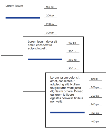
Let's look at some examples. In the images below, you can see how the additional text causes the text element to grow. The ruler to the right of each drawing will help you keep track of where each element is on the page.
Example 1: 50-Pixel Gap Below a Text Element
In this first example, a line is located within 70 pixels below the text element. Note that as the text element grows, the line moves down the page to maintain the 50-pixel gap.
Example 2: 100-Pixel Gap Below a Text Element
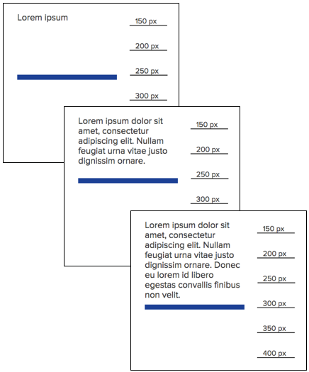
In this second example, the line starts out more than 70 pixels away from the text element. As the text element grows, note how the line stays where it is until the text element grows so much the gap between it and the line shrinks to 10 pixels. At that point, the line starts moving down the page with the growing text element to maintain the 10-pixel gap.
Example 3: Multiple Elements Below a Text Element
If multiple elements are below the growing element, their behavior is also controlled by the gap between them in exactly the same way. In other words, gaps that are within 70 pixels are maintained, while gaps that are larger than 70 pixels shrink until they become 10 pixels.
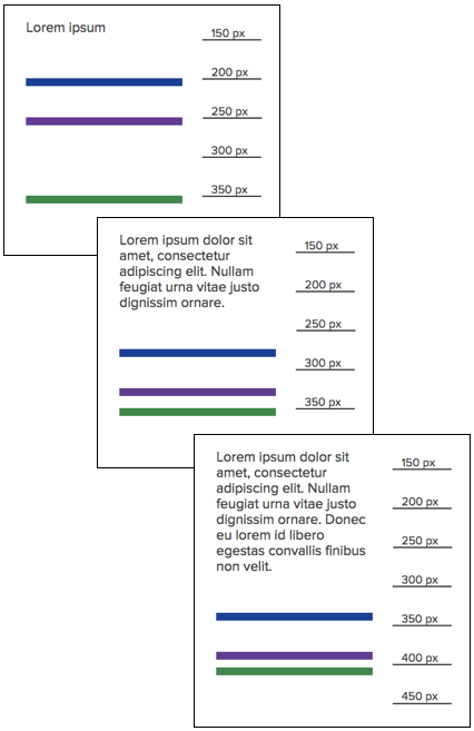
In the example above, the blue line is 50 pixels below the text, the purple line is 50 pixels below the blue line, and the green line is 100 pixels below the purple line. As the text grows, the blue and purple lines continue to shift down the page maintaining their 50-pixel gap while the green line stays where it is. This continues until the purple line moves to be 10 pixels above the green line. At that point, all three shapes continue to move down the page maintaining their new relative positions (50 pixels for the blue and purple lines and 10 pixels for the green line).
Vertical Alignment
The rules outlined in this article apply to elements that are laid out vertically on the page. Elements that overlap vertically by more than half of the element above, will not affect the elements below them when collapsing.

In the image above on the left side, the purple shape does not overlap more than half of the blue shape. When the purple shape is collapsed, the green shape is affected. On right side, the purple shape overlaps more than half of the blue shape, so the green shape is unaffected by its collapse.
The Footer
When elements collapse, expand, and grow, the rules governing the footer are identical to those discussed above. In other words, if the gap between the last element on the page and the footer is within 70 pixels, collapsing the last element causes the footer to move up and the page size to shrink. However, if the gap is greater than 70 pixels, the footer remains where it is. Note that this can cause unnecessary white space at the bottom of your page.
Similarly, when an element grows to accommodate more information, if the gap between it and the footer is within 70 pixels, that gap is maintained, while a larger gap (over 70 pixels) will shrink until it reaches 10 pixels.
Notes:
- If you find you have an unwanted gap between the footer and the last element on the page, double-click the footer handle to remove the gap.
- If the last element on your page appears hidden even though you didn't hide it, double-click the footer handle to increase the page size.
Elements in Containers
When elements are attached to a container, the container box itself can change its height as a result of the change in height or position of its attached elements. With container boxes, however, this behavior is controlled by the gap between the bottom edge of the attached element and the bottom edge of container box. Therefore, you need to calculate that gap following the same process as explained above.
Collapsing and Expanding Containers
When elements are attached to containers, the rules for collapsing and expanding are as follows:
- When the container is collapsed, all its elements appear collapsed. They take up no space on the page, and the rules for collapsed elements control the behavior of other elements on the page.
- When the container is expanded, any elements that had previously been expanded are also expanded. Elements that were collapsed previously remain collapsed.
- When all the elements inside the container are collapsed, the container itself is collapsed.
Note: When a container is collapsed, its attached elements appear to also be collapsed. However, their collapsed property is still false.
Collapsing and Expanding Contained Elements
In this example, the gap between the shapes is 50 pixels. The gap between the bottom shape and the bottom edge of the container is also 50 pixels.

When the blue shape is collapsed, the purple shape takes its place, and the height of the container box itself shrinks by 50 pixels.
Growing Contained Elements
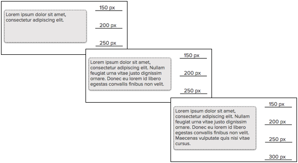
When an element inside a container box grows, the box itself also grows to accommodate it, following the same rules as for elements below a growing element.
If the gap between the bottom edge of the growing element and the bottom edge of the container box is within 70 pixels, the container box grows so that the gap is maintained. The figure below illustrates how this works.

However, if the gap is greater than 70 pixels, the container box maintains its height until the bottom edge of the growing element reaches 10 pixels from the bottom of the container. At that point, the container box continues to grow to maintain the gap at 10 pixels, as in the figure below.
Grouped Elements
When elements are grouped together, they behave as a single element. This means that if an element above the group collapses, expands, or grows, all the elements in the group move together according to the rules laid out in this article. If the group itself collapses, expands, or grows, the same rules outlined above apply.
The gap above the group is calculated from the top-most element in the group; the gap below the group is calculated from the bottom-most element in the group. Likewise, the horizontal overlap is calculated from the left- or right-most element.
Element Margins
Margins are the driving force behind the behavior of the elements described above. Margins are "sticky" so if the margin of an element is in contact with another element the other element will move when the first element is expanded or collapsed. The elements' margins can be seen by activating the browser's development tools.
Example 1: Less than 70-pixel Gap
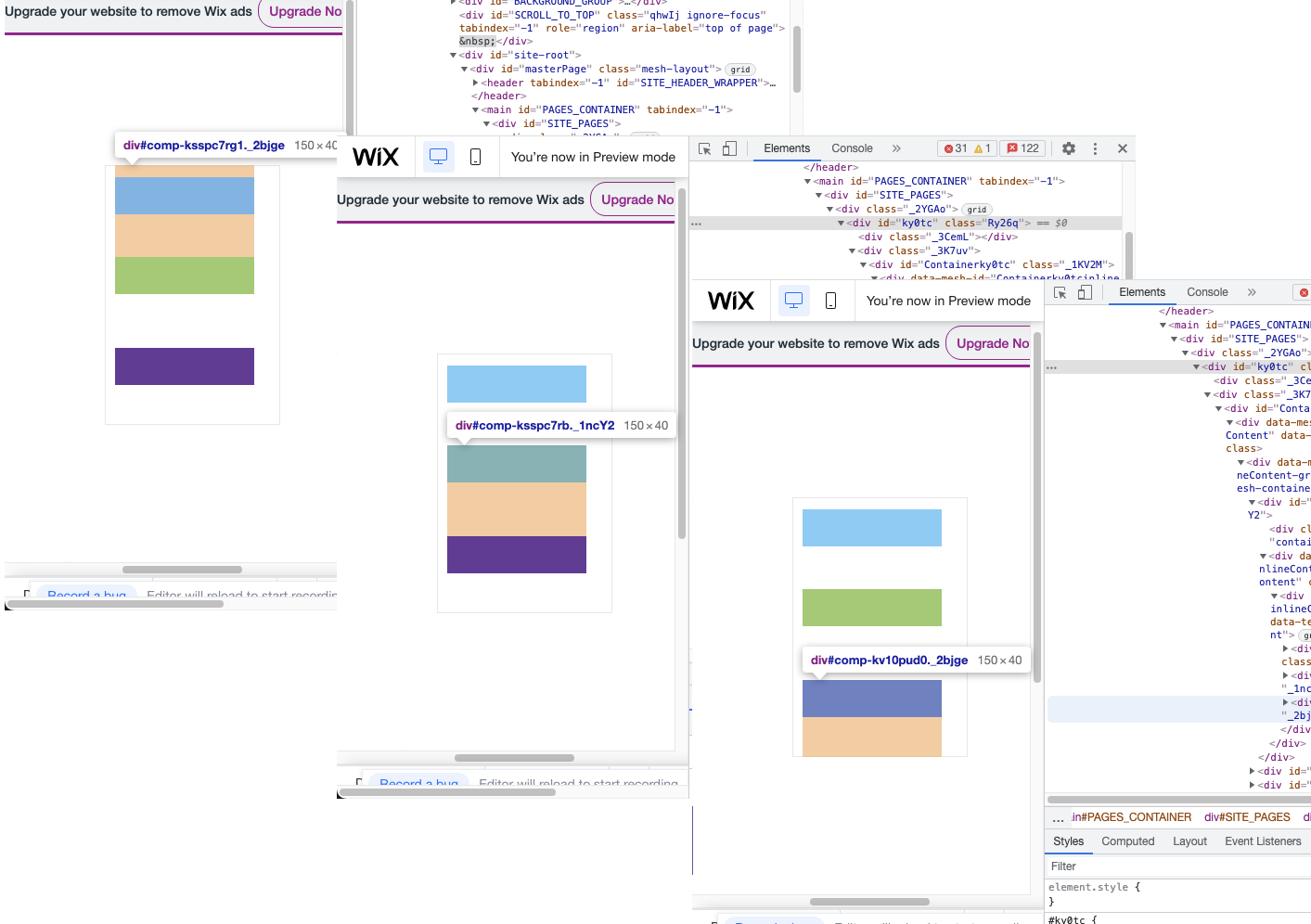
In the example below the orange areas are the margins of each box. The boxes are contained in a container box.
The blue shape has an upper margin as it is the highest element which extends to the top of the container box, and a lower margin that extends to the top of the green box. The green box is less than 70 pixels from the blue box.
The green box has no upper margin , but has a lower margin that extends to the purple box, which is less than 70 pixels from the green box.
The purple box has a lower margin which extends to the bottom of the container box, which is less than 70 pixels from the purple box. Because the margins of each of the elements touch the element below, collapsing an element will move the lower element up and resize the container box.
Example 2: Greater than 70-pixel Gap
In the example below the purple element is more than 70 pixels from the green box, so the green box's margin does not extend to the purple box. If the green or blue box is collapsed, the purple box will not move and the container box will not resize.
The purple box is less than 70 pixels from the bottom of the container box, so its margin extends to the bottom of the container. When the purple box collapses, the container box will resize.