Velo: Working in the Mobile Editor
The primary functionality for the mobile Editor (Wix Editor) or breakpoints (Wix Studio) is to design the layout of your site when viewed on a device such as a tablet or mobile device.
Site behavior on different devices
You can use code to control how your site behaves on different devices. To find out which device your site is being displayed on, use the formFactor property of the wix-window-frontend API, which returns either "Desktop", "Mobile", or "Tablet". You can then add code to your site that includes a condition to control how your elements behave, based on the device.
Hiding elements on different devices
You can hide certain elements on your site when displayed on different devices using the mobile Editor (Wix Editor) or breakpoints (Wix Studio). Unlike an element's hidden property, which controls the visibility of an element when a page first loads, hiding elements allows you to specify which elements should never appear on tablet or mobile views of your site.
Note: Breakpoints (Wix Studio) allow you to hide elements in customized breakpoint views for your site in addition to tablet and mobile views. In the UI of the mobile Editor (Wix Editor) you can hide elements only in the mobile view of your site.
Wix Editor:
-
To hide an element from the mobile version of your site, navigate to the mobile Editor. Click on your element, then click the Hide Element button
 .
. -
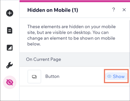
To unhide the element, navigate to the Hidden on Mobile panel on the left and click Show on the element you wish to unhide.

Wix Studio:
-
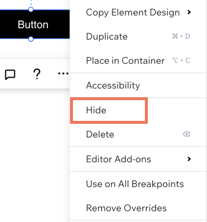
To hide an element from different breakpoints of your site, navigate to the breakpoint of choice and click on your element. Click on the More Actions button
 , then click Hide.
-
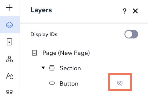
To unhide the element, navigate to the Layers panel on the left. Look for the element you want to unhide, click the Show button.

Note:
- Changes made in larger breakpoints cascade down to smaller breakpoint sizes. For example, if you hide the element in the tablet breakpoint, the element will automatically be hidden in the mobile breakpoint. You can override the cascading effect by unhiding the element in the mobile breakpoint.
Important: Hiding an element using the mobile Editor (Wix Editor) or breakpoints (Wix studio) removes that element from the page's DOM. Any code that relies on the hidden element's existence will break.