 In his talk, “Designing books is no laughing matter. OK, it is,” Chip Kidd (a TED Books designer in his own right) gives a wonderfully concise description of what book cover designers do. He says, “My job is to ask this question: ‘What do stories look like?’”
For David Shoemaker, the designer who made the cover for the new TED Book The Art of Stillness, this question presented a challenge. Because the story in this book, written by longtime travel writer Pico Iyer, is about the joy that comes from sitting still, quietly, and reflecting on life.
“I tried a lot of ideas at the start—straightforward ones, like a statue, a still-life photo, a canoe on a lake. There were also some deliberately counterintuitive ones—like an antic scribbled circle with vibrating type,” says Shoemaker. “Some were just type-based, since it’s a strong title.”
In all, Shoemaker created about 40 draft designs for this cover, and did about 25 revisions once he found the right approach. Below, a few of these revisions, with Shoemaker’s insights on how he got to the final cover.
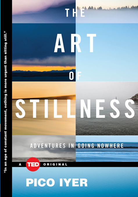
 Revision 3. From his initial batch of designs, here’s the one that seemed to work best. This cover uses four of the illustrations from inside the book, serene landscapes from photographer Eydis Einarsdottir. “Everyone liked the idea of a single, almost abstract landscape scene, but it risked looking like a new age book. Trial and error proved that using a single image inevitably sent the wrong message,” Shoemaker says. “I had the idea of collaging six of the landscapes to convey the premise by comparison. One image may look meditative, but with six of them, you absorb what they have in common.”

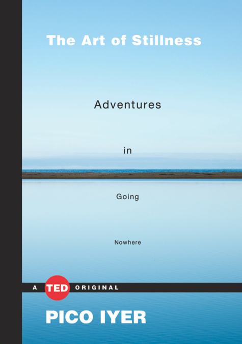
Revision 4. When the approach above didn’t quite work, Shoemaker went back to the idea of a single image. “This was the most successful of the single landscapes. We returned to this because it has a certain abstract power — it takes a moment to register what you’re seeing, and the horizon line plays off the logo band in an interesting way. It certainly conveys stillness,” he says. “But I think the question of the self-help-book look still applied, so we didn’t go forward with it.”

Revision 11. After a few more revisions, Shoemaker reverted back to the image grid. “The type was an effort to make the book look more literary. In the end, the grid design felt closest to what we wanted to convey, but it lacked the power of a single image,” he says. “Even if that single image was impossible to find.”

The final version. “It was someone at TED who suggested that we try to ghost the image behind the type. I loved the idea,” says Shoemaker. “It was a struggle to get enough of the image to show through, since the title doesn’t exactly form a neat wall of type, but I think it does the job that the others didn’t. It’s strong, visibly memorable and readable from a distance — and in the Amazon age, it’s important to be readable from a thumbnail. It does what we sought to do with the others: to use a landscape to convey stillness, but to frame it in an unexpected way.” This is the cover you’ll see on bookstore shelves.
.
The Art of Stillness has been selected as an iBooks Notable Book of the Month. Find out how to buy The Art of Stillness in print or as an e-book »
In addition to designing books covers, Shoemaker also writes. He released his first book this month, The Squared Circle: Life, Death and Professional Wrestling. And no, he did not design the cover.
Comments (15)