Skip to content
widget get a load of this?

macOS 14 Sonoma: The Ars Technica review

If at first you don't create usable desktop widgets, try, try again.

Andrew Cunningham

I was preparing to write an intro calling macOS Sonoma—version 14.0 of Apple's desktop operating system, for those of you who can't keep the ever-lengthening list of California codenames straight—a "low-key" or "small" release. Because it definitely feels that way, and it's tempting to think that Apple is taking it easy on new features for older OSes because it's devoting so much internal time to VisionOS and the Vision Pro.

But looking back, I've said something along those lines for each of the last few macOS releases (and several others before that). Honestly, these days, what macOS update hasn't been "low-key"? Every one since Big Sur (11.0) overhauled the UI and added Apple Silicon support has been content to add a few pieces on top of the foundation, fiddle a bit with under-the-hood enhancements and new security measures, maintain feature parity with iOS for the built-in apps, and call it a day. That's what Sonoma does, too.

So macOS Sonoma is a perfectly typical macOS release, a sort of "Ventura-plus" that probably has one or two additions that any given person will find useful but which otherwise just keeps your Mac secure and avoids weird iCloud compatibility problems with whatever software is running on your phone. You probably don't need to run out and install it, but there's no real reason to avoid it if you're not aware of some specific bug or compatibility problem that affects the software you use. It's business as usual for Mac owners. Let's dive in.

Table of Contents

System requirements and compatibility

Sonoma continues Apple's post-Apple-Silicon tradition of dropping Intel Macs relatively aggressively, including many models that ran (and will continue to run) macOS Ventura just fine. Here's the full compatibility list:

  • 2019 iMac and later
  • 2018 MacBook Air and later
  • 2018 MacBook Pro and later
  • 2019 Mac Pro and later
  • 2018 Mac mini and later
  • 2017 iMac Pro
  • All Mac Studio models

Notable models to get the axe include the 2017 MacBook Pro models and the last remaining 12-inch MacBooks. If you want to run Sonoma, you need a 2019 Intel Mac, something with Apple Silicon, or something with an Apple T2 chip.

As usual, Apple doesn't explain much about its rationale for when old Macs get dropped from the support list. The easiest answer right now is that the company is dropping Intel Macs a bit more quickly than usual so that it can stop supporting them entirely in another release or two (my best guess is that the last of the Intel Macs have one more major macOS update left, though that's just speculation based on past behavior).

There are benefits to the T2 chip that separate these T2 Macs from the older ones that Apple has dropped support for—the T2 accelerates encryption operations, handles encoding and decoding of video streams, and enables Apple's Touch ID fingerprint reader, among a few other things. But none of these are vital to basic computing in macOS, and pre-T2, many of these things were already being handled by features built into Intel's chips.

Other system requirements, or “the Apple Silicon-only club”

Not every new macOS feature is officially supported on all Macs that can run the operating system. It used to be that this was a complex matrix of devices, with different capabilities based on the specific CPU, GPU, Wi-Fi, or Bluetooth version that each Mac had. Nowadays, with all but the last few generations of Intel Mac excluded from the support list, the only relevant question is, "Do you have an Apple Silicon Mac or not?"

These Sonoma features require some flavor of M1 or M2 processor:

  • The "Presenter Overlay" mode for video calls.
  • Game Mode, which promises to limit background tasks and reduce Bluetooth latency.
  • High-performance mode in the Screen Sharing app.
  • Getting rid of the "Hey" in "Hey Siri."
  • Running games built with the Game Porting Toolkit.

These features join the list of things from previous releases that only worked on Apple Silicon Macs, including:

  • Running iOS/iPadOS apps.
  • Spatial Audio in FaceTime when using AirPods.
  • The 3D globe and more detailed renderings of cities in Apple Maps.
  • On-device voice dictation, with no Internet connection required and no time limit.
  • Portrait Mode in FaceTime.
  • Live Captions transcription in FaceTime or any other app.
  • "Reference mode" with the 12.9-inch M1 iPad Pro, which lets you use your iPad "as a secondary reference display" in Sidecar mode.
  • Inserting emoji using voice dictation.

Sonoma also brings us our first feature that can only work on a subset of Apple Silicon Macs. MFI-certified assistive hearing devices can be paired directly to Macs, but not to Macs with a vanilla M1 inside. You'll need an M1 Pro, M1 Max, M1 Ultra, or any flavor of M2 chip to use this feature; the vanilla M1 is not supported.

“Coming later this year”

Every year, Apple announces a few things at WWDC that don’t make the cutoff for the initial iOS and macOS release season in the fall. Those features are usually added in the winter and spring in subsequent updates before Apple’s internal attention then turns back to its next major releases.

Apple says all of these features are coming "later this year." They aren't included in the 14.0 release of Sonoma, and as such, we won’t be covering them in this review:

  • Various Messages features, including iCloud syncing for SMS messages, the ability to use stickers/Memoji/Animoji as reactions, and a "catch-up arrow" to take you to the first unread message in a long thread.
  • Enhanced AutoFill and form detection for PDFs.
  • Various Music features, including playlist collaboration, a Favorite Songs playlist, the ability to favorite albums, playlists, and artists.
  • A new widget for the Music app.

What should I do with my unsupported Mac?

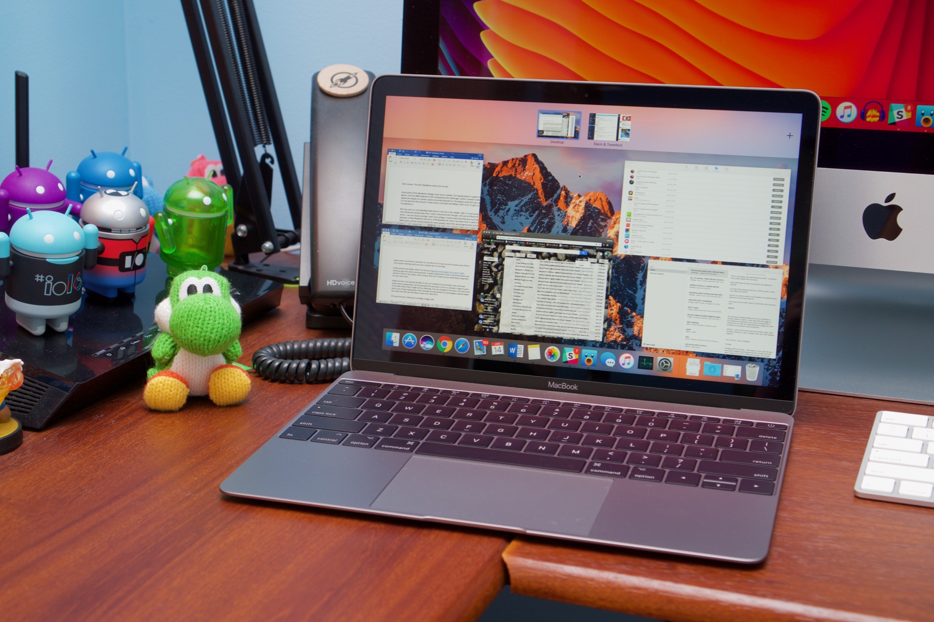
A 12-inch MacBook model sitting on a desk.
The last of the 12-inch MacBook models officially loses macOS support in Sonoma.
The last of the 12-inch MacBook models officially loses macOS support in Sonoma. Credit: Andrew Cunningham

This question is getting more complicated for older Intel Mac owners every year because of Apple and Microsoft.

For starters, Macs that can still run either macOS 12 Monterey or macOS 13 Ventura will still get security updates for most, if not always all, vulnerabilities patched in macOS Sonoma, plus new Safari updates. Monterey will be covered until the fall of 2024, and Ventura will be covered until the fall of 2025, assuming Apple sticks to its past update practices.

Using an older Mac or iDevice after it stops receiving new major operating system updates isn't always seamless; if you have an iPhone that you can update to iOS 17, for example, you may find iCloud features here and there that won't be available on the device running the older software (the Notes app is a frequent culprit in my experience). But generally, your Mac will continue working as it does now, and there's no immediate threat of major third-party browsers or apps dropping support for your OS right away.

If you're running a Mac that can't upgrade past macOS 11 Big Sur, which as of now is unlikely to get further software updates, the answer gets trickier.

A project called the OpenCore Legacy Patcher has kept newer macOS versions running on older Macs. Based on the same technologies used to turn generic PC hardware into "Hackintoshes," OCLP works primarily by taking drivers and other bits and pieces from older macOS releases and retrofitting them to work with the newest macOS version.

The problem for the OCLP project is that the retrofitting process takes more and more effort as Apple continues to strip Intel code out of macOS. It used to be that you could re-enable support for some older Macs by tricking the installer into believing it was running on a supported Mac, and maybe by restoring an old removed Wi-Fi driver. Now, well, it's more complicated than that.

The project's developers are still working on Sonoma support as of this writing. Generally speaking, OCLP works pretty well for Macs that are very close to the "end of support" line; it should be possible to make Sonoma run fairly well on 2016 and 2017 Macs. But the older your Mac, the greater the odds are that the OCLP team won't be able to get everything working, and you'll need to put up with more bugs.

Looking beyond macOS, it used to be that jumping over to the dark side and installing Windows was your best way to keep running a modern operating system on your old Mac. But the newest version of Windows that Intel Macs will officially support is Windows 10, which has its own October 2025 update cutoff looming.

Windows 11 will run on Intel Macs, but not without modification. Windows 11 imposed additional security-related requirements on PCs: a processor made in roughly 2017 or later and a Trusted Platform Module (TPM). Most Windows 11 PCs use a "firmware TPM," a bit of the CPU dedicated to handling the same cryptographic functions as a dedicated TPM, and many Intel Macs could support these CPU-based fTPM functions. But Apple disables Intel's fTPM because macOS doesn't use it, and the company doesn't make the Apple T1 or T2's TPM-ish Secure Enclave available to Windows, either.

Windows 11 works fine on "unsupported" PCs, but you'll need to jump through some hoops. Our guide to installing Windows 11 on unsupported PCs will work just as well on Intel Macs if that's something you want to tinker with.

If you do run Windows, make sure you use the macOS Boot Camp Assistant to grab Apple's latest Windows drivers first. iCloud for Windows, the web version of iCloud, and the iCloud Passwords extension for Chrome (and other Chromium-compatible browsers) provide hooks into a lot of your iCloud data, though things like iMessage and FaceTime won't work.

More recently, Chrome OS Flex has also become an option for people trying to resuscitate an older PC. But as of this writing, it might not be a good choice for Macs that are losing macOS support. The newest Mac models on Flex's certified models list are a non-Retina MacBook Air from 2015 and a MacBook Pro model from 2013, indicating that little, if any, testing has been done to make sure Flex runs flawlessly on newer machines. Even on a couple of those "certified" MacBook Air models, the webcam apparently doesn't work.

"Those devices do pose some special challenges from a technical perspective," Peter Freudenberger, Chrome OS Flex Customer Engineer, told Ars of these 2016 and 2017-era models. "In the time period you’re describing, Apple started transitioning from mainstream components found in any PC, to highly customized or even completely unique parts. From the testing our team has done, trackpads and camera modules look to be a particular challenge, with limited mainline Linux support outside of some community-maintained special projects."

Chrome OS Flex may work if you install it, but it's anyone's guess whether sound, networking, or input devices will work correctly. The same goes for Linux, which Chrome OS uses for its kernel.

"ChromeOS Flex, like any OS based on the Linux kernel, relies heavily on the level of hardware support available in the kernel (currently 5.15 on Flex, with an update to 6.x scheduled for next year)," said Freudenberger. "In the interests of balancing maximum hardware support with an OS that is feasible for Google to maintain, it seems like fully supporting this hardware may continue to be a challenge. We’d love to see Apple and others contributing more to the kernel, so that older hardware like this can remain usable after official support has ended."

Modern distros will almost certainly install and run, especially if you're willing to blow away all traces of a macOS install and use your entire drive to run the OS. But you'll be totally on your own if you have any kind of problem with graphics acceleration, networking, sound, trackpad support, or any of the other basic computer-y things you generally take for granted.

The path of least resistance, for better or worse, is to consider newer hardware. That's frustrating if your Mac is still in good condition and meets your day-to-day needs, but Apple Silicon-based desktops and laptops will come with major performance upgrades compared to an Intel Mac of that vintage, and laptops will come with massive battery life upgrades, too. Apple's certified refurbished store is a good way to save a bit of money on something that's still in like-new condition with a like-new warranty.

This isn't the most palatable route if you're on a budget, but replacing the old Mac is the simplest way to stay up to date with new features and security updates.

Branding and installation

Those looking for meaning in Sonoma’s codename need look no further than Sonoma, California.

The town is some 435 miles north of Ventura, much nearer to Apple's Bay Area stomping grounds. Sonoma is "coastal" in a relative sense—it's about an hour's drive from the coastline—but it's known for wines, while Ventura is known for beaches and resorts.

Still, as operating system codenames, the two towns echo each other in some ways. Both are reasonably popular tourist spots, and both are current or former county seats for counties that share their names. Both began as missions established by Spanish colonizers that were later secularized and grew into towns after Mexico won its independence.

But Sonoma's population is 10,739, just a fraction of Ventura's 110,763.

These are, as ever, the idle musings of a non-resident who has spent two hours reading municipal websites and Wikipedia and looking things up on Google Maps. And all of this assumes that Apple spends any time at all thinking about the thematic resonance of its California codenames rather than just picking them because of vibes and how Craig Federighi feels when he wakes up on the morning of WWDC. But based on some cherry-picked facts and the features Sonoma focuses on, you could make a case for Sonoma having a Snow Leopard-y relationship with Ventura—you know, if you had too much time on your hands. Similar aim, similar look and feel, but a smaller scope and lower impact. It's not a totally incorrect assessment.

I'm sorry, but hot pink and pea-soup green isn't doing it for me.
I'm sorry, but hot pink and pea-soup green isn't doing it for me. Credit: Andrew Cunningham

Visually, Sonoma’s icon maintains the “technicolor smudges” motif that macOS has used for its installer icons and default wallpaper since Big Sur in 2020. But something has shifted since the first betas rolled out this summer. While early Sonoma betas used the colorful swirl as its default desktop background, later betas and the release version of the operating system went back to a high-resolution photograph, the kind that Apple used to ship with all its California-location-themed OS updates. Big Sur came with one of these wallpapers, but it wasn’t the default; Monterey and Ventura seemed to have ended the practice entirely.

Why go back? The easiest explanation is that a photorealistic wallpaper is a better showcase for Sonoma’s new screen savers than swirling abstract colors. Sonoma does include a swirling-color screen saver that transitions into a static desktop wallpaper, but the effect is a lot less striking than it is on a high-res image with lots of little details for the eye to pick out.

Or maybe there's someone inside Apple who agrees with me that this year's color palette—a dissonant clashing of Shrek-green, bluish-purple, and reddish-pink—is a lot less attractive than any of the color swirls from previous years.

Free space: Not quite 2GB larger than Ventura

The 13.0 Ventura release saved users quite a bit of disk space compared to 12.0 Monterey running on the same Mac, particularly for Intel Macs. This is partly because dropping some older Intel Mac models allowed Apple to strip a bunch of code out of the operating system, mostly related to drivers for the older Macs and system files that supported older Intel processors without AVX2 instructions.

Sonoma returns to the norm of taking up a little more space than the previous version, thanks to small increases in the sizes of all system volumes and the user data volume. Disk usage also drifted upward over Ventura's lifecycle, and Sonoma's goes up a little more. The following space estimates all exclude the virtual memory (VM), which can vary in size.

M1 Mac mini Installer size System volume Preboot volume All volumes
macOS Ventura (13.5.2) 11.97GB 9.17GB 4.99GB 16.52GB
macOS Sonoma (14.0 RC 1) 12.79GB 9.82GB 5.57GB 18.41GB
2020 Intel MacBook Air Installer size System volume Preboot volume All volumes
macOS Ventura (13.5.2) 11.97GB 15.41GB 1.85MB 14.47GB
macOS Sonoma (14.0 RC 1) 12.79GB 9.82GB 2.0GB 16.38GB

For both Intel- and Apple Silicon-based macOS installs, a fresh Sonoma install will take up not quite 2GB of extra disk space compared to a fresh 13.5.2 Ventura install (a 13.6 install is very similar). Not a debilitating loss for most Macs, but people with nearly full drives should at least think about offloading stuff to make some room. Those fancy video screen savers take up additional space, too, but it's complicated.

As we've written, Sonoma does end support for another significant swath of Intel Macs, but there's less space to be saved here because a 2017 Intel Mac and a 2020 Intel Mac share a lot more in common than a 2012 Intel Mac and a 2016 model. For example, the graphics drivers used to support 2017-era Macs are still present in Sonoma because they're needed to support Macs from 2018 and later.

That mostly comes down to Intel's own internal problems. Early in the 2010s, Intel's design and manufacturing teams were firing on all cylinders, cranking out all-new CPU architectures once every two years or so. By 2016, the company had stumbled, and most 6th- through 10th-generation Core processors were all riffs on the same basic CPU and GPU architectures. If this lack of advancement didn't directly cause the Apple Silicon transition, it probably at least helped convince people within Apple that moving to its own chips was the right call.

The next big chance Apple will have to reduce macOS's disk footprint will probably be when it entirely ends Intel support, whenever that is. There are already plenty of Intel-specific files that an Apple Silicon install of macOS doesn't include, but switching from the universal binary versions of the built-in apps and other files to Apple Silicon-only versions should be good for at least a bit of disk space.

Widgets: This year’s headliner

A mix of Mac and iOS desktop widgets in macOS Sonoma.
A mix of Mac and iOS desktop widgets in macOS Sonoma. Credit: Andrew Cunningham

Desktop widgets are having a moment again, years after the last time that desktop operating systems tried and then forgot them. Microsoft originally tried them between 2006 and 2012 with Windows Vista and Windows 7 before reviving a version of the idea in Windows 11 in 2021. Apple introduced a feature called the Dashboard in 2005, a separate desktop space where widgets could be configured. But it went essentially un-updated in every subsequent macOS release, getting shut off by default in new installs beginning in 2014 and cut out entirely in 2019.

Limited iOS-style widgets were added to the Notification Center area in 2020, but they suffered from the same basic problem that Dashboard did; it exists in its own space separate from the rest of my files and apps, and even when I tried to configure them in a way I thought I'd find useful, I never went to their special cordoned-off area often enough to get into the habit of using them.

Widgets can still exist in the Notification Center, and you arrange them using the same interface.
Widgets can still exist in the Notification Center, and you arrange them using the same interface. Credit: Andrew Cunningham

The desktop-mounted widgets in Sonoma try to fix this in a fairly straightforward and obvious way—by letting people move those widgets outside of the Notification Center to put them smack dab in the middle of their desktops. They live next to or even amongst your desktop icons in the same way that iOS widgets coexist with your apps. These widgets can still go in the Notification Center if you want them to, either in addition to or instead of desktop widgets, and widgets in the Notification Center benefit from most of the extra work Sonoma puts in on the widget front.

New-to-Sonoma widgets

As part of the widget focus in Sonoma, Apple has revisited the Mac's native widgets, adding quite a few new ones that usually mirror their counterparts in iOS. For the ones that already existed in older macOS versions, several have been given new double-wide, extra-large views that take advantage of the extra space they have to spread out when placed on your desktop. Note that these extra-large widgets can only fit on the desktop, though—they can't be placed in the Notification Center.

The three most useful widget additions are all more or less direct imports from iOS and iPadOS. A battery status widget tracks the charge of your MacBook battery and any connected wireless accessories, a Home widget allows quick access to specific accessories and scenes, and a Shortcuts widget does the same thing with frequently used shortcuts.

Other all-new widgets include one for frequently used contacts from your Contacts app and a new Photos widget that will cycle through pictures from an album you specify. The Calendar, Podcasts, and Stocks apps also get some larger versions of existing widgets, now that they have more room to stretch.

Mac developers are free to make their own native widgets for Sonoma—though they were also able to do this in Big Sur, Monterey, and Ventura and have mostly chosen not to. The only third-party native macOS widget on my main work Mac right now is for Pastel, an indie color palette library and wallpaper generator. We'll see if more developers make them now that widgets are more visible or whether they rely on iPhone app widgets to fill the gap.

How iPhone widgets work, and what they can and can’t do

Mac widgets on the left, iPhone widgets on the right. Can you tell the difference?
Mac widgets on the left, iPhone widgets on the right. Can you tell the difference? Credit: Andrew Cunningham

Any widget from any app installed on your iPhone can be placed on macOS Sonoma's desktop as long as the phone is signed in to your iCloud account and on the same Wi-Fi network as your Mac. If you're not on the same network, widgets you've already placed will stop updating until you've reconnected again.

To demonstrate the functional gap between Mac-native widgets and iPhone-native ones, look at an app like Calendar, which offers nearly identical widgets for both. Place the Mac's Up Next widget next to the iPhone's Up Next widget, and there's very little visual difference between the two. But click an event on the Mac-native widget, and it opens the Calendar app. Click an event on the iPhone widget, and it usually tells you to dig out your iPhone.

That's the main limitation of iPhone widgets; if you're just looking at one, fine. If clicking on it just opens a link in Safari, that's also fine. Several iPhone-native news app widgets happily opened links in Edge, my Mac's default browser, when clicked. And even the iPhone version of the Home widget would let me click its buttons to control my accessories.

But if clicking on a widget is meant to open a phone app, you'll be told to look at your phone instead, even for first-party software where there's an analogous macOS app already installed. The Mac widgets imply that there's some kind of data handoff happening—"Open (App) on iPhone to continue," it says—when in reality, the message means, "Sorry, I can't do anything with this; try again on your phone."

The other issue with leaning on iPhone apps to fill out the Mac's widget roster is that some widgets are clearly only meant to be useful on a phone screen, not a computer screen. Sure, I could use some desktop space to display the QR code widget that shows how many Chipotle reward points I have, but I'm not going to wave my open, unlocked MacBook under a QR code scanner. All this widget can do on a Mac is tell me what a good burrito boy I am.

These useless-on-macOS widgets can always be ignored, of course. This is just to say that a useful widget on your phone is not guaranteed to be useful in Sonoma.

Setting up widgets

The widget picker. Note the upper-right corner, where you can distinguish between Mac and iPhone widgets.
Right-click an empty spot on the desktop to bring up the widget picker.
Clicking an empty space on the desktop makes all the windows hide themselves, exposing your widgets.
Many widgets support some kind of customization.

Right-clicking the desktop and clicking Edit Widgets makes your app windows fade away and brings up a new widget picker from the bottom of the screen. By default, this picker will show you every widget available in every app that's installed on your Mac and any app that's installed on an iPhone that is also signed in to your iCloud account. You can always tell whether you're looking at native macOS or iPhone widgets by looking at the top-right of the widget picker.

If you have multiple iPhones signed in to your account, you can specify which iPhone to use in System Settings. This can be handy if you have a second phone you use for work or for testing different versions of software.

Drag your first desktop widget and plunk it anywhere you want it—on an empty spot of your desktop, among the file and folder icons on your desktop, on a second monitor, wherever. Note that if you drag a widget to the corners of your screen, you will see a snap-to-grid outline that will reposition your widget a bit so that it's neither hanging off your screen nor too close for it.

The first widget in an empty spot of desktop can go wherever you want it, as long as it's within the borders of the screen. Subsequent widgets have to be placed relative to the first one. Credit: Andrew Cunningham

If you try to place a second widget close to that first one, you'll notice that snap-to-grid outlines appear all around it—again, to prevent overlap but also to keep things from looking too messy. This grid is pretty rigid, with lots of limitations that will keep you from making a mess but may also prevent you from arranging your widgets exactly as you want them. While icons will jump out of a widget's way when you try to place one, existing widgets won't move around unless you move them manually.

You're a bit limited in the way you can arrange widgets; the widget on the right here needs to be level with one of the two on the left and can't sit between them. Credit: Andrew Cunningham

As on the iPhone and iPad, widgets can come in small (1×1), medium (2×1), large (2×2), and extra-large (4×2) sizes; either pick the widget size you want the first time you drag it to your desktop or right-click it and pick the size you want once it's on your desktop. Right-clicking desktop widgets is also the fastest way to get rid of them and to access their individual settings (if they have any).

Widgets on your desktop always fade to a translucent gray as soon as there's an active app window of any size on the screen. They're always interactive, even in this faded state. To clear away app windows, either use the five-finger trackpad swipe that shows the desktop or click on any empty part of the desktop (including the space between icons) to make windows fly out of the way and expose your widgets. The latter behavior is new to Sonoma, and it takes a minute to get used to, but in practice, I don't really notice it now that I've been using the OS for a bit.

Four different widget sizes are available on the desktop.
Four different widget sizes are available on the desktop. Credit: Andrew Cunningham

If you have a laptop that you sometimes connect to a monitor, the widgets on your laptop's screen will always stay on your primary display, even if that means migrating to an external monitor. Widgets placed on a secondary display, on the other hand, will disappear until that second display is connected again.

I didn’t need these, but I don’t mind having them

If you love and can't live without widgets on your iPhone or iPad, you will hopefully find them equally useful on your Mac's desktop. In general, I find myself looking at a bare windowless desktop in macOS a whole lot less than I'm looking at the home screen on my phone or tablet, but between the existing show-desktop trackpad gesture and the new click-desktop-to-hide-windows behavior, it's easy enough to see them when you want to.

I will probably plunk a couple of widgets down on my desktop permanently, primarily the Weather widget, the Battery widget, and some of the HomeKit ones that give me easy access to frequently used scenes and accessories. In all three of these, I want to be able to see some snippet of information or flip a big on/off switch that doesn't require additional interaction. Beyond those relatively narrow use cases, I simply don't find most widgets useful. That's doubly true for widgets imported from the iPhone, where interacting with them often just prompts me to open an app on my phone.

As latter-day macOS additions go, I think widgets rank somewhere between Monterey's introduction of Shortcuts (I have a few that I use constantly) and Sierra's introduction of Siri (which I use on the Mac virtually never).

A new lock screen and other elementary stuff

Sonoma's new login screen looks like iPadOS, but without most of the functional additions.
Other user accounts' icons, hiding behind the most recently used account.

The look of the macOS login screen has been tweaked a bunch over the years, but it hasn't been substantially rearranged since Lion (version 10.7) in 2011. Sonoma rejiggers things, moving the login field to the bottom of the screen, adding a big clock, and using the last logged-in user's desktop wallpaper and/or screen saver as its background rather than the operating system's default background image. Disable the clock entirely (or choose to show it over active screen savers as well) via System Settings.

As sometimes happens with iOS-to-macOS features, the new lock screen comes with a new look without also adding the full range of cosmetic or functional features the iOS version has. There's no font customization here, no depth effects to partially and stylistically hide the date and time, and no informational mini-widgets. It's all about how the lock screen looks. And it looks neat! But that's all it is.

Visually, what's not a part of Sonoma is probably more notable than what changes. The iOS and iPadOS 17 updates each bring a bouncy, fun sense of fluidity to animations and controls throughout the operating systems. Sonoma occasionally looks more graceful than Ventura and earlier macOS versions, most notably in the fades into and out of screensavers and the lock screen, but Control Center controls and notifications and widgets all look and feel mostly static.

I imagine that many macOS graybeards reading that sentence will harrumph to themselves, "Good! I don't want more animation! And if it was here, I'd turn it off!" And that's fine. It might be that the more constant motion was tested internally and found to be a worse fit for a more precise keyboard-and-mouse-controlled OS than it is for a touch-controlled one (or maybe that extra movement would just tax the last few wimpy Intel integrated GPUs on the Sonoma support list too much). But the sense that the Mac is always a design step or two behind Apple's other big operating systems remains.

System Settings revisions

System Settings in Sonoma gets some minor tweaks and additions.
System Settings in Sonoma gets some minor tweaks and additions. Credit: Andrew Cunningham

Ventura introduced a new System Settings app last year to replace the venerable System Preferences. That means most of my criticisms of it from last year still stand, and on my Intel MacBook Air especially, the lagginess compared to System Preferences just makes the whole experience feel slower than it ought to.

But the new and old Settings apps have one thing in common: Apple takes every new macOS release as an opportunity to shuffle things around.

There are no full-on redesigns of any Settings screens this time—Apple didn't see a need to overhaul the display settings for a third year running—but there are a bunch of small things that have been shuffled around or removed from nested menus. Here's a quick list of all the changes I noticed, not counting settings for new features that we'll dive into separately:

  • New icons and subheadings for the Sharing menu. No features or functionality have really been changed here; things have just been tweaked to make settings easier to find and visually identify.
  • "Automatically hide and show the menu bar" and the number of recent documents, applications, and servers have been moved from Desktop & Dock, where they were before, to the Control Center settings. There's an argument to be made for placing them in either location, but this does ungroup them from a bunch of other settings they have lived with for a long time, a System Settings behavior I generally find more confusing than helpful.
  • Both FileVault and Lockdown Mode now live in their own Privacy & Security submenus for some reason.
  • The Preview button for screen savers is now hidden; click the screen saver thumbnail to preview it. The "preview" text only appears when you hover over the thumbnail.

In general, System Settings has neither grown nor worn on me in the last year. For settings I mess with fairly regularly, I've found where they are and have gotten used to any changes. For the ones I only touch occasionally, like when I'm setting up a new Mac, I still have to lean on the search function to find where things are.

Fancy new screen savers

Activating and deactivating one of Sonoma's new moving screen saver/wallpapers.

The coolest-looking thing in Sonoma is probably its collection of wallpaper-turned-screen-savers, mostly a collection of high-definition videos of cities or nature that smoothly and continuously zoom around their subjects.

A substantial portion of these videos, if not all of them, are the same ones Apple TV boxes use as screen savers—but the way Apple uses them in Sonoma looks undeniably cool. You get the best effect when you use the same video as your wallpaper and screensaver, which you can do with an easy toggle in the Settings app.

With this toggle turned on, your desktop wallpaper looks like a still image. But when the screensaver turns on, your icons and app windows fade away, and your wallpaper starts to move. Nudge the keyboard or trackpad to exit the screensaver, and your icons and app windows come back, but your wallpaper continues to move for a bit before slowing down and becoming a static image again. Same deal when you wake the computer up—you'll see the video version on the login screen, and once you log in, your icons and apps fade in and the video slowly comes to a stop.

To get the full effect, use the same screen saver as your wallpaper and desktop. Note that macOS's default energy settings will shut your screen off before the screen saver starts though.
Downloading a new screen saver.

Like some of Ventura's wallpapers, these new screensaver/wallpaper videos are downloaded on first use to save disk space. If you don't want to use them, regular wallpapers and screensavers in Sonoma work like they used to but with a more graceful transition to and from screensavers. Transitioning into a screen saver, your apps recede, and the screen either fades to black (for pre-Sonoma screen savers) or dissolves to the screen saver video. When you come out of a screen saver, there's a dissolve transition back to your desktop as your apps pop back in. It doesn't really add functionality, but it looks clean and attractive.

All of that said, there's a bit of "what year is it" to this feature—I personally see my screen saver with some regularity because I regularly use a Hot Corner shortcut to start the screen saver, locking the machine. But most MacBooks, especially when away from their chargers, will turn their screens off before you ever see a screen saver. It's neat that they look so nice, but the default energy settings on any given Mac renders them mostly invisible, and if anything, I'd worry about this feature encouraging people to keep their screens on longer so they can look at the pretty screen savers.

The screen savers also run much more smoothly on my Apple Silicon Macs than they do on my 2020 Intel MacBook Air, where the frame rate hitches often enough to be noticeable. Faster Intel Macs with dedicated GPUs ought to be fine; slower Intel Macs (like the 2018 Air and 2018 Mini) with worse GPUs may have even more prominent frame dropping. Try them for yourself and see if you find the performance distracting.

macOS uses purgeable storage to “prevent” screen savers from eating up disk space

I've got a folder full of screen savers, and now Finder and Disk Utility can't agree on how much free disk space I actually have.

In the release version of Sonoma, there are (currently; Apple has added more throughout the beta process) 134 of these screen-saver-turned-wallpapers, split among four categories: Landscape, Cityscape, Underwater, and Earth (mostly orbital views of different sections of the planet at different times of day). Only the built-in defaults—the colorful Sonoma swirl and an aerial view called Sonoma Horizon—are immediately available for use. Each of the others must be downloaded separately, one at a time, before they can be used.

These files come down as 240 fps 4K videos, and even with HEVC/H.265 encoding, the file sizes can get pretty big. The largest one we downloaded was nearly 1.5GB, and the smallest was a little over 100MB. Downloading all 118 of the videos that were available a couple of weeks ago resulted in a whopping 54.48GB of files, saved to /Library/Application Support/com.apple.idleassetsd/Customer/4KSDR240FPS.

Or does it? Turns out Apple is using purgeable storage to "prevent" these screen savers from taking away from your usable disk space. The Finder is happy to keep purgeable files on disk for as long as there's space for them, but the OS begins silently deleting things as your drive fills up; the OS also generally treats iCloud files this way, clearing them from disk because it knows the files are still available in the cloud.

Screen savers are among the locally stored files that macOS considers "purgeable."
Screen savers are among the locally stored files that macOS considers "purgeable." Credit: Andrew Cunningham

Here's how purgeable storage manifests when downloading and then getting rid of a bunch of screen savers on a 125GB test volume on a 2020 Intel MacBook Air:

  • I started downloading all the screen savers to see what happened when you did that and how much space they would take up. During this process, the videos were downloaded to the system folder specified above, and the amount of free disk space shown in the Finder's status bar went down as you'd expect it to as the drive filled up.
  • On my next restart, weirdly, the Finder's free space calculation acted like I hadn't downloaded the files at all; it went back to showing 90-something gigabytes of free space, the same as it did before I started downloading screen savers. At first, I assumed that every screen saver except the active one had been purged.
  • But this wasn't actually true! The videos were still available in the folder, and opening Disk Utility showed an accurate free space calculation.
  • I then restarted again and immediately opened a Finder window. For a brief moment, the Finder's status bar showed the actual amount of free space on the disk. But this quickly changed back to the 90-something gigabyte number, as though the Finder needed a moment to look at the screen saver folder and exclude it from the count.

After that, I started trying to use the space that the Finder was telling me was available. As I copied files, I watched macOS gradually delete downloaded screen savers, starting with the ones downloaded the longest time ago and skipping any I was currently using. According to Disk Utility, the amount of free disk space that actually existed hovered between 18 and 12GB—between 10 and 15 percent of my 128GB drive.

As the drive filled, macOS deleted more and more screen savers, though the disk space reported by Disk Utility and Finder never agreed again until the volume was within a few gigabytes of being full. Functionally, the Finder's reported amount of free space is the "canonical" one that determines how much you can copy to the drive, but it's not a true measure of actual free space.

Part of me thinks this solution is a clever way to offer a ton of screen savers without actually making the user "pay" for the amount of disk space the video takes up. I suspect the average user won't download more than a few, but even a half dozen of them can take up 5 or 6GB of space, which is a lot for an older Mac that only shipped with a 128GB SSD. Having the system purge these transparently in the background frees people from needing to think about it.

On the other hand, I still don't love that the free space reported by the Finder is less-than-totally-accurate. There are performance and durability implications for SSDs if you're using a nearly full one, since the small number of flash memory cells marked as "free" get written and rewritten over and over again. There's a difference between having 10GB of free space and 60GB of free space, and with the current behavior, you could be using a mostly full drive while believing that you have plenty of room to spare.

What I don't know, since I've only been using the final build of Sonoma for a couple of weeks, is whether there's also some kind of time-based purging that macOS will eventually do for unused video files in addition to the free-space-based purging behavior we were able to trigger—deleting old screen savers after a week or month of disuse, maybe. That doesn't make it right for the Finder to inaccurately report your actual free disk space, but it would mostly address my actual functional concerns.

Can you roll your own?

Officially, the only videos you can use to create these screen savers are the ones Apple provides. Unofficially, during the beta period, some testers were able to use their custom videos as slow-mo screen savers by copying one to the system folder where the screen savers live, deleting one of the official screen savers, and renaming the custom video to match the file name of what you just deleted.

In my testing in the release candidate version of Sonoma with a couple of different videos, they would show up on the desktop as a wallpaper and begin playing when you enabled the screen saver but would crash to a black background rather than slowing back down to a static image when exiting the screen saver. Those with more time and inclination may figure out how to get custom videos working consistently, but at least in my experience, the process is a bit more involved than simply plunking a video in a folder.

Apps: Safari 17

Whether you think the Safari 17 update is a big deal depends on your default browser. If you're ride-or-die for Safari, it's a pretty substantial and wide-ranging update that adds solid power-user features. If you primarily use Chrome or some other Chromium browser, these are mostly things you've already had for quite a while, including on macOS.

But hey, even if Safari 17 is a bit of a catch-up release, maybe Google's recent ad-tracking "innovations" or the deluge of "value-added" Microsoft Edge features have you thinking about a switch.

Web apps

Safari in the back, web app version in front.
Safari in the back, web app version in front. Credit: Andrew Cunningham

This is something that iOS and iPadOS have supported for a long time, but macOS in Safari is finally able to do it, too: You can save an individual webpage to the Dock and then launch it independently of the actual browser. This is something Chrome and other Chromium browsers have supported for ages, though, and Apple's implementation has some shortcomings that would probably keep me from relying on it much.

Adding a website to the Dock is, somewhat counterintuitively, done using the Share menu. Do this, and you'll be given a chance to customize the web app's name and URL before it goes to your Dock. A shortcut will also be created in /Users/<youraccount>/Applications, which will persist even if you remove the web app from your Dock; this shortcut won't appear among your Mac's locally installed software in the regular Applications folder.

Once you've created and launched a web app, it will run in its own window without the customary Safari address bar or other ornamentation. From this point on, macOS treats it as its own "app," which can be launched and quit independently from Safari and appears as its own separate entity in command-tab and other app switchers. Permissions for location services, notifications, and hardware access are managed from within Safari—if the site has access to something in Safari, the web app will, too.

Create web apps by using the Share menu.
Create web apps by using the Share menu. Credit: Andrew Cunningham

Check Activity Monitor and you'll see that each web app you launch spawns a bunch of processes, mostly to manage the app's sandbox and handle the tab's communication with the GPU and networking interface.

If you check the Settings menu in a web app, you'll be given a few more options, including the option to change the icon, the name or URL, and a couple of things about how the window looks (by default, the icon is pulled from the website itself, which sometimes doesn't work and sometimes pulls an outdated icon that the developer hasn't paid attention to in a while).

I've definitely found sites that didn't work properly; attempting to create a web app for my local Plex server always created a weird loop where I would be kicked to my default browser to log in, at which point I would have a Plex tab open in my browser and not in the actual web app. (The same site works fine in Edge.)

The site's name and URL can be customized when you create it.
Editing the icon is done through the Settings menu once you've launched the web app.

Web apps also can't use extensions, somewhat bewilderingly given that Safari 17 also adds a whole bunch of features meant to manage extensions differently for different profiles. In Chromium browsers, extensions generally work as they do in a regular browser tab, though there's no toolbar for icons to appear.

An advantage of using Safari for web apps, despite its shortcomings, is that Safari has historically been easier on MacBook batteries than Chrome has been, although Google regularly claims to be making improvements. Otherwise, to the extent that I find web apps useful, Chromium offers a version that feels a bit less seamless, where all your browser features still behave like you expect them to.

From Tab Groups to Profiles

Switch between profiles in a Safari window...
...or launch a new window using a specific profile via the Dock.

Safari 17 supports multiple user profiles for the first time. This is an outgrowth of the Tab Groups introduced in Safari 15—in that version, you could create different batches of tabs to try to help organize them, but there wasn't any additional separation. User profiles take that even further. Each profile has its own unique browsing history, cookies, bookmarks, extensions, and Tab Groups, more fully separating a profile you might use for work or a side project and the default profile you use for everyday browsing.

You can create as many custom profiles as you want to in Safari's settings. The start page for each profile gets its own little semi-customizable icon and background color, to help you tell them apart at a glance. When you set up a new profile, you're given the option to start from an existing Favorites folder and set a different home page for each profile.

Once you've configured profiles, you can either switch in the upper-left of an open Safari window, or launch a new window using a given profile by right-clicking the Safari icon in the Dock (or opening a new window from the File menu, if you're really old-school).

Even if you don't care about keeping different kinds of tabs separate, the ability to enable different extensions for different profiles could be useful. You could create one profile with a bunch of coupon-clipping shopping extensions enabled, for example, but only use it when you're actually shopping, keeping those extensions from collecting data or slowing anything down the rest of the time.

One continued shortcoming of Safari relative to Chrome and some other browsers is that you can't attach these separate profiles to separate iCloud accounts. Profiles sync with the main iCloud account that's signed in to your Mac, so, even if you have separate Safari profiles for home and work, it's still your home (or work) iCloud account you're using to keep the profiles synced between devices.

You can make and use profiles on Macs that don't have iCloud accounts. But it's also not possible to mix and match iCloud profiles that sync and local-only profiles that don't.

Private Browsing gets private-er

A locked Private Browsing window.
A locked Private Browsing window. Credit: Andrew Cunningham

Speaking of features that can wall off some Safari tabs from others, Private Browsing sees some improvements in Safari 17 as well.

Just like in iOS and iPadOS 17, Private Browsing windows will now lock themselves after a period of inactivity; Apple says they'll lock automatically after eight minutes, and they'll also lock if the screen is locked or your Mac goes to sleep. Your password, Touch ID, or a paired Apple Watch can be used to unlock the window—anything you use to unlock your Mac can unlock a Private Browsing window.

Safari's tracking protection features are also ratcheted up by default in a Private Browsing session with a feature called "advanced tracking and fingerprinting protection." Apple says that this "prevents known tracking and fingerprinting resources from being loaded," and when clicking links, it also removes "identifying components of the URL while leaving nonidentifiable parts intact." A link could retain an affiliate ID or some kind of referral information (like links from social websites often do) but can't include additional information that could help identify your specific device or browsing session.

In the Advanced privacy settings, this extra layer of tracking protection can either be disabled for Private Browsing windows or extended to all Safari tabs across all profiles. If these tracking protections break the functionality of a page, right-clicking the reload button will give you the option to reload the page, a bit like how you can reload sites with content-blocking extensions disabled when things are broken.

This extra protection doesn't totally resolve the confusion innate to Private Browsing in Safari and in all browsers—that it keeps your browsing activity "private" primarily from other users of your computer, and not necessarily from the servers you're sending Internet traffic to. But the extra script blocking and anonymization don't hurt.

Finally, in the Extension settings, there's a checkbox for each extension you have installed that will enable or disable it in Private Browsing mode. This way you can load essential extensions (like a third-party password manager) without worrying about the other ones.

JPEG XL and HEIC image support

Like HEIC and WebP and AVIF, JPEG XL's main claim to fame is improved compression, delivering the same image quality as JPEG in a lower file size, or much-improved image quality at the same file size.

As happened when Apple added WebP support to Safari a few years ago or AVIF support last year, the rest of macOS doesn't treat JPEG XL images quite as well as JPEG or PNG images. Sonoma can show thumbnails in Finder and preview them in Quick Look, but Preview won't open or edit them. Preview can currently open WebP and AVIF images natively, but prompts you to save to a different format before letting you edit. So JPEG XL support is one step behind that.

Google removed JPEG XL support from Chrome a year or so ago, citing "not enough interest" and "[in]sufficient incremental benefits over existing formats." Speaking of "existing formats," Chromium's outsize footprint in the browser market and its early support for the Google-backed WebP format has already made WebP the closest thing the Web has to a true JPEG successor. Google may or may not re-add JPEG XL support to Chrome, but it's a fairly niche addition either way.

Apple is supporting HEIC images in Safari, too, though this is a case where support in macOS and its other apps actually runs a bit ahead of Safari. HEIF/HEIC has been the iPhone’s default image format since 2017, and Preview, Photos, and the Finder all work with these images pretty much the same way they do with JPEGs (though many apps export to JPEG automatically for easier sharing between Apple and non-Apple devices).

Miscellany

Common sense prevails: A couple of years after admitting that, yes, website favicons are useful things to have in tabs because they help you quickly identify tabs at a glance, Safari 17 also adds favicons to the Favorites bar.

Quite a few developer-centric things have been added, including a reorganized Develop menu, a revamped Responsive Design mode for testing sites that automatically resize themselves to fit a given device's screen, and menu items that allow you to launch sites in iPhone and iPad simulators more quickly for people with those simulators installed via Xcode. Web Inspector has also been changed enough to merit an entire WWDC session about it.

While the Safari 17 release notes for iOS and iPadOS mention AV1 video playback support, it is only coming to "devices with hardware decoding support, like iPhone 15 Pro and iPhone 15 Pro Max." That strongly implies that it's a feature that's currently exclusive to the Apple A17 family, and that we'll need to wait at least until the Apple M3 to see macOS support; I can confirm that AV1 playback doesn't work in Safari 17 running on an M1 or M2 MacBook Air.

For the complete list of changes to Safari and the underlying WebKit engine, this circa-WWDC blog post and this post from last week both get into other details, including new HTML and CSS support and other additions that most users won’t need to know about.

Safari 17 on Ventura and Monterey

Apple supports Safari on the last two macOS releases as well as the most recent one, so even if your Mac is stuck on Monterey (macOS 12) or Ventura (macOS 13), you'll still be able to benefit from most of Safari 17's improvements.

The new Safari usually comes with all of the underlying WebKit enhancements and security patches, plus most of the new features that Apple has introduced, but there's usually some small subset of features that works exclusively on the latest version of macOS.

This year, Safari 17 users on older OSes won't be able to pin websites to their Dock (of course, they can always turn to Chrome or another browser for that). The lock for Private Browsing tabs is available and works the exact same way but is off by default instead of on by default.

While Safari in Ventura or Monterey can view JPEG XL and HEIC images, the image formats supported by the underlying operating systems haven't changed. For JPEG XL, it means basically no app other than Safari (or compatible third-party image editors) can touch them; HEIC images are fine.

Finally, when trying to use Passkeys on sites that support it, Safari 17 on Sonoma will let you auto-fill Passkeys directly, in Ventura and Sonoma you'll need to use a passkey stored on another device, like an iPhone running iOS 17.

Other apps

As the Mac's built-in apps go, Safari is the biggest beneficiary this time around. Many other apps get small additions, but they're mostly small tweaks or additions to functionality that already existed.

Messages

The Messages app is probably the one most affected by "coming later this year" syndrome, but it still comes with a handful of improvements. A couple are small quality-of-life changes to existing features, like the ability to swipe right on a message bubble to reply to it or to play back audio messages at up to 2x speeds.

You generally shouldn't use SMS-based two-factor authentication codes if there is any other option available; Sonoma's own built-in password manager can generate more secure codes for you. But if the service you're using doesn't provide anything else, Messages can now delete those codes after you've used them. The toggle is in System Settings > Passwords > Password Options, and it discards codes after you've used autofill to insert them.

On the topic of group texts: When it's not begging Apple to add support for RCS messaging, Google has tried to add features to its own messaging app to make iOS-to-Android texting a little less obnoxious for its users. Each platform's emoji or emoji-adjacent message reactions show up on the other platform a little bit more gracefully than they did a couple of years ago, even if I'm still never sure whether images or videos I'm sending to a green-bubble group text are going through properly.

Apple has also been adding more features so that fellow iPhones roped into green bubble group chats can at least take advantage of each others' features. "Tapbacks, effects, edit, replies and more" will at least show up for other iPhones now (though tapbacks and effects already should have been working this way as of iOS 16 and Ventura).

Photos

Photos app improvements are pretty mild this year. One nice addition if you rely on prompt iCloud syncing between your phone and Mac is a Sync Now button at the bottom of your library that you can hit to force a sync if one isn't happening automatically.

When copying and pasting adjustments made to photos, the app will "intelligently match exposure and white balance between images," trying to compensate for the ways light can shift in the same batch of photos.

Smart albums now recognize pets—and it's done retroactively, as it recognized my cat that's been dead for two years. It may be a little less accurate than it is at recognizing people, though, since my cat got a pair of different smart albums for no immediately apparent reason.

The app's auto-generated Memories albums are editable, too. Insert photos you'd like to have included, or re-order the photos that are already included.

Notes

New formatting options in the Notes app for all your embarrassing celebrity apologies.
New formatting options in the Notes app for all your embarrassing celebrity apologies. Credit: Andrew Cunningham

Apple has changed the way inline multi-page PDFs appear in the Notes app, making it possible to scroll through every page horizontally. And it's possible to link to another note from within a note; type ">>" and you'll see a menu of your most recent notes. Keep typing and you can search through your existing notes or create a new note with the title you've just typed.

Two other new formatting options include block quotes and a new "monostyled" option that further distinguishes monospaced text from other kinds. Any monospaced text you have in existing notes will appear as monostyled in Sonoma.

When viewed in Ventura or iOS 16, linked notes will appear as grayed-out text; you can still edit the notes, you just can't use the links. Monostyled text will appear as normal monospaced text, and block quotes will just appear as bolded text.

Apple also supports opening Notes directly in Pages via the Share menu if you decide you need a more complete word processing experience, but this appears to be a new feature of Pages 13.2 rather than Sonoma itself. Installing the latest version of Pages in Ventura gets you the exact same share-to-Pages option.

Reminders

Reminders' biggest claim to fame in Sonoma is a grocery list feature, a special sub-type of list that will automatically sort items into categories. (Other lists can also benefit from these subheadings, but you'll need to type them and group things manually on any list other than a grocery list). Just start typing things like "apples" and "milk" and "cake mix" and the app will begin tossing them into categories that are at least broadly correct, though how useful the groupings are to you may depend a bit on how your grocery store is laid out.

The auto-sorting feature errs on the side of specificity, so if you want items to go to under a specific heading, you may find that you need to use more adjectives to coax Reminders in the right direction. "Diapers" went under "Baby Care" without incident, but "formula" went under "Personal Care & Health" until I specified "baby formula." "Peanut butter" and "mustard" auto-sorted into "Sauces and Condiments," but "jelly" went into the Deli category until I typed "strawberry" in front of it.

If you add a word to an item, the app will prompt you to click to move it to a new section rather than doing it automatically. You're free to drag items into whatever sections you want, but the app won't remember those changes in subsequent lists. If you want to categorize "honey" as a "Baking Item" rather than as a "Sauce & Condiment," you'll need to do it every time you make a list, or you can add an extra adjective that makes it auto-sort into the category you want.

Mail

The emoji, they're big now.
The emoji, they're big now. Credit: Andrew Cunningham

Safari can already autofill 2FA security codes received through Messages, but in Sonoma, that extends to codes received via the Mail app. Search results will also bring travel-related messages to the top of the pile as you get closer to a travel date.

Also, do you like adding emoji to your emails? Well, now you can add big emoji to your emails! Emoji that appear inline next to text are regular sized, but any appearing on their own line are upsized. Unlike in Messages, there's no number of emoji you can use that makes them automatically shrink down to be less big, though you can format them to be smaller yourself if you like.

Weather

The Weather app in macOS Sonoma, with a couple of extra data points and more space for the hourly forecast.
The Weather app in macOS Sonoma, with a couple of extra data points and more space for the hourly forecast. Credit: Andrew Cunningham

I've come to quite like the macOS version of the Weather app, just because it's clean and fast and it looks nice. The Weather app in Sonoma adds information about moon phases, wind gusts, and temperature and precipitation averages, and it also reorganizes the window a bit so that the hourly forecast has more horizontal space to spread out. More space means more visible hours.

Click through on some of the tiles and you'll also find a new more detailed "chance of precipitation" chart, plus a new wind map view.

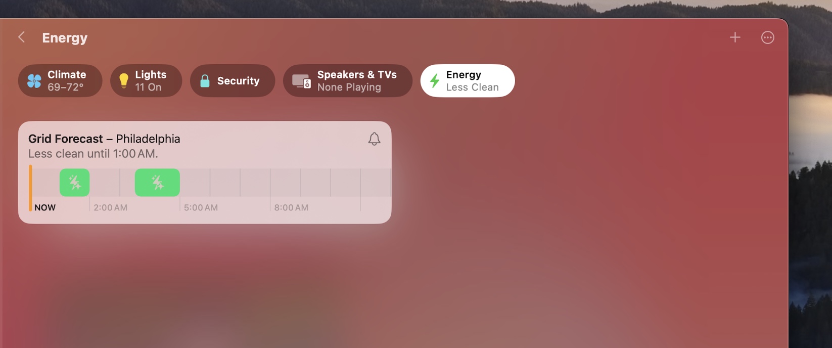
Home

The power grid forecast in the Home app.
The power grid forecast in the Home app. Credit: Andrew Cunningham

The Home app gets a new Energy tab that attempts to use data from your local energy grid to tell you when it’s more likely to be using cleaner forms of energy like wind and solar. Right now, this is purely a "for your information" kind of tab, and you can't incorporate power grid information into any of your automations; you can choose to get notified when the forecast thinks power in your area is more likely to be cleaner.

Apple doesn't say in the app or in the feature's support page where it is pulling this data from. Microsoft uses data from WattTime and Electricity Maps to pull in similar data for Windows Update in more recent Windows 11 versions. For now, Home only supports this feature in the 48 contiguous US states.

FaceTime and video effects

Some new reactions for video calls. Making hand gestures to the camera can trigger these, too. Credit: Andrew Cunningham

Sonoma adds several things that FaceTime and all compatible video apps can use, at least when equipped with the right hardware, starting with a new menu bar item that shows you a small preview thumbnail of your video so it's easier to see what you look like as you play with different settings.

This section can also double as an overview of what's new in FaceTime since Apple's first-party video chatting app automatically picks up all these benefits. But third-party apps like Zoom, Teams, and Skype that decide to adopt Apple's APIs will eventually get all of the same controls.

All of these features rely on having a webcam and an Apple processor with an NPU, whether that NPU is in a connected iPhone or in the Mac itself. This is easiest on Apple Silicon MacBooks, which come equipped with both. Sonoma even adds support for the background-dimming Studio Light on these models, something that used to require an iPhone and Continuity Camera.

Intel Macs can use the video effects when paired with a compatible iPhone over Continuity Camera. The features also work on all Macs connected to a Studio Display since it has a webcam and an A13 chip built into it. Apple Silicon Mac mini and Mac Studio models can also use them with a generic USB webcam attached, though video quality (and the quality of background-removal features) will vary depending on how good the webcam is.

The eight new reaction effects are basically iMessage send effects that play in the background of your video when you either make a specific hand gesture or click a button in the video menu.

For reference, here are the eight animations and the hand gestures that trigger them:

  • One thumb up: Thumbs up in a thought bubble.
  • One thumb down: Thumbs down in a thought bubble.
  • Two thumbs up: Fireworks.
  • Two thumbs down: Rainstorm.
  • One-handed peace sign: Balloons.
  • Two-handed peace sign: Confetti.
  • Two-handed heart shape: Hearts.
  • Two-handed throwing of the horns: Lasers.

I'd describe the basic effects as "goofy but cute." In my circles, it's a feature like iMessage stickers, which we all used to bother each other for a while and then stopped using forever, but to each their own. Some people still do bitmoji. I'm not here to judge you.

Presenter Overlay and window sharing

Presenter Overlay in "small" mode. Note the upper-left corner of the window, which denotes that it's being shared.
Presenter overlay in Large mode makes you look like a news broadcaster.

Countless person-hours have been spent trying to make PowerPoint decks seem dynamic and fun. Apple contributes to that number this year with new video effects and a Presenter Overlay mode for keeping yourself visible as you show your coworkers or clients your meticulously crafted transitions and animations.

The Presenter Overlay feature is closely related to some new screen- and window-sharing stuff Apple has built into Sonoma—all the features are behind the same icon, a little screen with a person in front of it. Basic screen and window sharing has no specific hardware requirements and will work on any Mac, including Intel models and Macs with generic webcams.

Sonoma will let you stream your desktop, or all the windows generated by a given app, or an individual app window. This includes both video and audio, for people who want to try to use this feature to host a Jackbox game night or something similar.

On top of this, the host can choose whether to allow remote users to control their screen; if they do, anyone on the call can request control of the host's screen, which then prompts the host for approval. It's essentially another conduit for the Screen Sharing features that have been built into macOS for a long time (though Sonoma has changed and improved a lot of things).

And then you get to the actual "overlay" part, which can either put your head in a little bubble over top of the thing you're presenting or put the thing you're presenting behind you like it's on a whiteboard or projector screen. This only works on Apple Silicon Macs with an Apple-made camera attached, whether it's the one built into your Mac or an iPhone in Continuity Camera mode.

The Presenter Overlay menu.
The screen sharing menu for Macs that don't support Presenter Overlay features.

It's fairly intuitive once you understand what's going on. In the "small" mode that puts a floating version of your head over top of whatever you're sharing, just click and drag the bubble with your head in it to put it where you want it to be. Whatever you see on your screen is what other people on the call are seeing. If you put your head right over top of the window, that's how they'll see it. If you put it to the side of the window, the screen on their end will extend some blank space where your head can go.

You have less control in the "large" mode, where you can change the size of the app window you're sharing within certain boundaries but are restricted to a maximum size that can't fully obscure your background. (When sharing the full desktop, it takes up this maximum amount of space.)

Did you like and use Center Stage and Studio Light and Desk View and the other webcam features Apple added last year? Then you'll probably appreciate these additions, which combine accelerated background removal with screen sharing technology to make video calls a bit more visually interesting.

High-performance screen sharing

Screen Sharing becomes its own app in the Utilities folder in Sonoma.
Screen Sharing becomes its own app in the Utilities folder in Sonoma. Credit: Andrew Cunningham

Apple first added basic screen-sharing support to macOS in 2007 with version 10.5 (Leopard). Screen sharing used a dedicated app, but it was hidden in macOS's system folders rather than in the Applications or Utilities folders—it was really only intended to be launched indirectly, either using the Finder or the Connect to Server menu. Its interface was a simple "connect to" dialog where you could enter your desired hostname or IP address. It was functional but minimalist.

Screen sharing in Sonoma revamps the app itself, as well as how the underlying technology works. You'll now find a Screen Sharing app in the Utilities folder (the same place as Terminal, Disk Utility, and others), signaling that Apple has made it a full-fledged app. The new Screen Sharing app looks a bit like a (very) light, feature-limited version of the long-neglected Remote Desktop management software, with a list of all computers you've connected to in the past, along with the time and date you last connected, the ability to see all computers on your local network with screen sharing enabled, and the option to create groups of computers so you can easily sort systems based on how you use them.

In the Settings of this new app, you can block specific users you don't want sharing your screen. By default, anyone can request control of your screen if they're on the same network and know your hostname or IP address—you can allow or refuse access or allow the user to connect in a view-only mode—but you can limit those requests to only people in your contacts list.

Editing the settings for a Mac we've already connected to.
For multi-monitor Screen Sharing connections, having different monitors in different windows is now an option.

Screen Sharing remains compatible with the VNC protocol, so it will still provide basic functionality when connected to Windows or Linux PCs with VNC servers installed and enabled. But the app remains at its most capable when connecting to other Macs, and it has gotten several upgrades (a few of which only work with two Sonoma Macs connected to each other).

Sonoma-to-Sonoma connections get a new High Performance connection mode—note that High Performance mode and all related features only work on Apple Silicon Macs, not Intel machines. High Performance mode mainly reduces latency and improves image quality when the connection between the two Macs is fast enough.

On a local Wi-Fi network, a High Performance connection between two Macs did look visibly better than a standard connection, and the remote Mac tracked my cursor well and responded to clicks and other inputs promptly. But that was really only true as long as I stuck to one virtual display or two low-ish resolution (1080p) virtual displays. Attempting to make two virtual displays that could expand to fill my desktop's two 4K monitors resulted in a lot of lag and eventually a freeze.

High Performance mode also enables a couple of other new features. One is High Dynamic Range over screen sharing, which will render a host Mac's content using HDR if your remotely connected Mac has an HDR screen. If you don't, this button will be grayed out. The other mode, Dynamic Resolution, isn't as interesting as I wanted it to be.

Dynamic disappointments

In theory, Dynamic Resolution changes the resolution of the virtual display as you resize the window so you never end up with any windows or UI elements that are outside of the currently viewable screen area.

The pre-Dynamic Resolution behavior, where the window would just scale as it was resized. Credit: Andrew Cunningham
With Dynamic Resolution on, the UI always stays legible. Credit: Andrew Cunningham

Dynamic Resolution was pretty busted when I looked at it over the summer, leaving me to guess a bit about how it was supposed to work because so many things about it weren't operational. In the release version of Sonoma, things don't out-and-out break as much, but it's still buggy, and it's more limited than I had hoped it would be.

Here is a long list of shortcomings with accompanying screenshots; for all of these, I am connecting from a Mac Studio with a 4K screen attached to a 13-inch MacBook Air.

A "letterboxed" full-screen window with Dynamic Resolution enabled. The virtual screen doesn't want to fill my Mac's 5K display.
A "letterboxed" full-screen window with Dynamic Resolution enabled. The virtual screen doesn't want to fill my Mac's 5K display. Credit: Andrew Cunningham

The resolution of the virtual display window can't normally be increased beyond the display resolution of the Mac you're connected to, and full-screen mode doesn't make the window resize to use your entire Mac's screen.

Turn off Dynamic Resolution and set the resolution manually and it fills the whole screen, but text is too small.
Turn off Dynamic Resolution and set the resolution manually and it fills the whole screen, but text is too small. Credit: Andrew Cunningham

If you turn Dynamic Resolution off in an effort to get a native 4K image, you end up with tiny text.

Toggle Dynamic Resolution from here and you'll actually get a decent looking, screen-filling 4K picture.
Toggle Dynamic Resolution from here and you'll actually get a decent looking, screen-filling 4K picture. Credit: Andrew Cunningham

At this point, if you turn on Dynamic Resolution through the remote Mac's System Settings, you can get a fully usable 4K stream from the remote Mac that works in full-screen mode. Playing around with this, I also reduced the app to a constantly resizing unusable black screen a couple of times. But it's evidence that the functionality I want is hidden somewhere in here. Of course, if you exit full-screen mode and re-enter it, you're right back to the same letterboxing problem as before.

Dynamic Resolution isn't available if you're connecting from a Mac with a smaller, lower-resolution display to a Mac with a larger, higher-resolution display—I couldn't use it with my MacBook Air viewing the Mac Studio's screen. Dynamic Resolution also isn't available if you're using multiple virtual displays.

Dynamic Resolution isn't available with multiple virtual displays.
Dynamic Resolution isn't available with multiple virtual displays. Credit: Andrew Cunningham

Speaking of virtual displays, trying to use a remote display in portrait mode seems completely broken.

There's a thin line between "bugginess" and "intentional behavior" throughout all of these new Screen Sharing features. Let me tell you what I had hoped this would be: a Mac version of Microsoft's Remote Desktop Protocol.

What’s great about RDP is that the size, resolution, and density of a virtual screen can be defined entirely by the client you’re using to connect, so that the experience of using a remote PC is a whole lot more like the experience of using your local PC.

Maybe Dynamic Resolution was intended to recreate these features and Apple only retained the functionality it could actually get working for this initial Sonoma release. Or maybe the feature broke for me during the betas because I expected it to be able to do things it was never meant to do.

But as is, Dynamic Resolution only really seems to make it easy to resize windows within a limited range that’s partially defined by the screen of whatever Mac you’re connecting to. It’s more than the Screen Sharing app was capable of before, but it’s not as exciting as I thought it could be.

Other Screen Sharing things

Customizing the toolbar in a Screen Sharing window.
Customizing the toolbar in a Screen Sharing window. Credit: Andrew Cunningham

The other buttons across the top of the Screen Sharing window work when you're connected to older macOS versions, too. Three of them offer shortcuts to the Launchpad, Mission Control, and Show Desktop functions since pressing any of those keys or using the trackpad gestures will activate those features on your host Mac, not the one you're connecting to. All of these were present in the old Screen Sharing app, but they weren't visible by default. There's also a toggle for switching between remote-control and view-only modes.

If you don't like the buttons as they are, right-clicking the toolbar will show you a customization menu that lets you play with how things are laid out, just like in other first-party Mac apps.

Finally, there are a handful of multi-monitor improvements. Connecting to a remote Mac with multiple monitors using Screen Sharing has always been a bit of a pain since you're locked into whatever monitor configuration the remote Mac is using. This could mean trying to juggle the contents of two 4K or 5K displays on a single MacBook display; the app gives you the option of viewing one screen at a time, but both screens would still be there.

For starters, the Sonoma version of Screen Sharing will let you split all of those remote displays into separate windows; now, swapping between displays is as quick and easy as switching between app windows.

For Sonoma-to-Sonoma Macs in High Performance mode, you also get up to two "virtual displays," no matter how many physical screens are connected to the host or guest Mac. If you're connected to a host Mac that has one screen (or no screens!) and you want to use it with a Mac that has multiple monitors connected, you can do that, albeit with no Dynamic Resolution support and an increased likelihood of lagginess if you set the resolution too high.

Gaming features: Game Mode

There's no toggle for Game Mode. Your Mac will switch it on by default when it detects a game running in full-screen mode.
There's no toggle for Game Mode. Your Mac will switch it on by default when it detects a game running in full-screen mode. Credit: Andrew Cunningham

Monterey and Ventura included substantial new features that suggest Apple is interested in making the Mac a viable gaming platform now that every Apple Silicon Mac comes with a respectable GPU. In Monterey, it was adaptive sync and better window-capturing support for game streaming. In Ventura, it was Metal 3 (along with DLSS- or FSR-like upscaling) and expanded gamepad support.

Sonoma brings two more features that point to Apple's newfound seriousness about gaming on the Mac. The first is Game Mode. It's analogous to a Windows 11 feature of the exact same name, and they're functionally similar in that they both promise to deprioritize background tasks to keep games running smoothly.

Apple's version of Game Mode also promises to lower Bluetooth latency for connected input devices and wireless headphones.

There's a menu bar icon that can turn Game Mode off. If you turn it off, it will stay off by default for that game the next time you launch it.
There's a menu bar icon that can turn Game Mode off. If you turn it off, it will stay off by default for that game the next time you launch it. Credit: Andrew Cunningham

I tested with a pair of non-AirPod Bluetooth earbuds and a DualShock 4 controller connected to an M2 MacBook Air, mostly playing games downloaded from Steam. Game Mode started reliably when games began and disappeared when they were closed.

I can't say I noticed a difference in input latency, even in twitchier 2D games where I'm more sensitive to that kind of thing. But I definitely noticed an improvement in audio latency, where normally I'd need to switch to my earbuds' low-latency Game Mode to get lag-free audio.

Game Porting Toolkit

Sonoma supports a new Apple developer tool called the Game Porting Toolkit, a combination of the open source WINE compatibility layer and Apple's proprietary D3DMetal framework that can convert DirectX API calls meant for Windows into ones that Metal GPUs can understand. (Other translation layers also exist for Windows input, networking, and audio APIs.)

This has generated a bunch of pieces about how much it will do for Mac gaming, usually with a comparison to the Steam Deck and the way its Proton technology gets many games written for Windows to run on Linux. The Game Porting Toolkit is playing in that neighborhood for sure, and with some of the same technologies. But it's important to remember what it is and isn't.

Apple pitches the Game Porting Toolkit (GPTK) not as a way for developers to repackage and distribute games for public consumption but as a test environment allowing devs to "quickly understand the graphics feature usage and performance potential of [their games] when running on a Mac. It doesn't take months to get a sense of how your game looks, sounds, and plays. You see your game’s potential right away."

Two subsequent WWDC sessions outline how you're supposed to recompile your DirectX 12 or Vulkan shaders and then render everything with Metal before you release a game that runs natively on macOS.

The GPTK doesn't have the same goals as Proton, which is targeted at end-users running Windows games on the Mac with no extra work or intervention on the part of game developers. It's also not a way for developers to quickly repackage an existing game for distribution. The overhead of all the code translation involved—from Intel code to Arm code, and from DirectX API calls to Metal ones—automatically ensures that your game won't perform as well as it ought to on the hardware, and most Macs will be base M1 and M2 models without a lot of power to spare.

It's mainly made for developers who want to speed up the process of prototyping and demoing their game. It's a genuinely useful tool that serves a real need. But Apple is still putting itself in the position of trying to convince developers to port their games to the Mac rather than meeting them where they are with an end user-focused compatibility layer, à la Proton or even Rosetta 2. This may be a first step down that road, but it's not what the GPTK is yet.

That said, what Apple intends for the GPTK and what people have been doing with it don't have to be the same thing. Developers and gamers have been experimenting with it for months now, repackaging their own Windows games and getting things to run just because they can. Intermediary apps like Whisky attempt to make the complicated porting process easier for people who want to experiment.

Not everything runs, and because Rosetta translation doesn't translate any of Intel's AVX instructions, newer games that require them can't easily be converted. What does run doesn't always run well. But there's real promise here, especially if Apple continues developing the tools based on developer feedback (not always a strength of Apple's).

Security: Password management

Anyone with an iCloud account can share passwords and passkeys with you, and you can set up multiple groups for multiple things.
Anyone with an iCloud account can share passwords and passkeys with you, and you can set up multiple groups for multiple things. Credit: Andrew Cunningham

Over the last few releases, Apple has slowly built many of the most useful password manager features into iOS and macOS, including sync between devices, automatic password generation, warnings about reused and potentially breached passwords, and more. These features don't fully replace a dedicated password manager for Android users, advanced users who make extensive use of multiple password vaults, or IT people who need to be able to centrally manage passwords for a large group of users. But for people at home, it's considerably better than "using the same six passwords for every single site you visit."

Sonoma's main addition to the arsenal is password sharing—essentially separate password vaults that can be shared with other people who have a compatible device tied to their iCloud account. The area where you set this up in Settings is a bit misleading, implying that people need to be in your iCloud Family Sharing group to have access to passwords, but once you set it up, the only limitation is that people you share passwords with must be in your Contacts somewhere.

Upon setup, each group member can decide which of their passwords or passkeys to share with everyone else in the group, ideal for sites or apps (daycare/school, banking, utilities, health care, and so on) where you share access with one or more people. It clears that same "good enough for lots of people, considerably better than nothing" bar that the other password management features have cleared, and the addition of shared password groups might even help it replace a paid password manager for people whose families and friends mostly live within Apple's ecosystem.

If you've got older devices attached to your account, you'll need to update them before they can use shared passwords.
If you have older devices attached to your account, you'll need to update them before they can use shared passwords.
If you have older devices attached to your account, you'll need to update them before they can use shared passwords. Credit: Andrew Cunningham

One caveat is that this password sharing won't work on any Macs or iDevices running OS versions older than Sonoma or iOS 17. If you have any of these older devices associated with your iCloud account, you'll get a warning about them the first time you set up a shared password vault.

Sonoma also makes this built-in password manager useful for one big constituency: Mac owners who use Chrome (or some other Chromium browser) instead of Safari. An extension that previously just enabled password syncing for Chrome users on Windows can now be used in macOS as well. Signing in is quick—download the extension and click on it, and macOS will show you a six-digit code. Once you've entered it, you're set.

More data access restrictions

The macOS Mojave update (10.14) began requiring apps to request permissions before accessing certain types of data, and releases since then have added more of them, based either on the type of data (photos, mail, etc.) or the folder location (Desktop, Downloads, etc.).

Sonoma adds a write-only permissions mode for the Calendar app, so software can create new appointments without needing to read the existing ones. Access to your Photos library can also be granted to apps on a per-photo basis, allowing you to share some but not all of your pictures with a given app.

Apps will also need to ask before they access any data in another app's data container—sandboxed third-party apps will start doing this automatically, even if their developers haven't updated them specifically for Sonoma.

USB device access settings

Sonoma gives you more control over those USB accessory prompts.
Sonoma gives you more control over those USB accessory prompts. Credit: Andrew Cunningham

Ventura added a security prompt that asked users for permission every time they attached most USB accessories to their Mac for the first time. In the Privacy & Security area of System Settings, there's a new drop-down where you can either disable the prompts entirely or make the Mac ask for permission every time you connect that accessory, even if you've granted permission before.

Accessibility: Personal Voice and Live Speech

Sonoma will prompt you to record a series of 150 voice samples so it can put together a Siri-esque approximation of your voice.
Sonoma will prompt you to record a series of 150 voice samples so it can put together a Siri-esque approximation of your voice. Credit: Andrew Cunningham

I don't need most of the Accessibility settings that any of the big software companies build into their operating systems, which usually means I don't feel adequately qualified to cover them in a way that will be useful for their intended audience. But I don't want to give them short shrift, either, especially because Sonoma has a lot of new stuff in it.

The most intriguing one—though maybe less intriguing than it would have been a couple of years ago, following this year's avalanche of AI-powered services that promise to do the same thing—is Personal Voice.

Personal Voice, currently only available to English speakers, is pitched to “people who are at risk of losing their voice” and want to preserve a facsimile of what they sound like that can be used for text-to-speech in phone calls and in apps like FaceTime. It's created using entirely on-device processing, and it can then be synced between devices using iCloud after it has been created.

You set up a Personal Voice by finding an area with low background noise and then recording 150 short phrases, a process that took me maybe 10 or 15 minutes once I accounted for re-dos of flubbed recordings but which may take longer for people who have more trouble speaking (you can leave off and come back any time you want without losing progress). Those individual recordings can be exported after the fact if you want them.

The system process that cobbles together your Personal Voice from the 150 samples you recorded.
The system process that cobbles together your Personal Voice from the 150 samples you recorded. Credit: Andrew Cunningham

Your Mac will then chew on those samples for at least a few hours, depending on how fast the CPU is. An M2 MacBook Air took around six and a half hours to prepare my Personal Voice once I had recorded everything, using a process called SiriTTSTrainingAgentthat operated exclusively on the efficiency cores and never pegged any one core at 100 percent, I assume in the interest of maintaining system responsiveness. As of this writing, this training agent process has zero Google results; my best guess is that it could be a previously internal tool that Apple uses to synthesize its own Siri voices.

Once you've created your voice sample, turn on Live Speech in the Accessibility settings, select your personal voice, and you can type whatever you want into the text field that appears to listen to yourself.

Your Mac will take at least a few hours to put together your Personal Voice.
Your Mac will take at least a few hours to put together your Personal Voice. Credit: Andrew Cunningham

What I got was a synthesized voice that did kind of sound like me, but like a flat, affectless, digitized version of me who had fallen partway down into the uncanny valley. In other words, it had a lot of the same shortcomings as the Siri voice, especially if you remember what Siri sounded a few years ago before Apple had gone to more trouble to make the speech sound smoother and more natural. If you happened to read a sample with an odd inflection or say a vowel sound a little weird when you were recording your samples, you'll occasionally have that weirdness reflected in the speech.

When you enable Live Speech, you'll get a text field you can type anything into. FaceTime and other apps will also let you use Live Speech in lieu of speaking.
When you enable Live Speech, you'll get a text field you can type anything into. FaceTime and other apps will also let you use Live Speech in lieu of speaking. Credit: Andrew Cunningham

Again, this would be pretty cool if you hadn't read any of the "I fooled my own mother with this AI-generated version of my voice" articles this year. I do really like that the voice samples here are locally generated and that you have total control over the original 150 samples you record, as well as the end result. But if the goal is to preserve what your voice sounds like, Apple is playing catch-up here; it's not a failure, but it also feels behind the times.

Like the older Spoken Content accessibility setting—still available, for reading out bits of text on your screen—the other voices available for Live Speech range from a few different Siri voices to the old voice samples that Apple shipped with Mac OS 8 in 1997.

Grab bag

Some one-off macOS feature additions are worth enumerating individually but don't take a lot of time to cover. Here are some of them.

Less-annoying autocorrect and other typing things

One of the first things I turn off when I'm setting up a new Mac is the "correct spelling automatically" setting, because my typing is more accurate on a keyboard than a touchscreen, and autocorrect is almost always more annoying than it is useful.

Sonoma adds a useful feature even for people who do turn this setting off, where clicking on an underlined word (or backspacing to the end of it if it's the last word you typed) can offer one or more suggestions for how to correct the spelling and grammar.

If you do keep autocorrect fully enabled, words that have been corrected will be temporarily underlined. Whether they're underlined or not, you can right-click them to revert them to what you typed in the first place.

There are a couple of other handy additions, too—hit the globe key to bring up a small menu of suggested emoji based on what you just typed. And if you use a lot of ducking cusses in your day-to-day, Apple will finally, begrudgingly add them to your vocab list so they can be used for suggestions and autocorrections.

Caps lock indicator

Sonoma's caps lock indicator.
Sonoma's caps lock indicator. Credit: Andrew Cunningham

When you push the Caps Lock button on any Sonoma Mac in any text field, a new blue icon shows up next to your cursor to tell you that your caps lock is on. It's arguably redundant with the Caps Lock light that's built into most keyboards, but it's useful for the times that you hit the Caps Lock key by accident.

The indicator goes away once you actually start typing, at which point the text you're suddenly yelling will clue you into the fact that Caps Lock is engaged; pause your typing for a second and it will pop back up. The indicator can appear in any text field in any app—you won't need an app to be targeted to Sonoma to benefit.

More backdrop options for system account icons

Credit: Andrew Cunningham

Do you like customizing your account's sign-in icon? The number of background colors available for it with emoji, memoji, and monogram icons has increased from eight to 18.

Easier DFU mode restores for soft-bricked Macs

In case you've never encountered it before, Intel Macs with an Apple T2 chip and all Apple Silicon Macs support a special DFU (device firmware update) recovery mode. DFU mode can either revive or fully wipe and restore a Mac in the event of a firmware update gone wrong or when all other recovery methods have failed.

Previously, restoring these Macs involved downloading and using a separate Mac app called Apple Configurator, also used to perform similar restore operations on iDevices. Sonoma supports DFU recovery from within the Finder, same as for iPhones and iPads; connect the busted Mac to a functional Sonoma Mac using a USB-C cable and restore it without needing to use additional software.

Pronouns in the Contacts app

There's a field for pronouns in the Contacts app now.
There's a field for pronouns in the Contacts app now. Credit: Andrew Cunningham

This feature is exactly what it sounds like.

Faster video encoding for M1 Ultra and M2 Ultra?

Apple's release notes claim that M1 Ultra and M2 Ultra Macs in Sonoma will "encode video faster in Final Cut Pro, Compressor, and third-party video applications."

Using an M2 Ultra Mac Studio, I attempted encoding several test videos in Final Cut Pro and Handbrake in both Ventura and Sonoma, using both CPU-only software encoding and hardware-accelerated encoding. I never saw an iota of performance difference. If I can get Apple to tell me the circumstances under which users will actually see performance improvements, I'll let you know.

Why can't I set multiple timers?

Somewhat inexplicably, despite the addition of support for multiple timers in iOS 17 and "multiple timers" as a listed feature for Sonoma, I couldn't use the Clock app or Siri to actually set more than one timer at once. I've asked Apple about this one, too.

Freeform share widget

If you use the Freeform collaboration app that Apple added post-launch to iOS 16 and macOS Ventura, Sonoma adds a Share widget that will send various images and documents directly to your board for easy sharing. The app gets a couple of minor updates that make it easier to create diagrams and show people around your board.

Pausing GIFs

A Sonoma accessibility setting will pause GIFs in Safari and other WebKit apps.
A Sonoma accessibility setting will pause GIFs in Safari and other WebKit apps. Credit: Andrew Cunningham

Animated images in Messages, Safari, and other apps like Mail that use the built-in WebKit rendering engine will let you pause GIFs and other kinds of animated images. Head to Accessibility in System Settings, then Display, then toggle the "auto-play animated images" setting off.

This can be useful for when someone sends you GIF with too short a loop, or something you simply don't want to see repeated over and over. But if the app you're using brings its own rendering engine—usually Chromium's, either through the Chrome browser itself or an Electron app like Slack or Discord—that software doesn't respect this system setting.

No more legacy Mail plug-ins

When Apple introduced Mail extensions two years ago in macOS Monterey, it said that legacy plug-ins for the Mail app would stop functioning "in a future macOS release." Well, the future is here—old-school Mail plug-ins are no longer working in Sonoma, and you'll need to switch to newfangled Mail extensions if you can find one that performs a similar function.

Conclusions: Business as usual

Sometimes, macOS releases feel like they have a statement to make. Catalina cleaned up old cruft in a way that clearly presaged the next year's transition to Apple Silicon. Big Sur took the Mac's new chips and gave macOS a fresh coat of paint so it would be obvious you were using something new.

The rest of the time, most macOS releases defy easy categorization (and easy summary). Most have release notes that are a mile wide and an inch deep, touching almost every built-in app with some kind of improvement, but only doling out huge new features or big app overhauls one or two at a time.

Year over year, this makes most Mac software updates feel "small" or "boring." But the cumulative effect is always noticeable; if I go back two or three macOS releases, I'm guaranteed to notice multiple missing features I've gotten used to in newer versions.

I'd also say that Sonoma is the first release that really feels like it's definitively breaking with the Intel era. In prior releases, the things that didn't work on Intel Macs were niche or silly features like "rendering a 3D globe in Maps" or "using an iPad Pro as an external display for color-grading," not exactly things most people are using every day. Apple even added Live Text—the ability to highlight and copy text in images—to Intel Macs after initially saying the feature would be Apple Silicon-only. And the presence of the Apple T2—itself technically Apple Silicon—helped those Intel Macs support many features even as pre-T2 Macs slowly lost them.

But between Game Mode, the new screen sharing features, and the missing Presenter Overlay mode, Intel Macs are slowly losing feature parity. And the list is only getting longer. Within the next year or two, we'll see the final version of macOS that runs on Intel.

I do want owners of Intel Macs to be able to keep using their Macs for something for as long as those machines stay functional. But I'll admit that I'm curious to see what macOS can do when the M1 becomes the floor for the Mac's hardware capabilities.

The good

  • Not a huge release for any one kind of Mac user (except maybe Safari people), but there's a little something for everybody.
  • New screen saver/wallpapers are pretty.
  • A better stab at useful, usable widgets than the last couple of tries.
  • New gaming features could make more games happen on the Mac eventually.
  • Only takes a little more disk space to install than Ventura.
  • Apple's password manager is getting pretty good for people who live mostly in Apple's bubble.

The bad

  • Still dropping Intel Macs at an accelerated pace.
  • More features are skipping Intel Macs, computers Apple was still selling as recently as this year.
  • Screen Sharing updates don't bring it anywhere near even with Microsoft's Remote Desktop Protocol, though they do enable some neat FaceTime-y things.

The ugly

  • Bad installer icon color scheme.
Photo of Andrew Cunningham
Andrew Cunningham Senior Technology Reporter
Andrew is a Senior Technology Reporter at Ars Technica, with a focus on consumer tech including computer hardware and in-depth reviews of operating systems like Windows and macOS. Andrew lives in Philadelphia and co-hosts a weekly book podcast called Overdue.
Staff Picks
cwolf
Regarding the screen-saver space-on-disk behavior...

MacOS has had the concept of purgeable files for a while. Files that are designated as purgeable are removed as needed when disk space gets low or some other application needs the space. These files are reported as part of the "Available" space in Finder, Disk Utility will show you Used, Free and Available with a breakdown of how much of the Available space is actually purgeable.

Edited - here's a link to a somewhat better discussion:
Tim Buchheim
If you try to place a second widget close to that first one, you'll notice that snap-to-grid outlines appear all around it—again, to prevent overlap but also to keep things from looking too messy.

If you hold down the Command (⌘) key while moving a widget it will give you somewhat more freedom. (It still snaps into place when you get within a few pixels of another widget, but it greatly reduces the range where snapping kicks in.)
Most Read
  1. Listing image for first story in Most Read: Helene ravaged the NC plant that makes 60% of the country’s IV fluid supply
    1. Helene ravaged the NC plant that makes 60% of the country’s IV fluid supply
  2. 2. Apple couldn’t tell fake iPhones from real ones, lost $2.5M to scammers
  3. 3. X fails to avoid Australia child safety fine by arguing Twitter doesn’t exist
  4. 4. Neo-Nazis head to encrypted SimpleX Chat app, bail on Telegram
  5. 5. ULA’s second Vulcan rocket lost part of its booster and kept going