Skip to content
Widgetization

iOS 17 review: StandBy for more features

Messaging features lead a low-key refresh of the iPhone’s software.

Samuel Axon
App icons in iOS 17
iOS 17 isn't a radical step forward, but there's still plenty to dig into. Credit: Samuel Axon

With the impending launch of Vision Pro and visionOS, it might look like iOS and iPadOS aren’t Apple’s main focus right now. Nevertheless, this year’s update promises some notable additions—even if some won’t be available until weeks or months down the line.

There’s one major new feature that’s available right away—StandBy, which turns your phone into a smart display. Core communications apps like Messages, Phone, and FaceTime are cornerstones of this update, too, along with new ways to use AirDrop. And as usual, Apple has introduced some new AI-powered features, including improved autocorrect and typing suggestions.

Meanwhile, the iPad got some key features from last year’s iPhone software update, plus improvements to the controversial Stage Manager multitasking view.

Several planned features, like a new journaling app, didn’t make it in this initial launch, but Apple plans to roll them out in smaller updates during iOS 17’s yearlong cycle.

Even though this isn’t one of the more dramatic iOS annual updates, there’s still plenty to talk about. Let’s start with StandBy.

Table of Contents

StandBy

While there are several app-specific additions throughout iOS 17, the headlining new feature is StandBy, which turns your phone into a sort of smart display or digital clock on your nightstand. It’s on by default, and it activates when you connect your iPhone to a power source and leave it still in a landscape orientation.

Given leaks and rumors about a HomePod-with-smart-display over the past couple of years, it’s hard not to see this feature as a peek at a future product. It probably is, but it’s also a nice addition for iPhone owners, even if it’s not an essential one.

You might remember the multi-year craze at CES of Google Assistant and Amazon Alexa smart displays. Those products found their niche, but they were clearly overhyped. Regardless, that’s basically what this is, but it runs right on your iPhone without the need for additional hardware—and it’s Siri instead of those two arguably more useful voice assistants.

A black-and-red clock
StandBy's clock page in night mode.
Widgets in night mode
The widget page in night mode.

You can choose between two viewing modes for StandBy in the Settings app. The default one is a low-brightness full-color option akin to the default behavior of the iPhone 14 Pro and iPhone 15 Pro’s always-on home screen. There’s also a night mode, which brings the brightness way down for a two-tone, red-text-on-a-black-background look that reminds me uncannily of Nintendo’s ill-fated Virtual Boy. I’d pick the night mode option if I put an iPhone in StandBy mode by my bed at night; the other one is too bright and distracting and is more suitable for an office desk or the kitchen counter.

Widgets, Photos, and Clock

StandBy takes over your phone’s entire screen when it activates, and it’s split into three distinct pages: widgets, photos, and clock.

The first of those shows two side-by-side app widgets, each of which takes up wholly half of the screen. The designs and functionality of these widgets are similar to small, 2x2 home screen widgets.

A black screen with simple calendar and weather widgets in landscape orientation
The widgets page in StandBy with a calendar and weather.
The same black screen with different widgets
The clock and photo widgets.
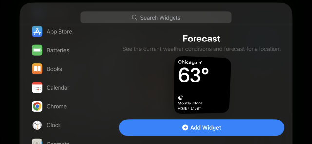
A menu with search and browse options for widgets
This is the widget picker for StandBy.
A simple clock with a photo as the background.
This is the full-screen photos page.

Photos serves up full-screen images from your library in the Photos app. You can swipe up and down between albums, and it automatically picks some to start with, like “featured,” “pets,” and “cities.” You can choose your own albums for it, too.

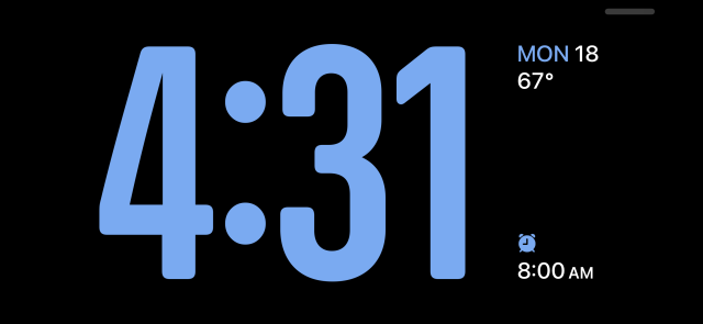
Lastly, there’s a full-screen clock that comes in five swipeable styles: Analog, Digital, World, Solar, and Float. These clocks look great, and I have a feeling many people who use StandBy will just opt for these instead of the more involved pages.

A digital clock with weather and alarm info
The "Digital" StandBy clock.
A timezone map with clock overlaid
The "World" StandBy clock.

Live Activities and Siri

In addition to those three pages, StandBy also supports Live Activities—even multiple Live Activities simultaneously, like if you have a timer going while you’re listening to music. In my experience, it was the Live Activities that made StandBy shine. They offer robust interactivity; for example, the Now Playing one includes playback, volume, and AirPlay controls.

You can also invoke Siri while in StandBy mode, which can be handy. It works just as you’d expect.

Notifications

StandBy supports notifications, though you can disable them if you’d like to keep distractions at bay.

When a notification comes in, it briefly takes over the entire screen. Tapping on it opens up the associated app. You can even receive, answer, or reject phone and FaceTime calls in StandBy. Once you take a call, it becomes a Live Activity that you can minimize while you’re talking. The entire call can begin, take place, and end within StandBy.

StandBy is definitely iOS 17’s flashiest new feature. Whether it’s useful for you or not depends on your relationship with your phone, though. It makes the best of a time when the phone is not typically that useful, like when it’s sitting on your nightstand while you sleep or when it’s on your desk next to you while you’re using your computer.

Not everybody’s looking for that. Some people will prefer to keep everything totally offline during times when they’re not holding their phones, and others won’t see any value in a mode that hides many of the phone’s most useful features.

But for the handful of folks who like the idea of keeping their phone useful—but not too engaging—during those times, it’s a welcome addition.

The widgetization of iOS continues

For the past couple of releases, Apple has emphasized bringing modular pieces of apps out of the apps themselves and into other places in the OS, like Siri, Shortcuts, notifications, and widgets, among other things.

The goal seems to be to gradually move iOS away from the “switch to this full-screen app to do a thing, then switch to another app to do another thing” paradigm to one where you have to spend less time in apps, making the home screen more than just an app launcher and the lock screen more than just a list of notifications to look into.

In iOS 17, Apple has laid the groundwork for major new progress in that direction even though the options are too limited to tell the full story at the time of iOS 17’s initial public launch.

Interactive widgets

Since their introduction, widgets in iOS have been non-interactive; they could show you information, but tapping them just launched the app tied to them. There was nothing you could do with them from the home or lock screen. iOS 17 changes that by introducing interactive widgets.

Whereas the old widgets were treated as one giant button that you could tap to open the related app, these widgets allow for multiple tapping points, and those tapping points can invoke behaviors, causing the widgets to refresh with new information. Interactive widgets can be installed in multiple places across the OS, like the home screen, the lock screen, and in StandBy’s widgets page.

You’d think interactive widgets would be a game changer. Maybe they will be! But at the time of iOS 17’s launch, the only Apple-made interactive widgets that are much use at all are the Music, Home, and Podcasts ones. The audio widgets now finally allow you to stop and start playback of specific songs or podcasts with a tap on the home screen, while the Home one lets you quickly tap to toggle connected devices off and on.

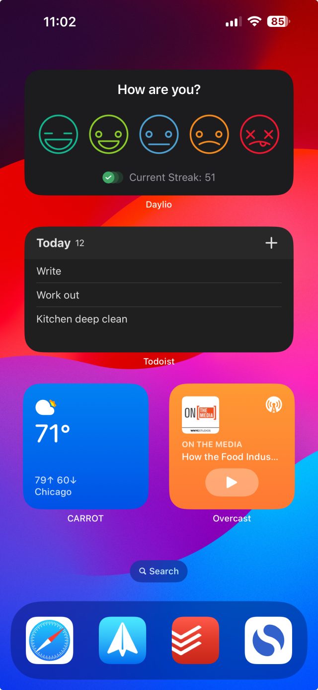
A home screen full of widgets
Both third-party and Apple-made widgets can now be interactive.
Podcasts widget in iOS 17
The Podcasts widget allows playback, but not browsing or much of anything else.
Todoist in iOS 17
Apps like Todoist and Reminders are a natural fit for this simple interactivity.
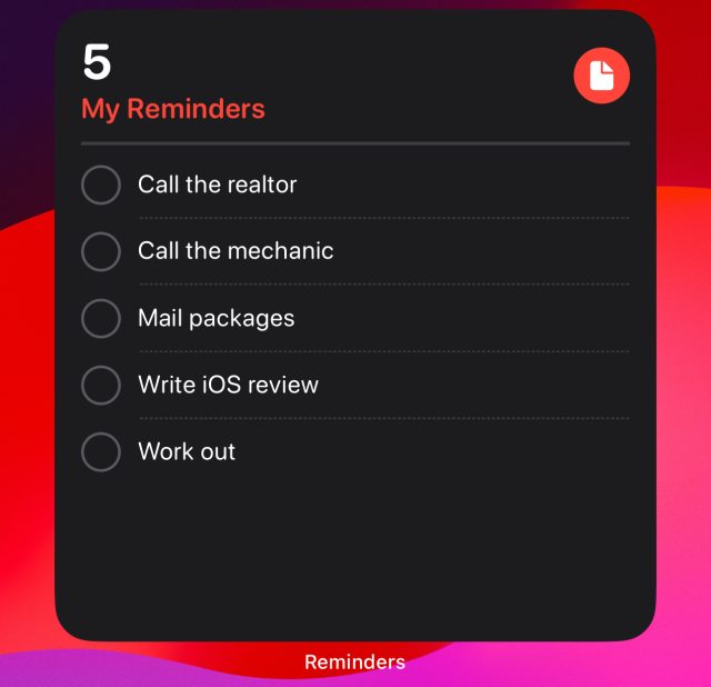
You can also place some (barely) interactive widgets on your lock screen, like the Reminders one here.

Still, they don’t give you many options for browsing. You can’t scroll, and complex swiping gestures and the like aren’t supported. You can just tap what you see, and that’s it. So you can’t read through an entire email or document, and you can’t scrub through to a specific point in an audio file.

Third-party developers have access to interactive widgets, and a handful that have already implemented them have gotten more creative with them. For example, some have introduced paginated widgets, making the best of the tapping gesture to still allow you to browse more options.

I’m mostly talking about home screen interactive widgets here, but there are lock screen interactive widgets, too. Those are generally smaller and less functional, and there are only two Apple-made interactive lock screen widgets. Reminders is an obvious pick, and it works nicely enough for checking off tasks. The other is Shortcuts, which will be great for power users.

Live Activities

The bigger news for the lock screen is that Live Activities are now available to third-party developers. In my view, Live Activities are a better fit for the lock screen than widgets that are interactive, but only to a point, so that’s the widget change I personally find most exciting in iOS 17.

You might be noticing a theme here: interactive widgets and Live Activities are a great opportunity for third-party developers to bring new functionality and convenience to the iPhone. I’m looking forward to seeing what more of them do in the coming months because Apple hasn’t done anything exciting with interactive widgets in its own apps.

Phone, Messages, and FaceTime

StandBy and interactive widgets are the major OS-wide features of iOS 17, but as usual, Apple has made updates big and small to individual apps. I won’t get into the weeds with most of these, but there is one broad category that has gotten outsize attention this year: communications apps like Phone, Messages, and FaceTime.

Contact posters

Contact posters allow you to create a custom full-screen image that will display on others’ iPhones when you call them, in place of the simple name-and-contact-photo approach of yore.

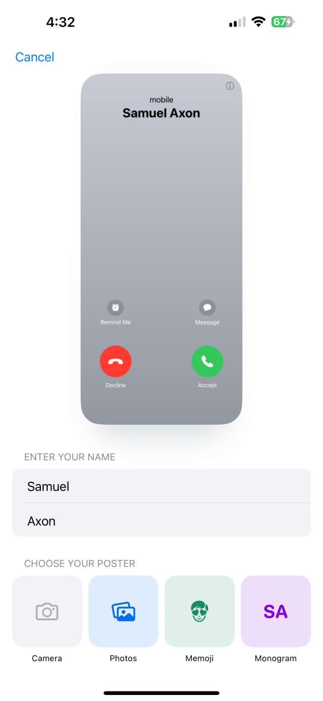
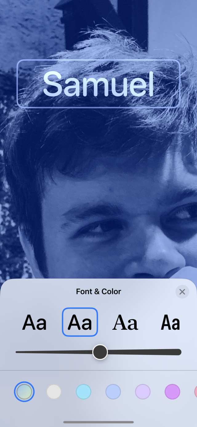
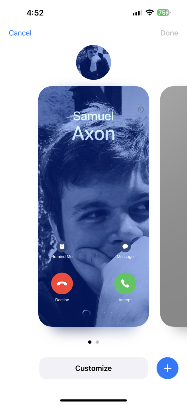
The interface for designing these posters is similar to the one you already use to set your various home screen backgrounds, right down to the swipeable cards of different options with the "customize" button at the bottom. You can pick a photo, adjust the crop and positioning, apply various filters, modify the colors, and change the font for your name.

A menu for configuring contact posters
A simple menu gets you started customizing your contact poster.
A font picker in iOS
You can customize the font and colors of your poster in a similar interface to the one used to customize lock screens.
A blurred contact poster
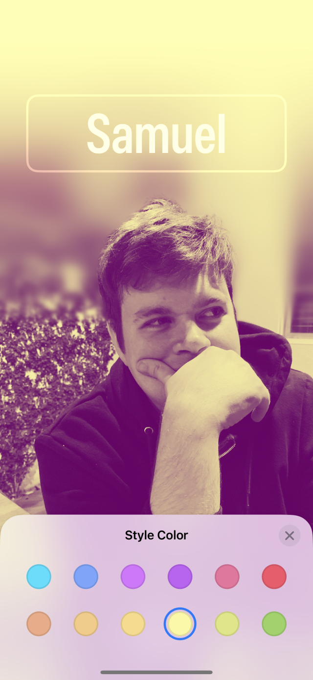
When editing, it tries to solve cropping issues with creative use of blur and the like, but the results are mixed.
A selector for different contact posters
You can swipe between different configurations just like with the lock screen tool, too.

I ran into several small challenges with the AI smarts that drive this, though. For example, when I tried to select a picture for my own contact card, it showed several automatically selected suggestions—all of which were pictures of my wife, not me, for some reason.

It was also a bit hard to find a picture of me that I liked that fit the phone's super-tall aspect ratio while also making room for the text and other elements. iOS tries to intelligently work around this by using some strategic blurring and layering, but it often just looks weird. After a while, I found a photo that I thought was OK, but I'll have to set aside some time to take photos specifically to fit this application.

All told, it feels like a bit of work for something that doesn't add much to the experience. There was nothing wrong with just showing the name and contact photo like the iPhone has for ages. There is something to be said for controlling how you’re presented to others, I suppose, but I’d rather focus on having control over how others appear on my own device. You might not agree; if that's the case, this feature is for you!

Provided you do have an appropriate picture handy, it can be easy to set up, and the pre-made designs and color options look lovely.

The dream of the ’90s is alive in the Phone app

It’s not often these days that the “phone” part of the smartphone gets significant attention in an update, but that’s where some of the action is in iOS 17.

There are a few small design changes, but the important news is that the '90s are back again, because call screening is now possible!

When you receive a call, you can choose to send it to voicemail. When you do, on-screen text will live-transcribe whatever the caller is saying when they leave that voicemail. You can even pick up and answer mid-voicemail. I only got to use this feature a couple of times, but it worked well, and the transcription seemed accurate.

This is my personal favorite feature in iOS 17. I think it’s even more convenient than the old version of call-screening since you don’t have to put the phone up to your ear to see what’s going on.

I was an unrepentant, committed call screener back in the days of landlines and home answering machines. When I lost that ability, I switched to a policy of almost never answering my phone unless the call was from my wife or a family member. I’d let it go to voicemail and either listen to that voicemail or, in true (elder) Millennial fashion, text the caller to follow up afterward.

Now I can screen calls again, provided the person calling is someone who’s inclined to leave a voicemail to begin with. Of course, most people in my life now operate in the “text to ask for a phone call if one is needed” social contract instead of the “just call someone blind like it’s still the 20th century” one, and most people who call and leave voicemails are people trying to sell me something.

But I know that’s not true for everyone, and I’m even hopeful this new feature will encourage people to leave voicemails to bring call screening back because that’s still my favorite way to do it after all these years.

(On a related note, you can now leave video voicemails in FaceTime.)

Messages and more

There are a bunch of small updates and new features within or related to text messaging and contacts.

Search filters

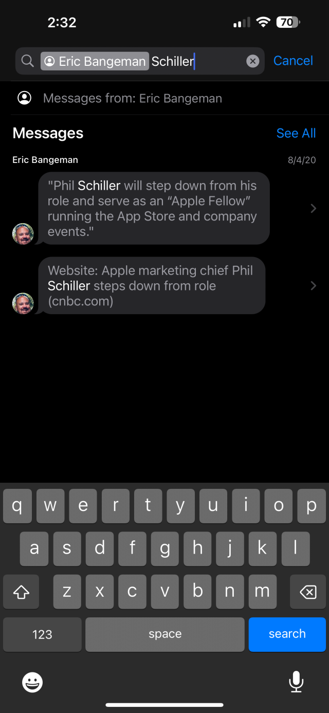
I found the addition of search filters to the Messages app to be particularly useful. You’ve been able to do simple searches in Messages for a while, but it has never been particularly useful because it was just a basic semantic search that returned a giant list of all the messages you’ve ever received with the query in them.

Apple introduced search filters to Photos a while back, and I use them all the time to do things like type in someone’s name alongside a location to find photos including that person taken in that place. Now you can do the same in Messages. You can find messages from a specific person that mention a word, or all the messages from that person that include photos, and so on.

It makes search in Messages much more useful, and it’s another favorite addition for me this year.

A search query returning conversations with Eric Bangeman that mention Paul Schiller
Search is much more powerful in Messages than it used to be.
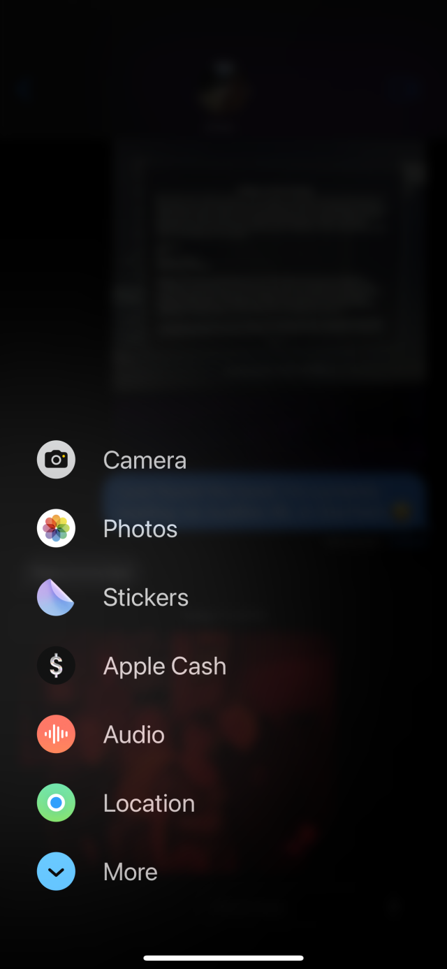
A vertically sorted list of items like "stickers" and "photos"
This new media picker replaces the horizontally scrolling bar seen in previous versions of Messages. This is where you'll find Check In, among other new features.

NameDrop

With NameDrop, Apple sought to streamline the tradition of awkwardly working out the best way to exchange phone numbers with a new friend, a new feature that uses AirDrop.

When you meet someone new and want to share contact information, there’s a wide range of customs. Sometimes you speak your number to someone while they type it into their phone; sometimes they hand you their phone so you can type it in yourself. Then you either have to do one of those the other way around, or, more often, the person you just gave your number to will text you right away so you can see their number, too.

With NameDrop, you can press the top of your phone close to the top of theirs, and it immediately shares contact info with a snazzy visual that makes use of contact posters. The recipient can choose to either just receive or to both receive and share their info back.

Of course, you both have to have iPhones (or a supported Apple Watch, in a later update), but I could see it being handy now and then.

Check In and Live Location

Many people stay in touch via text message if they may be heading into an unsafe situation. For example, my wife’s best friend likes to go kayaking alone, and she sends text messages to my wife on a schedule so someone will know to look for her in case an accident happens. There are other possible examples, too, like going on dates or walking late at night in an unsafe area.

Apple has formalized that process with a feature called Check In. You launch inside Messages via the same place you’ll find stickers, photos, and so on. You can set either a destination or a time window. If you don’t reach the destination or check in within the time window, or if your device unexpectedly becomes unreachable, your contact will automatically be notified.

You can choose between two levels of information to expose when that happens. If you select “Limited,” the recipient will see your current location as well as the current states of your Apple Watch's and iPhone’s batteries and network connections. If you select “Full,” they get all of that plus “route traveled and location of last iPhone unlock and Apple Watch removal.”

In tandem with the ability to share your live location via the Find My app or inside Messages, this gives you a lot of options for keeping a trusted person in the loop so you know you’ll have support if you need it.

Both users have to be using a device that runs iOS 17. It’s unfortunate that a safety feature like this hasn’t found a way to at least partially include friends who are on Android devices, but it’s still a great idea.

The grab bag: Other notable changes

Offline maps

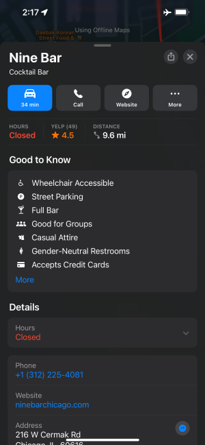
For the first time, you can now download a map area in Apple’s Maps app so you can browse the map and get turn-by-turn directions even when you don’t have any signal. Google Maps has offered this feature for years, but I’m happy to report that Apple’s implementation is just as good as Google’s, and it’s a welcome addition.

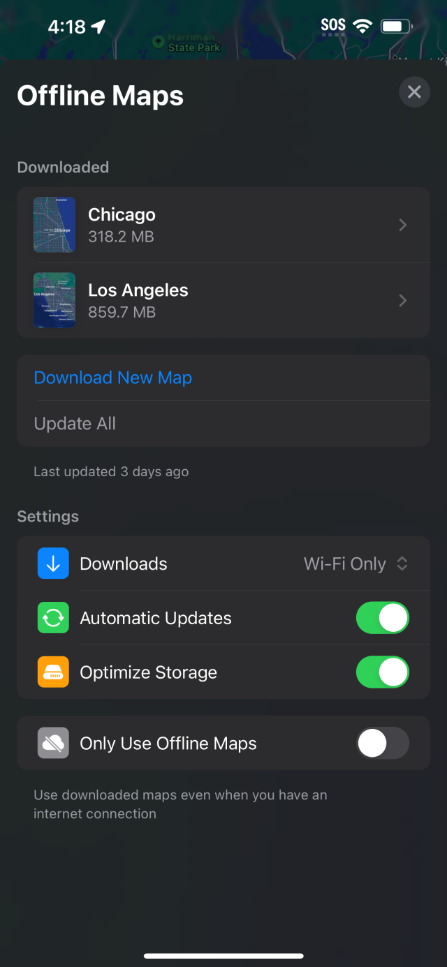
An options panel inside Apple Maps
In this offline maps options menu, you have a few toggles, as well as a list of individual maps you've downloaded and a prompt to add more or update all the existing maps.
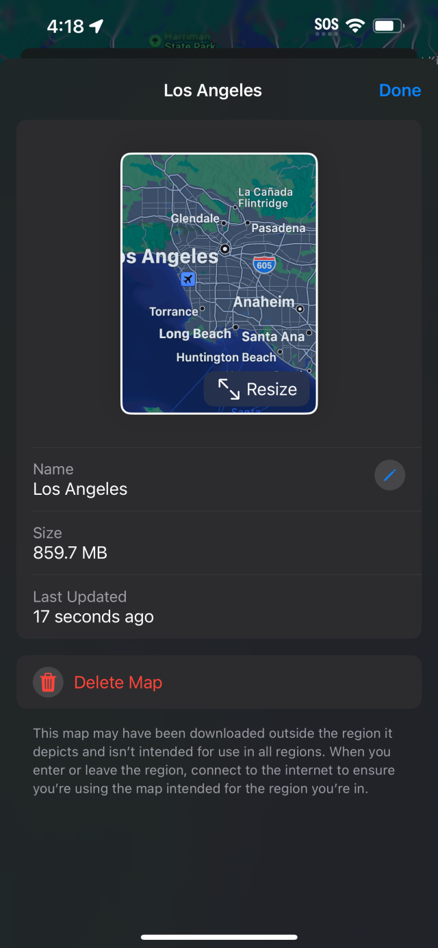
A map-specific options panel
Tapping on an individual map in the options panel brings up this view, which tells you when the map was last updated and lets you resize or rename it.

I wrote at much greater length about my experience with offline maps in the earlier days of the iOS 17 beta, and I included detailed comparisons with how the feature works in Google Maps, so check that out if you want to dig deeper.

Safari profiles

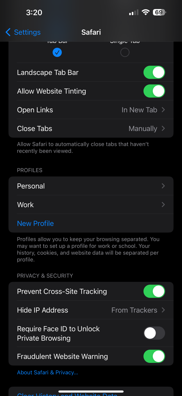
Safari now supports multiple profiles, though the way to set them up isn’t obvious. You have to go to the Settings app to create and manage profiles; you can’t do it from within Safari.

Profiles buried in the Safari screen of Settings
Weirdly, you can't set up profiles within Safari, though. You have to do it in Settings.
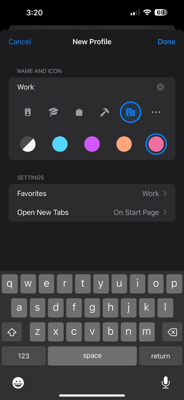
A screen for naming and coloring profiles for Safari
This is the view for configuring a new profile.

But once the setup is done, you can quickly switch between profiles in Safari’s tab menu. Each profile has different tab groups and history. The obvious use for this is keeping separate profiles for work and personal life, but you can define them however you’d like.

New privacy features

Speaking of Safari, there are a few improvements to private browsing. Private browser tabs can automatically lock when you’re not currently using them, requiring Touch ID, Face ID, or a passcode to access them. You can turn this feature on and off in the Settings app.

Safari will also strip tracking URLs (like those used for e-commerce links and so on) in private browsing mode. You can set a separate default search engine for private browsing if you’d like, and Apple claims Safari now “keeps your most sensitive browsing safe with more aggressive tracker blocking and fingerprinting protection.”

The privacy features aren’t limited to Safari, obviously. You can now hide your email address in Apple Pay. It was added earlier this year, but it's worth noting there’s a new hardcore privacy option called Lockdown Mode. Lockdown Mode changes networking settings and more to reduce the attack surface, but at the cost of usability. It’s intended for extreme cases, like journalists or public figures who are being targeted by governments or hostile individuals.

Siri stuff

Siri still may not be the most powerful voice assistant out there, but it’s one of the most widely used, so it’s good that it's getting some attention. There’s nothing fundamentally different about Siri in iOS 17, but there are some nice new features.

First up, you can now just start a sentence with "Siri..." instead of saying "Hey Siri" to invoke Siri. In my time with it, it seemed to work just as well as "Hey Siri" used to. It never missed an intentional prompt.

My first thought about this feature was that it might activate accidentally if you even mention Siri in passing to someone else in the room, but I couldn't get that to happen.

It appears to leverage AI to detect the difference between starting a query with the word or just saying "Siri" in passing. I tried it all sorts of ways, saying things out loud like, "Siri is the iPhone's voice assistant" and "Have you met Siri?" and these things didn't register like saying, "Siri, what time is it in Honolulu?" did.

I'm not saying it could never be triggered accidentally, I'm just saying it hasn't happened to me yet, despite my best efforts to trip it up.

Siri now supports back-to-back requests, so you can ask a follow-up question without saying “Siri” again. A new “Siri, read this” command allows Siri to read Reader-eligible websites aloud. You can also invoke Siri in the middle of calls.

Autocorrect and predictive text

Apple claims that iOS 17 brings numerous AI-driven improvements to both autocorrect and predictive text. Autocorrect is supposedly much more accurate, and it’s easier to edit your iPhone’s choices when it makes a wrong call.

Numerous new languages and keyboard layouts are supported, and Apple has also expanded the words that autocorrect and predictive text can learn. Most notably, this means that the iPhone can now learn swear words—about ducking time, as the company joked during its developer presentation earlier this year.

I haven’t spent enough time with the latest version of iOS 17 to make big judgments about the improvements—this is the sort of thing that becomes apparent over a long period of use—but any improvement is welcome. The swear word thing alone is a big deal.

iPadOS 17

Even more so than with iOS, this is not a major year for iPadOS, but here’s what I encountered during my brief time with iPadOS 17.

Apple has been trying to turn the iPad into a Mac-level productivity device for a few years now, but it never quite seems to get there. Last year, the company introduced Stage Manager, a new, Mac-like way of managing windows across multiple applications. It received a mixed reception, and iPadOS 17 seeks to address some of the concerns.

It offers more flexibility in resizing and positioning windows, which is certainly welcome. It also manages to work a lot better on external displays, including the ability to remember your previous configuration on a given display. I don’t think many people use the iPad with an external display, but for the handful of you who do, congrats: It’s a lot more convenient now.

Apple has also brought lock screen widgets, which debuted on the iPhone last year, to the iPad. To me, that feature seems less critical on the iPad because the iPad is a device you sit down and use for a dedicated session. You’re constantly taking out and putting away your iPhone, so the lock screen is a big part of the experience. That’s just not the case with the iPad.

I’m not saying I’m sad to see the feature, of course—and I think Apple has done a good job of bringing it to the tablet. It’s just not as big a deal as it was on the iPhone.

I’ll be honest: I still don’t see the iPad as a serious productivity device. It’s still not there for me, and while the tweaks this year are welcome, it’s not enough to change anything. As I’ve written in past iPad and iPadOS reviews, I’m not even convinced that’s a desirable goal for the iPad. The iPad is great as a media consumption tablet, a gaming tablet, and a point-of-sale device. As a user, I don’t see why it has to be more than that when the Mac exists—even though I understand that Apple wants to expand its usefulness to expand its audience and its place in the market.

Apple seems committed to making this happen, so I’ll continue keeping an eye on it and keeping an open mind. My verdict for iPadOS 17 is that it still hasn’t gotten there, though.

Coming later

There are a few iOS 17 features that Apple announced at its developer conference in June but that the company unfortunately couldn’t quite get across the finish line in time for this initial launch. These features are still promised for a later date, but I haven’t covered them here because, well, they’re not out yet! For now, I’ll list some key ones below.
  • A journaling app that has access to your personal data for making intelligent suggestions
  • AirDrop over a cellular data connection
  • AirPlay in hotel rooms
  • Signing in to Apple ID via proximity to another signed-in device
  • A favorite songs playlist in Apple Music
  • Collaborating with others on Music playlists
  • NameDrop between an iPhone and an Apple Watch
  • A catch-up arrow for group conversations in Messages
  • PDF features like intelligent form detection

It’s a slow year (but we’re not complaining)

iOS 17 and iPadOS 17 offer several welcome improvements, tweaks, and new features. They also continue two trends that have dominated recent updates for both platforms: the expansion of widgets giving modular access to functions from a variety of apps, and on-device intelligence that improves search, recommendations, and more.

This year’s update pushes both platforms forward just a bit—but not enough that too many people will notice. A more complete feature set will roll out over time, though, so by the end of the cycle, we’ll have seen a nice range of additions.

I’ve long said that iOS could benefit from having a more iterative release schedule, as opposed to lumping tons of stuff into a big annual update. So while it doesn’t seem like that was Apple’s intent, that’s effectively what we’re getting here, and that’s not necessarily a bad thing.

Those delays, combined with the fact that this is a low-impact year to begin with, make this one of the least notable recent iOS updates. I’m not saying you shouldn’t update your device to iOS or iPadOS 17, though—of course you should. I didn’t encounter any problems or setbacks that weren’t present in previous versions of the software, and the new features and tweaks are all welcome.

But it’s clear that Apple’s attention was focused elsewhere this year. That’s OK for the iPhone because iOS was already mostly in a really good place. iPadOS needed some refinement for Stage Manager, and it got that, but there’s more work to be done. I do recommend installing iOS 17 and iPadOS 17—I just don’t think we’ll remember this as a banner year for either platform.

The good

  • Expanded widget capabilities for third-party developers will likely bear fruit in the coming months.
  • Call screening is back!
  • StandBy makes the iPhone useful in a new context.
  • Tweaks make Stage Manager more useful on iPad.
  • Check In and live location are great safety features.
  • As usual, a bunch of small tweaks add up.

The bad

  • Several features have been postponed to later updates—even more than usual. (In truth, I don’t think this is really bad—it just might be disappointing for some folks.)
  • A few UI changes will mess with your muscle memory for a bit, particularly in the Phone and Messages apps.
  • Apple didn’t do enough with its own apps to sell the potential of interactive widgets.
  • iPadOS still lives in an awkward spot between consumption and production.

The ugly

  • Nothing, really—I don’t have any major complaints about this update.

Listing image: Samuel Axon

Photo of Samuel Axon
Samuel Axon Senior Editor
Samuel Axon is a senior editor at Ars Technica. He covers Apple, software development, gaming, AI, entertainment, and mixed reality. He has been writing about gaming and technology for nearly two decades at Engadget, PC World, Mashable, Vice, Polygon, Wired, and others. He previously ran a marketing and PR agency in the gaming industry, led editorial for the TV network CBS, and worked on social media marketing strategy for Samsung Mobile at the creative agency SPCSHP. He also is an independent software and game developer for iOS, Windows, and other platforms, and he is a graduate of DePaul University, where he studied interactive media and software development.
Most Read
  1. Listing image for first story in Most Read: Apple couldn’t tell fake iPhones from real ones, lost $2.5M to scammers
    1. Apple couldn’t tell fake iPhones from real ones, lost $2.5M to scammers
  2. 2. Helene ravaged the NC plant that makes 60% of the country’s IV fluid supply
  3. 3. X fails to avoid Australia child safety fine by arguing Twitter doesn’t exist
  4. 4. Neo-Nazis head to encrypted SimpleX Chat app, bail on Telegram
  5. 5. ULA’s second Vulcan rocket lost part of its booster and kept going