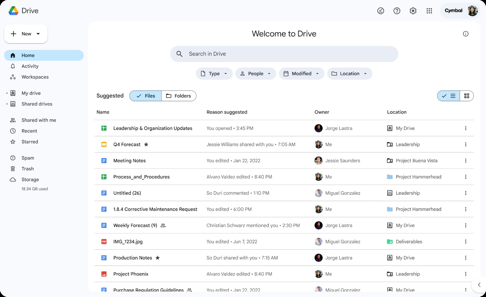
Back in November, Google Drive introduced a new homepage on the web, and the latest design lets you simultaneously see suggested folders and files.
Previously, you had to pick between seeing Files or Folders on the Google Drive homepage:

Google will now show both, with Suggested folders appearing first. You’ll see a line of folders (up to 6) that can be expanded to show up to 12.
Suggested files (up to 10) appear below with the “View more” button also available for 20 additional suggestions.
You may not see the “View more” option if you do not have additional file or folder suggestions.

These “personalized file and folder suggestions” leverage machine learning with recent activity, sharing patterns, and Google Calendar events taken into account.
Earlier this year, Google added a prominent search bar design to the page with enhanced file type, people, modification, and location filters. While Google wants it to be your default page, there’s an option to continue using the “My Drive” view.
This updated design is rolling out over the coming weeks for “all Google Workspace customers, Workspace Individual Subscribers, and users with personal Google accounts.”
More on Google Drive:
- Google Drive app for Windows adding ARM support for Snapdragon X soon
- Google Drive document scanner can now save as JPEGs
- Google Drive PDF viewer adding Gemini side panel integration
FTC: We use income earning auto affiliate links. More.


Comments