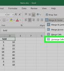
This article was co-authored by wikiHow staff writer, Rain Kengly. Rain Kengly is a wikiHow Technology Writer. As a storytelling enthusiast with a penchant for technology, they hope to create long-lasting connections with readers from all around the globe. Rain graduated from San Francisco State University with a BA in Cinema.
This article has been fact-checked, ensuring the accuracy of any cited facts and confirming the authority of its sources.
This article has been viewed 1,556,517 times.
Learn more...
If you have data to present in Microsoft Excel, you can use a line graph. This can easily be created with 2-D and 3-D Line Chart tool. You'll just need an existing set of data in a spreadsheet. Then, you can make a customizable line graph with one or multiple lines. This wikiHow will show you how to create a line graph from data in Microsoft Excel using your Windows or Mac computer.
Things You Should Know
- Highlight the data you want in the graph by clicking the top-left cell and dragging to the bottom-right cell.
- Click "Insert" → "Line Graph" icon (two intersecting line graphs) → click a graph style.
- Click the graph to customize it. Change the style, position, size, and name of the graph.
Steps
-
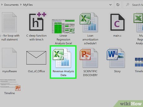
Open a workbook in Microsoft Excel. You can use an existing project or create a new spreadsheet.[1]
- Microsoft Excel is available on Windows and Mac. You can also use the online web version at https://www.office.com/.
- You can use Excel to make tables, type formulas, and more.
-
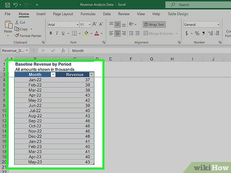
Highlight your data. Click and drag over the cells containing the data you want to use in your line graph. If your data isn't already entered, do so now. Be sure to select column headers if you have them.
- To select everything, click the top-left cell of the data. Press CTRL + A (Windows) or Command + A (Mac).
Advertisement -
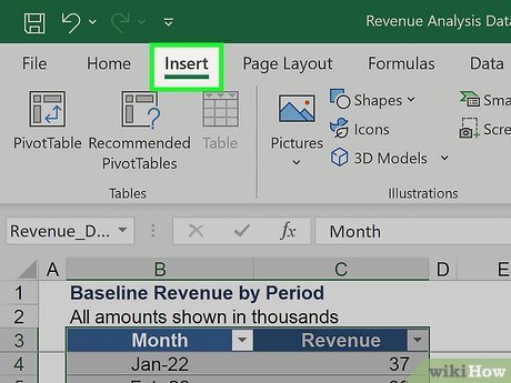
Click the Insert tab. This is at the top toolbar.
-
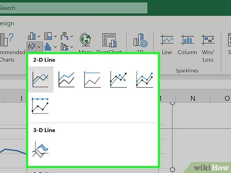
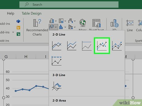
Click the graph icon. This looks like two intersecting line graphs. You can find this in the Charts section.
-
Hover over a line graph style. Hover the mouse cursor over a line graph template in the drop-down menu to see what it will look like with your data.
- The first section of graphs has traditional two-dimensional line graphs, while the second has one or more 3D line graphs.
- If you have a lot of data, the preview may take a moment to appear.
-
Click a graph style to select it. Once you decide on a line graph template, clicking it will create your graph in the middle of the Excel window.
-
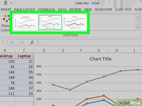
Change your graph's style. Once you create your graph, the Chart Design toolbar will open. You can select one of the styles in the toolbar to quickly select a new look for your line chart.
- If this toolbar doesn't open, click your line graph and then click the Design tab in the green ribbon.
-
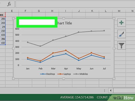
Move your line graph. Click and drag the white space near the top of the line graph to move it.
- You can also move specific sections of the line graph (e.g., the title) by clicking and dragging them around within the line graph's window.
-
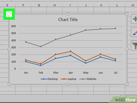
Resize the graph. Click and drag one of the circles on one of the edges or corners of the graph window in or out to shrink or enlarge your graph.
-
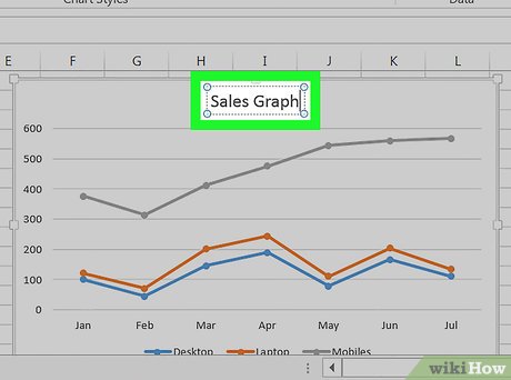
Change the graph's title. Double-click the title of the graph, then select the "Chart Title" text and type in your graph's name. Clicking anywhere off of the graph's name box will save the text.
- If you want to label your graph's axes, click the graph.
- Click + at the right side of the graph. A pop-up menu will open.
- Check the box for Axis Titles.
- Double-click the Axis Title box and delete the default text.
- Enter a new title.
- If you want to label your graph's axes, click the graph.
Community Q&A
-
QuestionHow do I name the y and X axis in the graph?
 Community Answer1. Click on the graph. 2. Select 'Chart Elements' on the side, which is the plus icon. 3. Tick the 'Axis Titles' box. Some text boxes should appear on the x and y axis.
 -
QuestionIf multiple lines are present in my chart, how can I view one at a time?
 Community AnswerOne method is to hide the relevant rows or columns that you do not wish to show on the graph. Hidden rows and columns are not displayed.
 -
QuestionWhy do my years show up as numbers?
 Community AnswerBecause A,B,C,D,E, and F, mean this: (A:2000->B:2001->C:2002->D:2003->E:2004->F:2005.)
Video
Tips
-
You can add data to your graph by entering it in a new column, selecting and copying it, and then pasting it into the graph window.Thanks
References
About This Article
1. Open a new Excel document.
2. Enter your graph's data.
3. Select the data.
4. Click the green Insert tab.
5. Click the "Line Graph" icon.
6. Click a line graph template.
