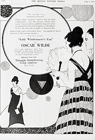
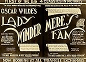
A Lady mistakes her husband's mother for his mistress and takes a lover.A Lady mistakes her husband's mother for his mistress and takes a lover.A Lady mistakes her husband's mother for his mistress and takes a lover.
Photos
- Director
- Writers
- All cast & crew
- Production, box office & more at IMDbPro
Storyline
Did you know
- TriviaNetta Westcott's debut.
- ConnectionsVersion of Lady Windermere's Fan (1925)
Featured review
This 1916 silent film is relatively faithful to the play on which it's based, Oscar Wilde's "Lady Windermere's Fan." Too faithful in some respects. The problem I have with Wilde's play is that while it's a satire on the manners and morals of Victorian-era high society, this is undermined by its rather hypocritical conclusion ultimately celebrating those very manners and morals, especially by its treatment of women as only being held to the ideal of motherhood. Including this, I've seen four screen adaptations of the play, and this one is the least committed to Wilde's satire, but is the most devoted to its upholding of Victorian virtues. That just makes an uneven play solidly bad, in my opinion. Ernst Lubitsch's 1925 version, on the other hand, flips this faithfulness around--it's all wit and very little morality--and is consequently by far the best version--better than the uneven talkie remakes, "The Fan" (1949) and "A Good Woman" (2004)--even better than the play itself. And it does this with few words, none of which are Wilde's, whose witticisms are the play's main appeal.
This 1916 adaptation is interesting, however, for comparison to Lubitsch's film, and as Charles Musser ("The Hidden and the Unspeakable: On Theatrical Culture, Oscar Wilde and Ernst Lubitsch's Lady Windermere's Fan") has convincingly argued, Lubitsch assuredly found this to be the case, too, as Warner Bros. purchased the rights to the 1916 version in preparation for Lubitsch's production (a common practice for remakes at the time). He would've seen this film as largely an example of what not to do, as well as improving on some of its more promising alterations and "opening up" of Wilde's text, which is restricted to three sets in four acts. Despite, like Lubitsch's film, mostly eliminating Wilde's famous epigrams, the 1916 version nonetheless is extremely wordy and quotes the original author quite a few times, although not necessarily his best lines. The running gag of the Duchess and her obedient daughter, Agatha is especially laborious, as the humor is entirely text based and any visual annotation provided by the actors is lost in the film's distant framings. (Check out the 1949 version if you want to see this bit effectively done.) Lubitsch replaced these sort of written witticisms with visual ones. This 1916 picture, by contrast, I believe only has one decent sight-based gag, which involves Tuppy battling with a plant to get nearer the scandalous Mrs. Erlynne.
Very much a product of its time, as continuity editing and camera placement techniques advanced rapidly between 1916 and 1925, it consists largely of establishing long shots, which are broken up by intertitles and quick inserts. The first part is slavishly devoted to this editorial scheme: establishing shot - insert - back to establishing shot, with iris closings and openings for transitions to title cards that introduce the subsequent scene, and it doesn't help that the American print we've inherited today is choppy. This pattern is alleviated a bit in the final acts with more extensive crosscutting during the party, including semi-match cuts between various couples in similar positions. It's certainly better than the obnoxious number of insert shots of dogs and product placement in an earlier episode.
I counted the number of shots in both the 1916 and 1925 films: there are 318 here and 702 in Lubitsch's film; yet, 96 of this film's shots are title cards, while there are only 63 in the about-one-half longer and faster-paced 1925 version. Thus, not only does the 1925 film have a brisker average shot length of 7.4 seconds compared to this one's 12.1 seconds, it also benefits from less reading, both proportionally and in real terms. The opening scenes of the 1916 picture are the worst in this respect, especially the very first scene, which features Mrs. Erlynne sitting in bed looking at and reading various documents loaded with exposition. I didn't even count the film's dozen-or-so shots of letters, a newspaper article and diary entry among the rest of the required reading of the title cards. It's more like reading a badly-written story than viewing a film at that point.
In addition to the excessive text and exceedingly distant camera placement, there's the dated acting comprised of broad gesticulation--although, granted, with the camera so far away, we probably wouldn't notice many subtler expressions. This sort of acting was designed to play to the gallery of the theatre, and that's practically where the camera places the spectator of this filmed play. On the plus side, there's some low-key lighting, but it doesn't make up for the sort of wretched theatrics in the scene where Lady Windermere reaches her arms outward, for which the film cuts to an insert shot of her baby. Unsubtle, indeed. Moreover, this is the only one of the four adaptations I've seen to retain Lady Windermere's baby, and it's excessive in hammering home the moral of the story that women best stay home and raise families. It's the least appealing aspect of Wilde's play, and that's the part this film highlights. That's the true scandal.
- Cineanalyst
- Sep 14, 2018
- Permalink
Details
- Runtime1 hour 6 minutes
- Color
- Sound mix
- Aspect ratio
- 1.33 : 1
Contribute to this page
Suggest an edit or add missing content

Top Gap
By what name was Lady Windermere's Fan (1916) officially released in Canada in English?
Answer