I found this listing while looking through the films of sound designer Randy Thom, and, reading in a comment that it was available for viewing on AtomFilms, I went and checked it out. The sound is great, is in fact the best thing about the short. The music overdoes it a bit, but in a short with no dialogue, I kind of expect that, and so was able to ignore it most of the time, at least when there was some action taking place for which sounds were created. When there's little action, and therefore little sound, the music takes over, and it's a bit much.
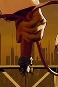
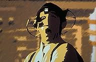
It's not a bad story, though a bit predictable, and the camera work does a great job of telling the story visually and putting a viewer inside the world of the character. But the look of the animation is terrible. I mean, it just looks terrible. This is not the result of a poor monitor or slow connection; I have neither. It's clearly the intent of the director to give it this degraded feel. While I am able to appreciate a picture not quite as sharp and crisp as a big animation studio like Pixar can create, it doesn't have to look like poorly processed film just for the sake of not having the most fabulous clarity. I think a better look could have been created if they hadn't put so much effort into degrading the image.
Still, it's worth a look for any film/animation student, and it's free at AtomFilms.com, so check it out.

