All aboard! The essential guide to mobile app onboarding for 2023 (and beyond)
Stats show that the average user has more than 80 apps installed on their smartphone, but only uses about nine of them day to day. In the space of a month, they might use 30.
So, while we happily spend hours each day on our favorite apps, many others are just sitting there, collecting digital dust. And that, more often than not, is because of a flawed or broken app onboarding process. Put simply, people just don’t get why or how they should use your app. A comprehensive app onboarding experience can make the difference between apps with staying power and those that end up trashed. In this guide, we’ll break down the components of a well-designed onboarding experience, and its power to educate, inspire, and engage users, ultimately leading to user retention.
What is mobile app onboarding, and why is it important?
In a nutshell, mobile app onboarding is a series of steps new users take before they begin to use an app. The process can include educating new users, collecting consenting user information, and guiding users to register for an account.
After downloading, app onboarding is the first introduction a user has to your app. Think of it as an audition, where you need to prove your app’s value and usefulness in solving users’ challenges.
The ultimate goal to keep in mind is that when users launch your app for the first time, the onboarding process should deliver value as quickly and as uniquely as possible to help users get to their “aha! moment.”
3 types of mobile onboarding – the laid back, the fast, and the value-oriented
Ideally, a new user’s relationship with your app should begin with onboarding and end with them becoming a loyal evangelist for your brand. But no two users and their experiences are alike, and different apps require different levels of onboarding to get users comfortable.
This means that, when designing your app’s onboarding experience, you should consider your user, their journey, and their expectations, and choose wisely from the following three formats:
1 – The progressive approach
- How it works: A progressive onboarding process allows users to explore the app and access new information as they navigate – in other words, learning by doing.
- Great for: This type of onboarding works well for apps with an intricate workflow, hidden or unique functionalities, many sections, or gesture-driven interactions.
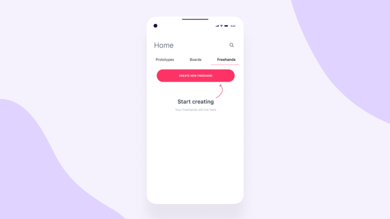
Progressive onboarding example
Collaboration tool InVision is a great example of a progressive onboarding process that previews the next step or the next related feature for users — but does so without overwhelming them — and leaves users in complete control as they navigate through the stages of their onboarding.
2 – The functional approach
- How it works: In this onboarding format, an app immediately shows new users the app’s core functions and how to use them. More specifically, function-oriented onboarding shows users where to start and how to execute common actions.
- Great for: A functional approach is useful when your app would benefit from a visual tour with specific instructions for its various features.
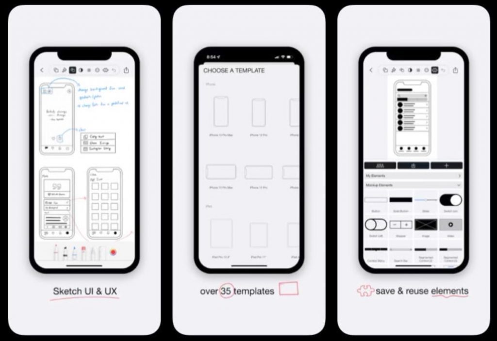
Functional onboarding example
Design workflow app Mockup does an awesome job of showcasing its key functionalities in only three simple slides.
3 – Benefits-oriented approach
- How it works: Benefits-oriented onboarding is a process that demonstrates the value of an app before anything else. It centers on what the app can do instead of how to use it.
- Great for: This technique is good for providing users with freedom and choice, for example where they can opt in or out of permission requests (such as push notifications or location access). It gives you an opportunity to highlight how opting in can enhance the user experience.
Benefits-oriented onboarding example
Evernote is a note-taking app that is all about accentuating added value. It shows users the app’s benefits right off the bat while also allowing them to choose how to proceed on their onboarding journey, providing users with both education and freedom of choice as they onboard.
How it’s done right – app onboarding best practices for 2023
While your precise approach to app onboarding will vary depending on your app’s complexity and users’ needs, there are still some universal truths all developers can and should follow:
1 – Get the data you need upfront
Plenty of apps are only as useful as the data their users provide. A weather app can’t warn you of an approaching thunderstorm if you haven’t shared your location. So, ask for what you need, but make it as painless as possible.
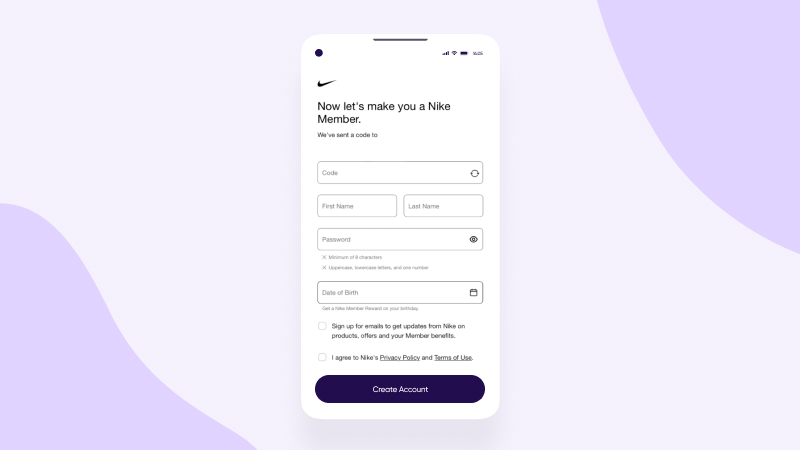
For example, Nike doesn’t just let its app users browse; it makes them “members”. Right after installing the app, users are prompted to provide their email address, and are then immediately met with the irresistible message: “Now let’s make you a Nike Member“, making users feel part of an exclusive club.
By obliging users to sign up before they access the app, Nike gathers the data to create a personalized experience. But, crucially, it doesn’t introduce unnecessary friction by asking for too much information at once – cutting the risk that users will browse briefly and then trash the app.
2 – Allow users to skip
Despite expecting a smooth and frictionless onboarding, most users don’t want to have their hands held throughout the process — especially if they’re tech-savvy or your app is fairly self-explanatory.
In that case, allowing users to jump right in and explore the app themselves is a great way to get them feeling excited, rather than patronized.
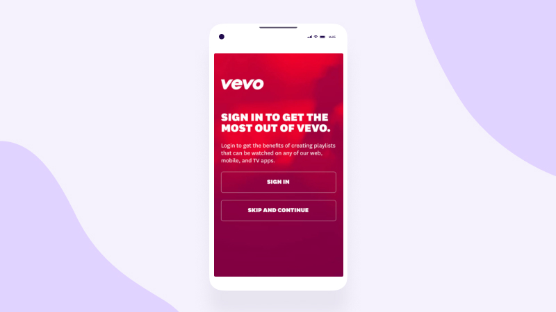
Music video streaming app Vevo gives its music-loving potential users the option to skip irrelevant onboarding parts, jump right in and enjoy. A great example of a progressive, user-focused approach.
3 – Immediately highlight core features
The best way to grab users’ attention is to showcase your app’s core functionalities as soon as they launch it. But try to resist the urge to throw every single feature at them all at once, or they’ll feel overwhelmed.
Instead, focus on the functions that most directly solve your users’ problem, and trust that they’ll discover all your other bells and whistles in their own time.
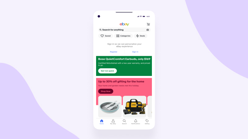
eBay offers an excellent example of an app that instantly highlights its core features and encourages users to self-navigate (even before creating an account), while keeping things simple once users are ready to take the plunge and register.
eBay understands that users are there to shop, so doesn’t stand in their way or bore them with a long tutorial on how the bidding process works. Instead, users are met with an easy-to-understand dashboard that allows them to search for whatever they’re looking for, quickly and intuitively.
4 – Engage on multiple channels
Your onboarding experience needn’t be limited to in-app engagement — you can engage new users on various channels with the aim of bringing them back to the app. Think entertaining push notifications, special offers via SMS, new features announcements on social media, and enticing emails.
Weaving multiple channels together for the onboarding process can enhance the user experience and lure them back to your app. Personalizing messages based on a user’s recent progress or status, like a reminder to complete registration, could be the final nudge they need to complete their onboarding process.
Online retailer SHEIN optimizes the power of push notifications as soon as its app is installed — offering users a chance to save money on the spot, and ensuring newbies don’t have the opportunity to stray too far.

5 – Be transparent about data
App users are becoming increasingly skeptical about data-hungry brands, so be transparent throughout your onboarding about what data you need and why.
Excluding non-consenting iOS14+ users, where no user level data is available for measurement, attribution or optimization, you’re already obligated to ask permission to access private info like GPS or a phone camera. But don’t pressure users into giving up permission without explaining how it will offer them a better mobile experience.
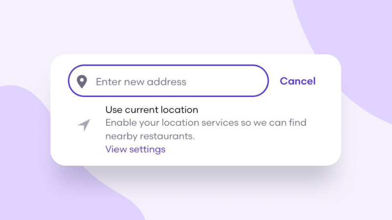
Grubhub, the food delivery app, understands this very well. Its app gives you the option to enter your address manually as you onboard (and every time you use the app after). At the same time, the app gently nudges you to enable your location when in the app, explaining that this makes for easier use.
6 – Show progress and celebrate milestones 🎉
At its worst, onboarding feels like a tedious slog with no clear endpoint. When users feel like they’ll be onboarding forever before they even get to use the app, their attention starts to wander and there’s a risk they’ll exit — or, even worse, delete — your app.
To reassure users, consider including a progress bar that shows how far they’ve got. After a user has taken an essential step, like creating a profile, uploading a photo, or even curating a playlist, why not drop some confetti or offer a joyful on-screen “ta-da” to keep users motivated and engaged.
The bad and the ugly – Common mistakes in mobile app onboarding
Done right, onboarding has the potential to boost your app’s engagement and user retention rates. However, the following don’ts can stand between your app and that sought-after engagement success.
1 – Design overload
Mobile app onboarding is one instance where it’s best practice to keep your app’s design simple, to avoid confusing or frustrating potential new users.
Even if you’re deliberately subverting traditional user interface (UI) expectations, your app’s success shouldn’t get lost in over-eager creativity.
For example, in a food delivery app, you should limit your onboarding to asking users for their location and chosen food type, rather than bombarding them with all the potential filter categories they can search. New users are interested in what’s readily available to them, rather than how to find your editor’s obscure restaurant picks or how many cuisine categories your site will offer.
Spotify, for example, is packed full of features yet has an onboarding process that’s as simple as creating a username and password. Only then do users see the immense possibilities that are available, if they choose to engage with them.
2 – Not beta testing
If a user is confused during the onboarding process, chances are they’ll uninstall your app faster than a speeding bullet. Beta testing is a tried-and-trusted way to check that your onboarding instructions are clear and explicitly demonstrate how to navigate your app..
In short, don’t let unclear instructions stand between your app and your users. Fresh sets of eyes are the best way to gather the valuable data that app designers need to understand the user experience and, ultimately, boost retention.
Key takeaways
Are you “onboard” with our tips for welcoming users into your app? Here’s a quick summary:
- Mobile app onboarding refers to the steps new users take before they start using an app. As a way to educate users and showcase what your app can do for them, this process is crucial to high engagement rates and long-term user retention.
- Different apps require different levels of onboarding – so consider your users and their journey before you decide whether to go progressive, functional, or benefits-oriented.
- Simplicity and transparency, giving users freedom during the onboarding process, cross-channel engagement, explicit instructions, and celebrating progress are best practices for a winning onboarding strategy.
- Don’t get carried away with your own creativity and desire to showcase all the cool things about your app — this can overwhelm your users during the delicate onboarding process. Careful testing will ensure they have a positive experience.
