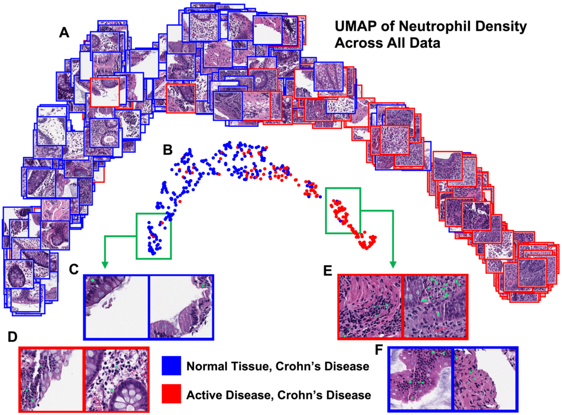
Figure 4.

UMAP of the normalized histogram representation of WSI neutrophil density for the entire dataset. All patches in this figure depict the 256 × 256 pixel CLAM patch with the maximum neutrophil density from the corresponding WSI. The UMAP displayed with patches depicts more clearly visible crypts and tissue edges in the normal cluster max patches than the active disease cluster (A). The UMAP displayed with circle markers highlights the separability of the two classes (B). Example patches are shown with their predicted neutrophil segmentation in green (C, D, E, F). Looking deep into the normal cluster, expected patches (C) and active disease outliers (D) show tissue edges and few segmented neutrophils. In the active disease cluster, expected patches (E) and normal tissue CD outliers (F) both show a larger number of segmented neutrophils, with fewer tissue edges visible (F).
