
Symbols of Tokyo
Tokyo Metropolis has the two official emblems. One is called the crest, another is called the symbol. It also has the two official flags featuring either emblem.
Metropolitan Crest

The Crest of Tokyo Metropolis (東京都紋章, Tōkyō-to Monshō) was adopted on November 2 1943, under the Metropolitan Announcement No.464 (告示第464号). It is same as the Crest of the former Tokyo City, decided by the city council on December 1889. It is believed to be designed by Hiromoto Watanabe (渡辺洪基, Watanabe Hiromoto), an alderman of the city.
The crest shows the Sun with six rays, representing Tokyo as the center of Japan. As most other prefectural crests in Japan, its color is not designated. The crest looks like a kanji 京 (kyō) of 東京 (Tokyo), but the metropolitan announcement does not explain as such.
Metropolitan Flag
 | |
| Proportion | 2:3 |
|---|---|
| Adopted | October 1, 1964 |
| Design | A white Metropolitan Crest on an Edo purple background. |
| Designed by | Hiromoto Watanabe (emblem) |
The Flag of Tokyo Metropolis (東京都旗, Tōkyō-to-ki) was adopted on October 1, 1964, under the Metropolitan Announcement No.1042 (告示第1042号). It features a white Metropolitan Crest on center. The background color is Edo purple (江戸紫, Edo murasaki), a traditional color which was popular in Edo.
Metropolitan Symbol

The Symbol of Tokyo Metropolis (東京都のシンボルマーク, Tōkyō-to no Shinboru Māku) was adopted on June 1, 1989, under the Metropolitan Announcement No.577 (告示第577号).
The design was selected by the Tokyo Metropolitan Symbol Selection Committee (東京都シンボルマーク選考委員会) from 20 candidates. The winning design was created by Rei Yoshimura (レイ吉村), a professional graphic designer.
The vivid green symbol features the letter T for Tokyo. It shows dynamism, prosperity, affluency, and relaxation of the metropolis for future. The symbol looks like a leaf of gingko, the metropolitan tree. However, neither the metropolitan announcement nor the Japanese official website explain as such. [1]
Metropolitan Symbol Flag
.svg) | |
| Proportion | 2:3 |
|---|---|
| Adopted | September 30, 1989 |
| Design | A vivid green Metropolitan Symbol on white background. |
| Designed by | Rei Yoshimura (emblem) |
The Symbol Flag of Tokyo Metropolis (東京都シンボル旗, Tōkyō-to Shinboru-ki) was adopted on September 30, 1989, under the Metropolitan Announcement No.978 (告示第978号). It features a vivid green Metropolitan Symbol on center. The background color is white.
Usages
The both emblems and the corresponding flags are the official insignias of Tokyo. The Metropolitan Crest and the Metropolitan Flag are older and used on more formal occasions. [2] [3] They are also used on traditional or historical objects, as well as the things of the longer duration of use. [2]
On the other hand, the Metropolitan Symbol and the Metropolitan Symbol Flag are more commonly used, including its official website [4], the metropolitan-operated buses and trains.
-
 Toei Subway train with the Metropolitan Symbol
 -
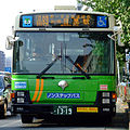 Toei Bus with the chromed Metropolitan Symbol
 -
 The gate of the Tokyo Metropolitan Government Building, with windows shaped as the Metropolitan Symbol
 -
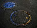 Manhole covers with the Metropolitan Crest


Notes and references
- ^ Metropolitan official website in English does say the symbols is "resembling a ginkgo leaf". [1], retrieved on September 29 2008.
- ^ Template:Ja icon 東京都のシンボルマークはイチョウではなかった (The symbol mark of Tokyo Metropolis was not a gingko), from excite.co.jp, retrieved on September 29, 2008
See also
External links
- The Tokyo Metropolitan Government official website. including:
- Template:Ja icon 都の紋章・花・木・鳥 (Metropolitan crest, flower, tree and bird)
- Template:En icon Tokyo's Symbols
- Template:Ja icon 東京都例規集データベース (Tokyo Metropolis ordinance database)
- Tokyo (Japan) at Flags of the World